Red Alabama ; I won't bite
PF Workd 1/10th scale resin bust
Painted in 2018

I’ve got quite a few kits from Pedro Fernandez Works, and I even get paint on some of them, which must mean that they’re pretty darn good.
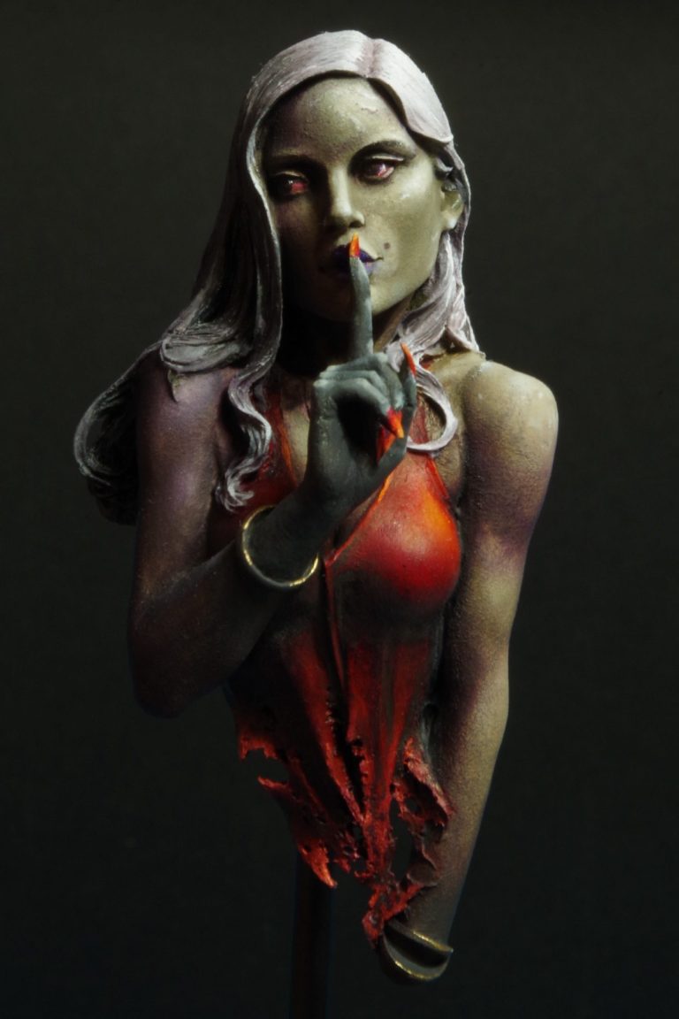
This is quite a simple concept, a fairly innocent looking girl with one finger to her lips in that universally understood request for quiet.
Simple indeed, but I’ve seen a lot of different examples of how to interpret the painting of this piece, and I really wanted to have a go at directional lighting, rather than overhead zenithal, which is my usual “safe ground”
Before I run through the painting, I’ve got to point out how nice the packaging is on the PF Works range, sturdy little boxes, nice shredded paper packaging and well moulded parts. Sometimes a little story about the charcter the sculptor has envisioned, and so as not to lead the buyer in any particular direction, the box art is usually a black and white drawing, which doesn’t bias the colour choices the painter might think about rendering.
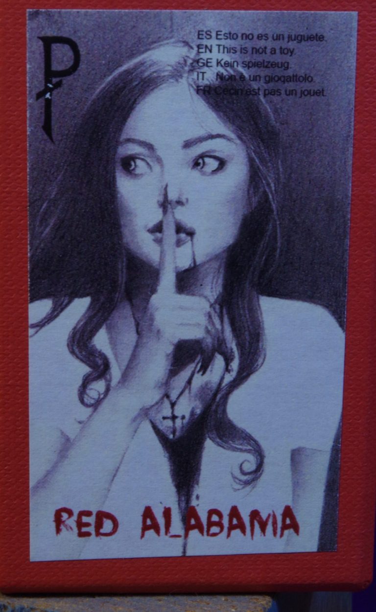
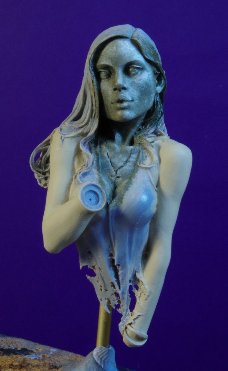
Photo #1 shows the box art, and photo #2 the main casting minus the separate right hand. The model has been primed, the flesh areas painted with a very pale flesh acrylic and then the face had it’s initial coat of oils added.
And this is where I make comparison to 3D printed pieces, where many a 3D sculptor would just print this as a single component, the sculptor here has had the foresight to separate the hand at the wrist, using a bangle to hide the joint, so that the lower face and chest is easily accessible to the paintbrush.
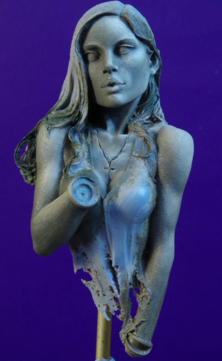
In photo #3 I’ve laid on a very pale flesh-toned oil, mixed from a good amount of Titanium White, a small amount of Raw Umber and just a little spot of Chrome Green.
I wanted her to look pale and hint at the undead side of her nature.
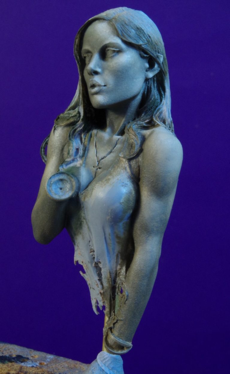
Photo #4 shows how the blending has smoothed out the flesh colours, having built up highlights with mire Titanium White, and added a little more Raw Umber and Chrome Green to the shadows.
At the moment I’m leaning towards zenithal lighting effects, which can be seen in photo #5 where the picture is taken from overhead and the highlights can be seen, with just a few shadows as you move down the figure.
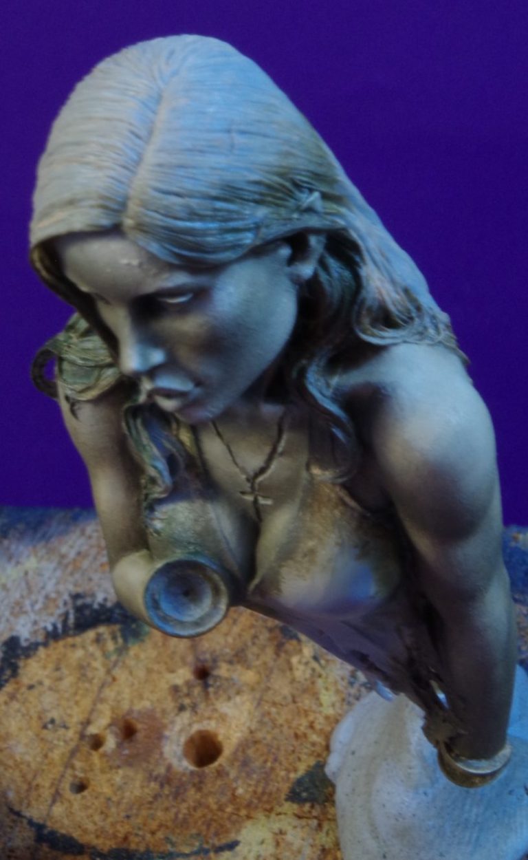
Photo #6 and a view at this point from underneath, showing the shadow areas particularly beneath the jaw-line.
Photo #7 and this is where I’ve begun working on the directional lighting idea, beginning with the dress, where the light is coming from her left. The shadow build-up on the right side of her face has begun too, and this will transfer to the right arm as well.
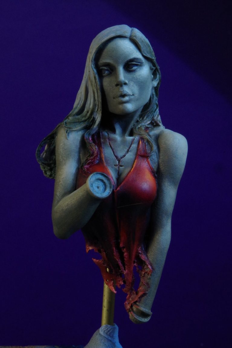
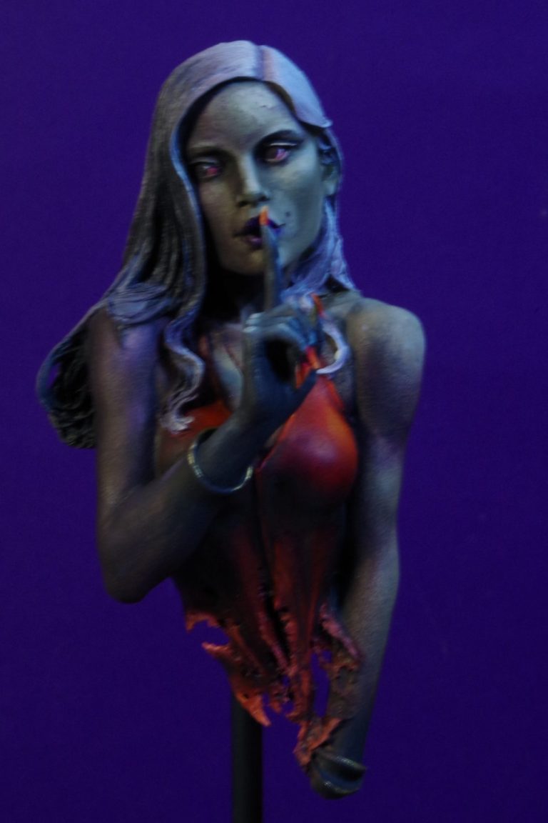
Photo #8 and a lot has gone on here, the shadow effect – very thin, gradual additions of Sepia oils added to the right side of the bust – has been built up further to darken the side that is away from the light source, and smaller details like the eyes, lips and fingernails have been painted in.
The hair has been painted with various grey colours, combing the paint on with a flat brush to leave brush marks in the paint that look like individual hairs.
The bangles have been painted with metallic gold colours from the Darkstar range, with very small catch-lights added from Molotow Chrome pen.
The eyes were perhaps more complex than they needed to be, adding a red outer rim to the iris, followed by a dark brown inner part and a black pupil. A tiny white catchlight was added to each at about the two o’clock position.
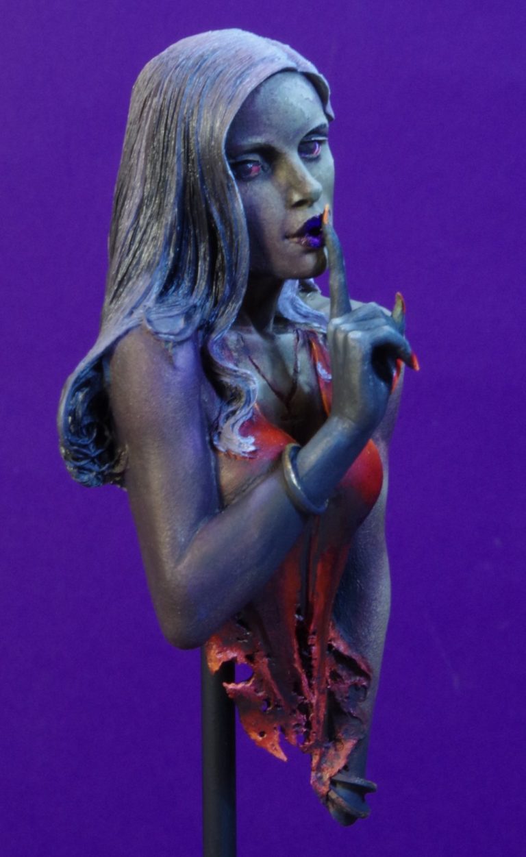
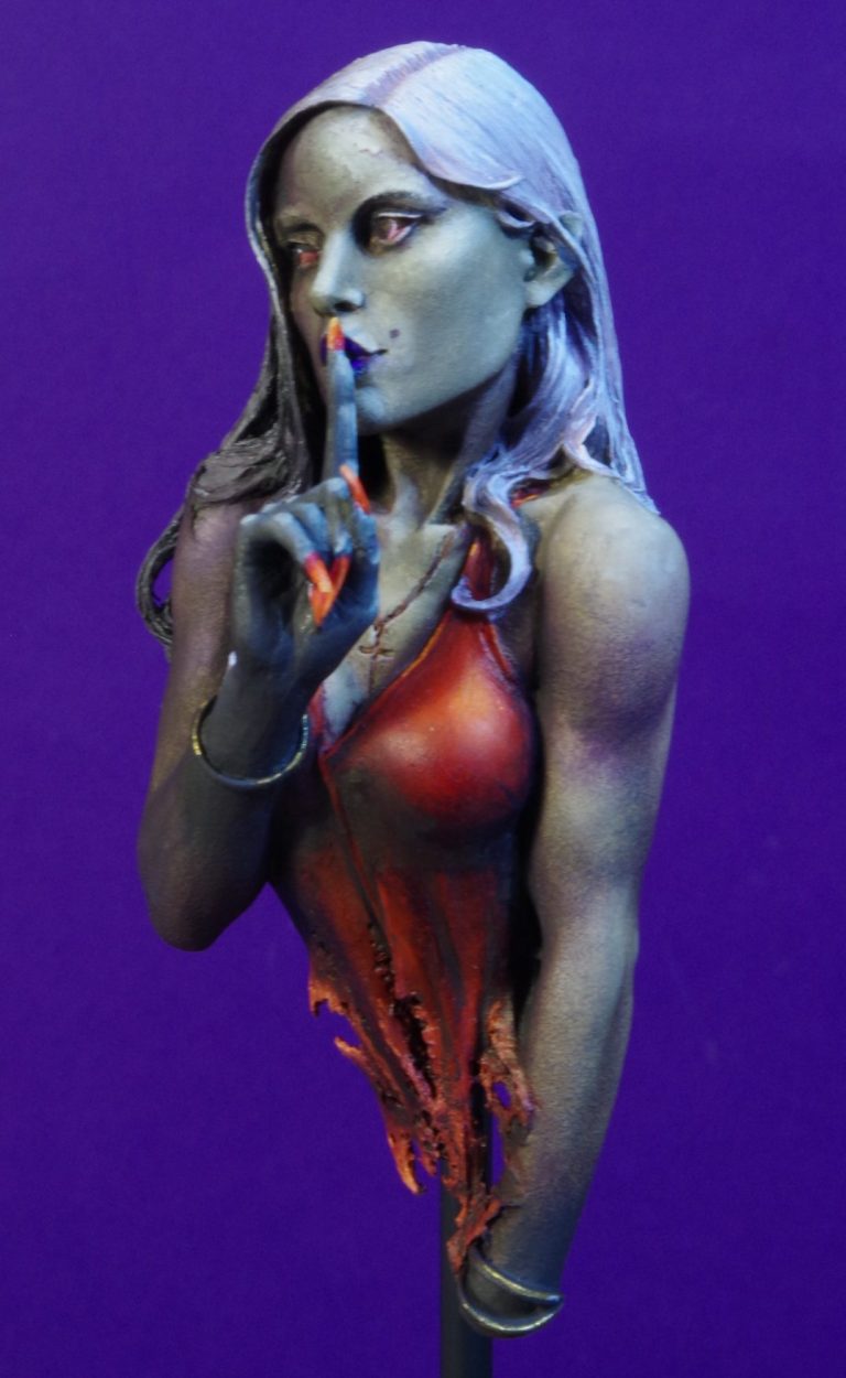
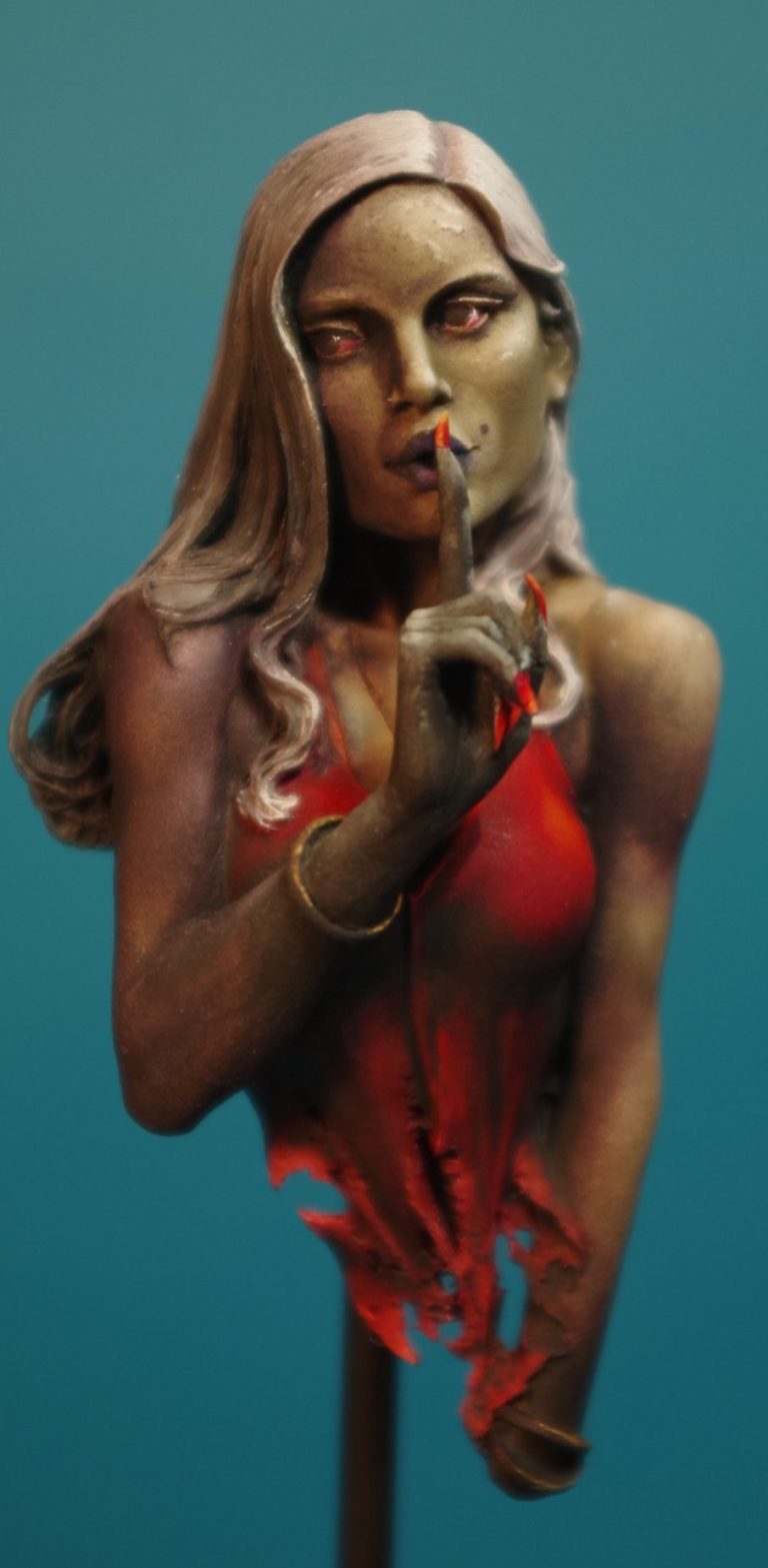
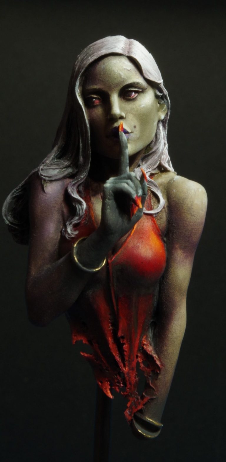
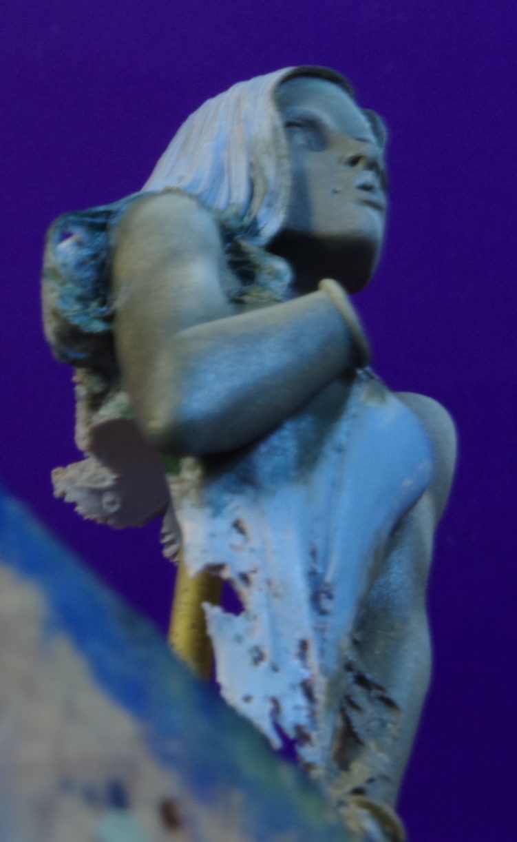
Photos #9 and #10 perhaps show the painted effect better in that the lighting used for the photography is not “helping” the effect, but showing off the shadow colour used on the figure’s right side in photo #9 and the forced highlights on her left in photo #10.
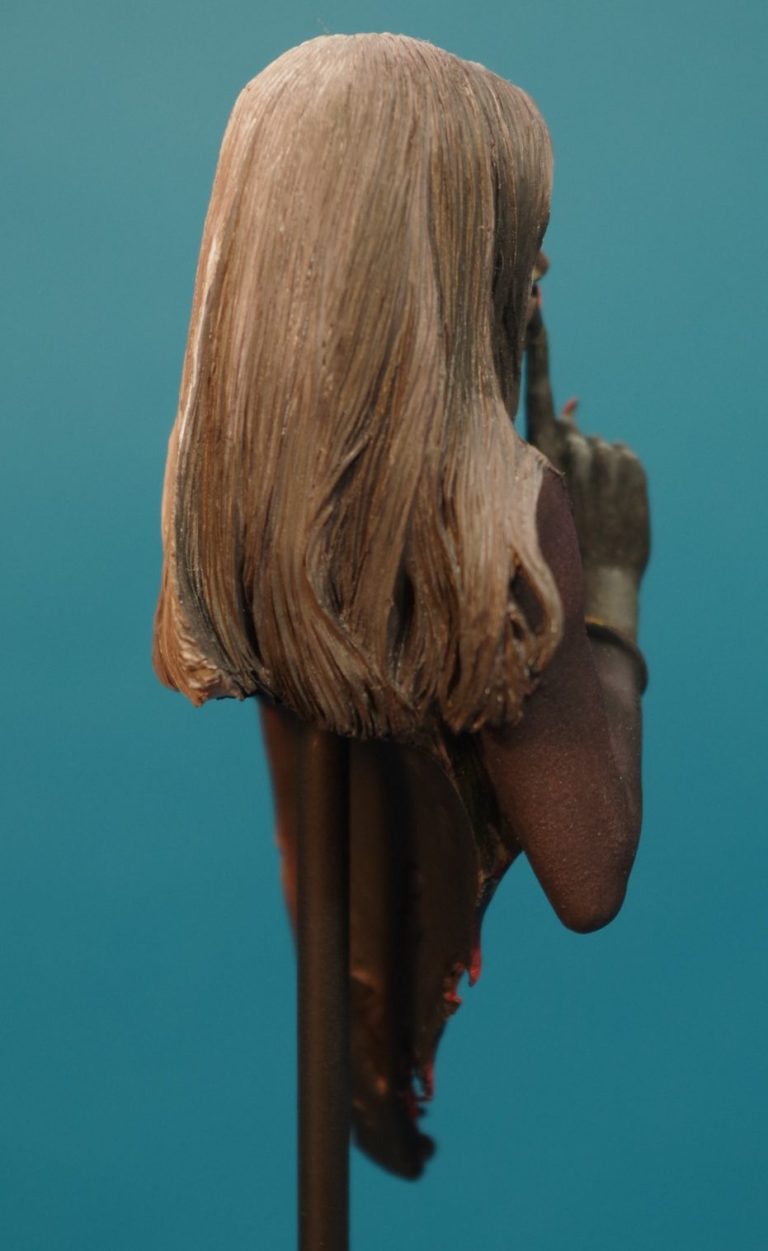
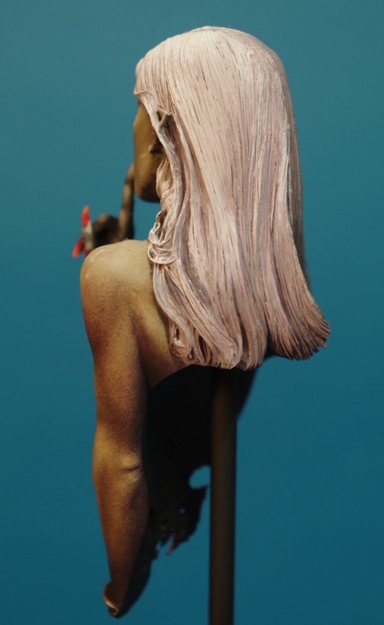
Photos#11 and #12 show the back of the bust, which to be honest is a little boring because it’s dominated by the long hair.
However again the painting effects can be seen with the right side being much darker than the left.
Final thoughts.
I’ve already said I like Pedro’s kits, they can almost talk, there’s an amount of activity, a character imbued into the pose that catches a moment it time.
Whether it’s a case of “quiet while I kill you” as in this one, or the Bunny Bible Basher’s intent to convert by any means necessary, the message is there.
It’s a skilful use of expression, and I doubt that it’s easy to do.
I remember well the historical kits from the late 70’s, 80’s and into the 90’s where cloned-faced, shop-store dummies were acceptable fare so long as a different uniform was offered.
This is admittedly a very small, and simple bust, it’s likely that busts of larger scales will overshadow it in your display case, but it’s one of those “sleepers” that although overshadowed, reward the attentive onlooker with a blast of character once they’re noticed……. If you beat her to the bite that is.
Highly recommended.
We need your consent to load the translations
We use a third-party service to translate the website content that may collect data about your activity. Please review the details in the privacy policy and accept the service to view the translations.