Female Mini-busts
Resin castings from 3D prints by LH Craft
Painted in 2025
Another stall, another purchase from the SMC stall.
What attracted me to these two little models ?
Well their simplicity and beauty really.
Although diminutive, there was a range of about half a dozen pieces, all female, in this scale, plus another half a dozen in a slightly larges size too.
These smaller offerings were a mere twenty Euros each, and to be honest walking past and not buying one or two would have been downright rude.
So yes, two went in the bag, and were on the workbench ready to be painted within a month of being back home from the show.
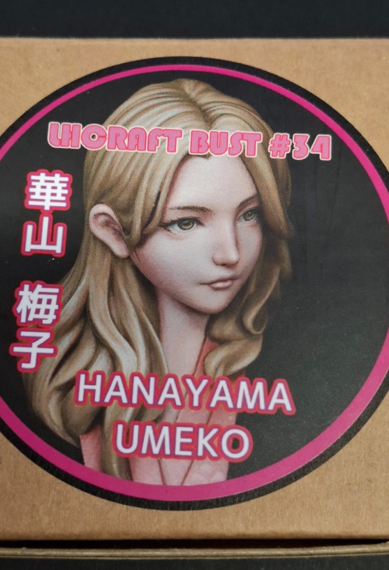
Photos #1 and #2 show the box art. Very well painted, and probably three times the size of the busts inside, but showing what can be done by a very competent painter.
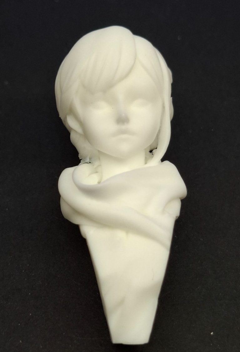
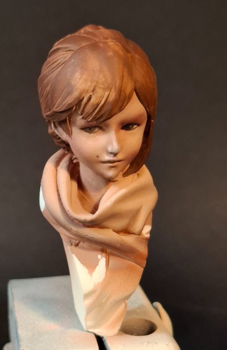
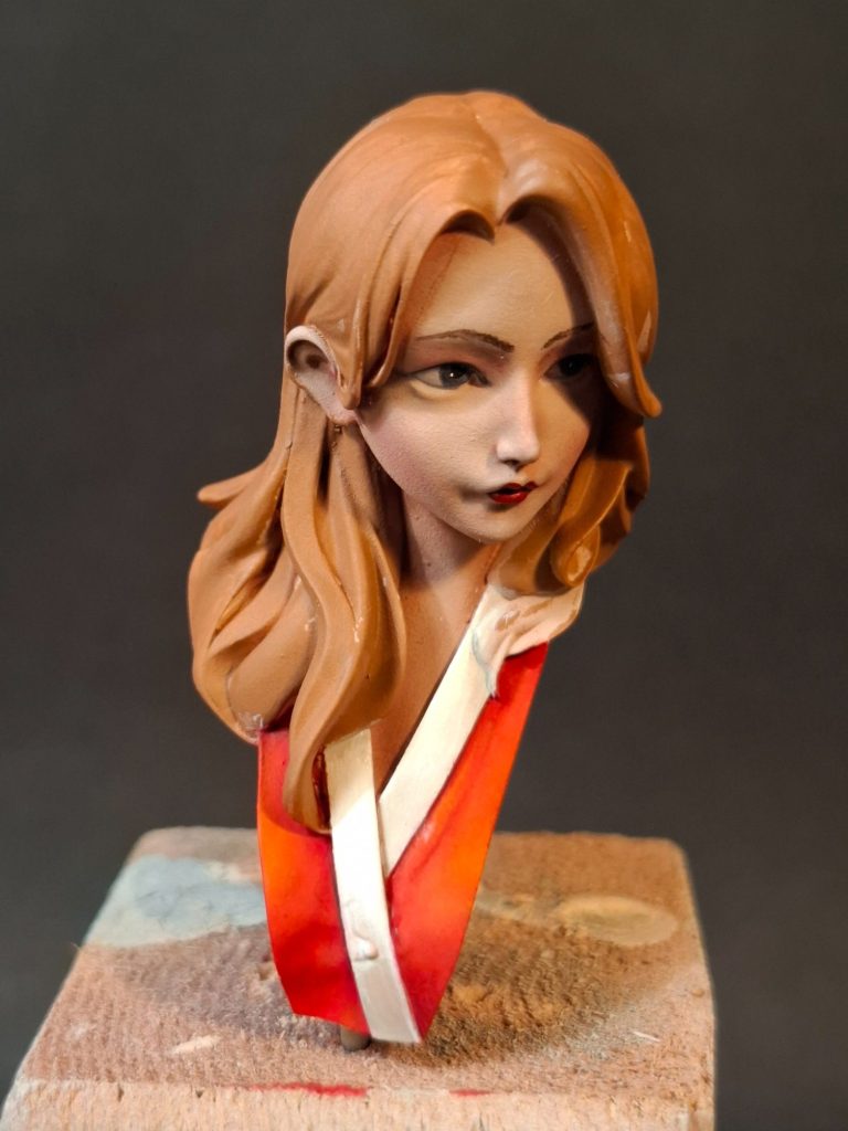
Photos #3 and #4, whilst rather poor shots, show the very pale, cream coloured resin castings.
There’s very little clean-up necessary, and after drilling into the base of each bust to insert a wire pin, I could attach each of them to a painting handle and get on with adding some colour.
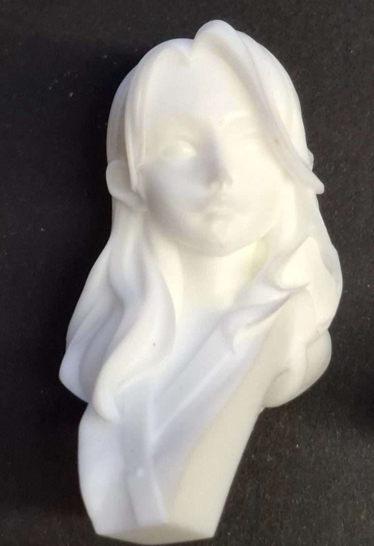
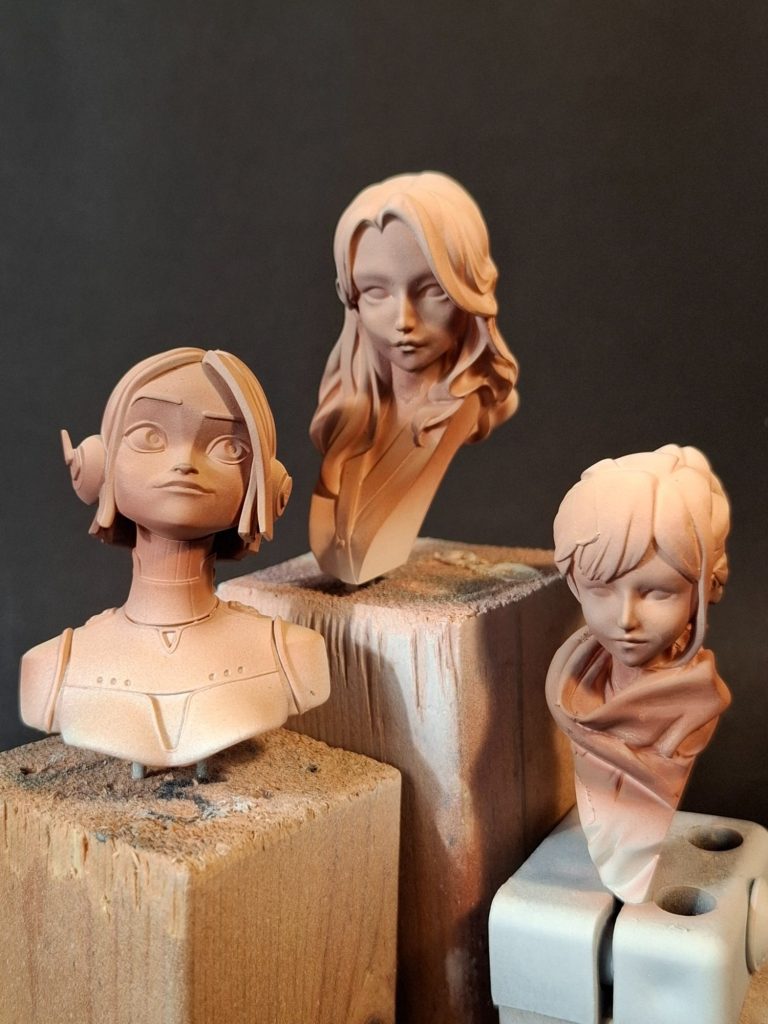
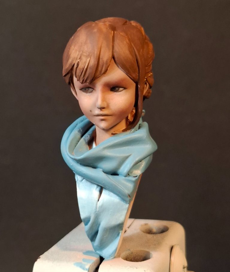
Photo #5 and I’ve started off with a primer coat of Halford’s White followed by airbrushing these and the little piece from Nonsense Miniatures with an initial mix of Tamiya NATO brown and Deck Tan from below, and then turning the models to spray from above with just the Deck Tan.
The airbrush does leave a nice smooth finish, and the blending is very good too; however, whilst the Nonsense Miniatures bust looked OK, I felt that the colours I used were a little on the dark side for these two busts.
As this is a new method for me – using an airbrush to start off the flesh tones - I’m not really set up with the correct colours yet, my paints being more for painting vehicles and aircraft.
SO a trip to Mike Jolly’s MJR model shop over the other side of Wigan a couple of days later saw me buying paints from the Tamiya range that I never thought I’d use.
A Flesh colour, a Dull Red, some more Deck Tan ( as I was running out ), White ( for the same reason ) and a couple of other colours too.
The problem ( OK I mean great things ) about entering a good model shop, And Mike Jolly’s emporium is a very good one indeed, is that you always see something else that you “need”.
I got some solution for darkening White Metal AFV tracks ( been after some of that for a long time ), some setting solution for decals, which I’m getting low on, a set of brass tubing for gun barrels, and a few other items, all of which came to less than £35.
Nope, not a single model did I bring home, strange but true, however, a small bag of useful stuff that, as my late father would say “will come in useful”
Home again, purchases put away either in storage drawers for when the current stock has run out, or alternatively near to hand, ready for use.
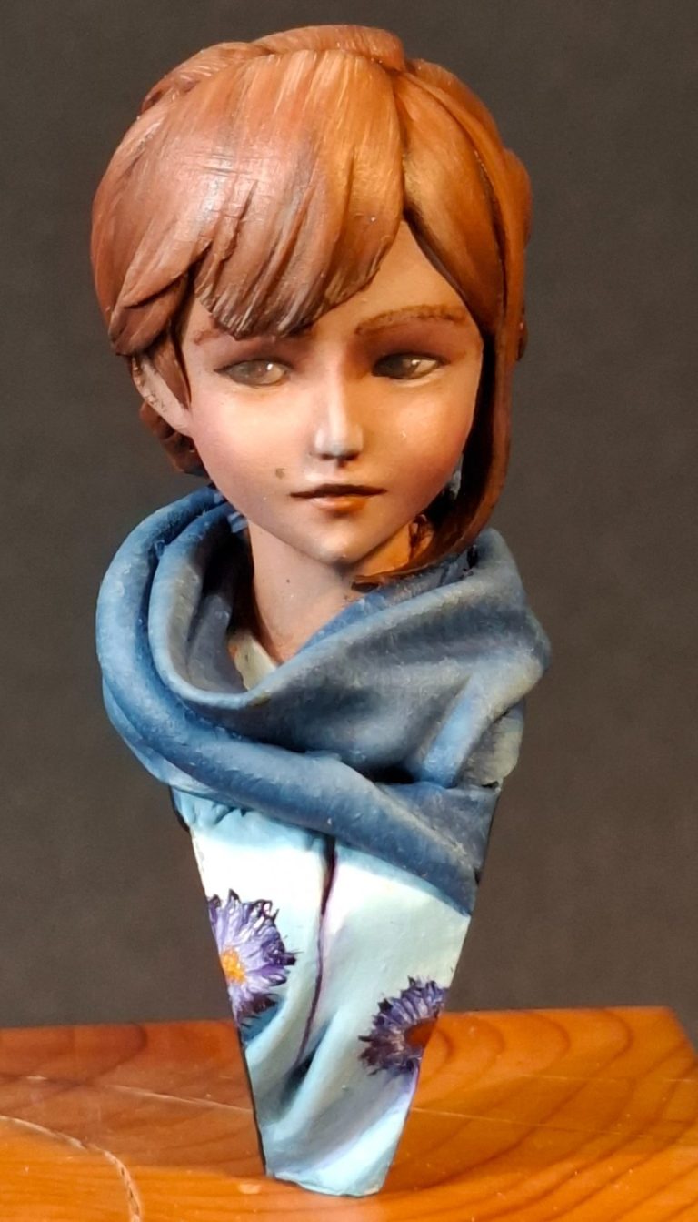
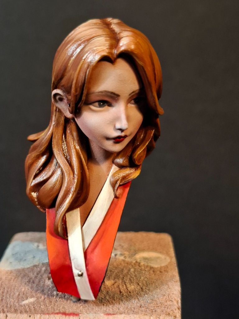
Splitting up the painting now to focus on just one of the busts, let’s look at Shimano Rinke as seen in photo #6. The additions to the skin on the face and neck are very subtle, using a soft brush similar in scale and shape to her having a brush to apply blusher make-up with, I used a gentle scrubbing motion to add the tiniest amount of Carmine to the lower portion of the cheeks, across the tip of the nose and as an eye shadow.
I cannot stress how little paint is being used here, and adding too much will mean restarting the airbrushing all over again after stripping the paint away.
To ensure that there is enough Carmine on the model I recommend painting an undercoat onto the hair so that the face gains a “frame” which will give context to the colours on the face.
Adding the eyes also helps, and from this you can then see if more Carmine needs to be added.
I painted the eyes brown, using a mix of Buff Titanium and a tiny spot of Carmine mixed in for the whites of the eye, and then adding Mars Brown as a starting point for the iris, lightening a “U” shape at the bottom of the iris with Light Red and then painting in the pupil with Mars Black. Finally a tiny catchlight of white was added on the border between the iris and the pupil.
In photos #7 and #8 I’ve moved on to the clothing. Until I undercoated it, I’d only glanced at this area of the model, and hadn’t really noticed that there is a scarf and also a shirt to be painted.
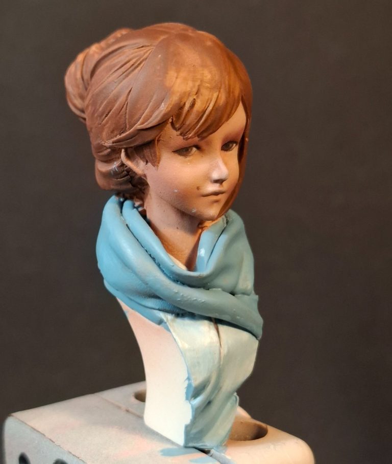
I began with the shirt, which has a tiny amount showing at the base of the neck, which is a bit of a pain to get at with a brush, but I managed it after a little struggle.
I used acrylics, for the shirt, establishing a pale blue colour over the whole of the garment, and allowing this to dry fully, before mixing the same colour and thinning it with a similar amount of water, and painting this mix on, a section at a time, and then adding more white to a separate puddle of the watered down mix on the palette, to lighten it and using a good brush to mix the lighter colour in “wet on wet”.
As more white was added the mid-tones and highlights could be built up, to almost a pure white, this was then allowed to dry fully, before adding a wash of the darker mix of blue, thinned with about three times it’s volume of water, and avoiding the areas of highest highlight, but adding two or three thin coats to the shadow areas and feathering it out towards the mid-tones.
Adding more water to the already heavily thinned darker blue mix, I added an overall glaze to the shirt to blend any blended sections that were less than smooth.
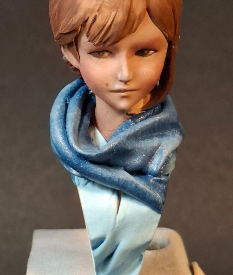
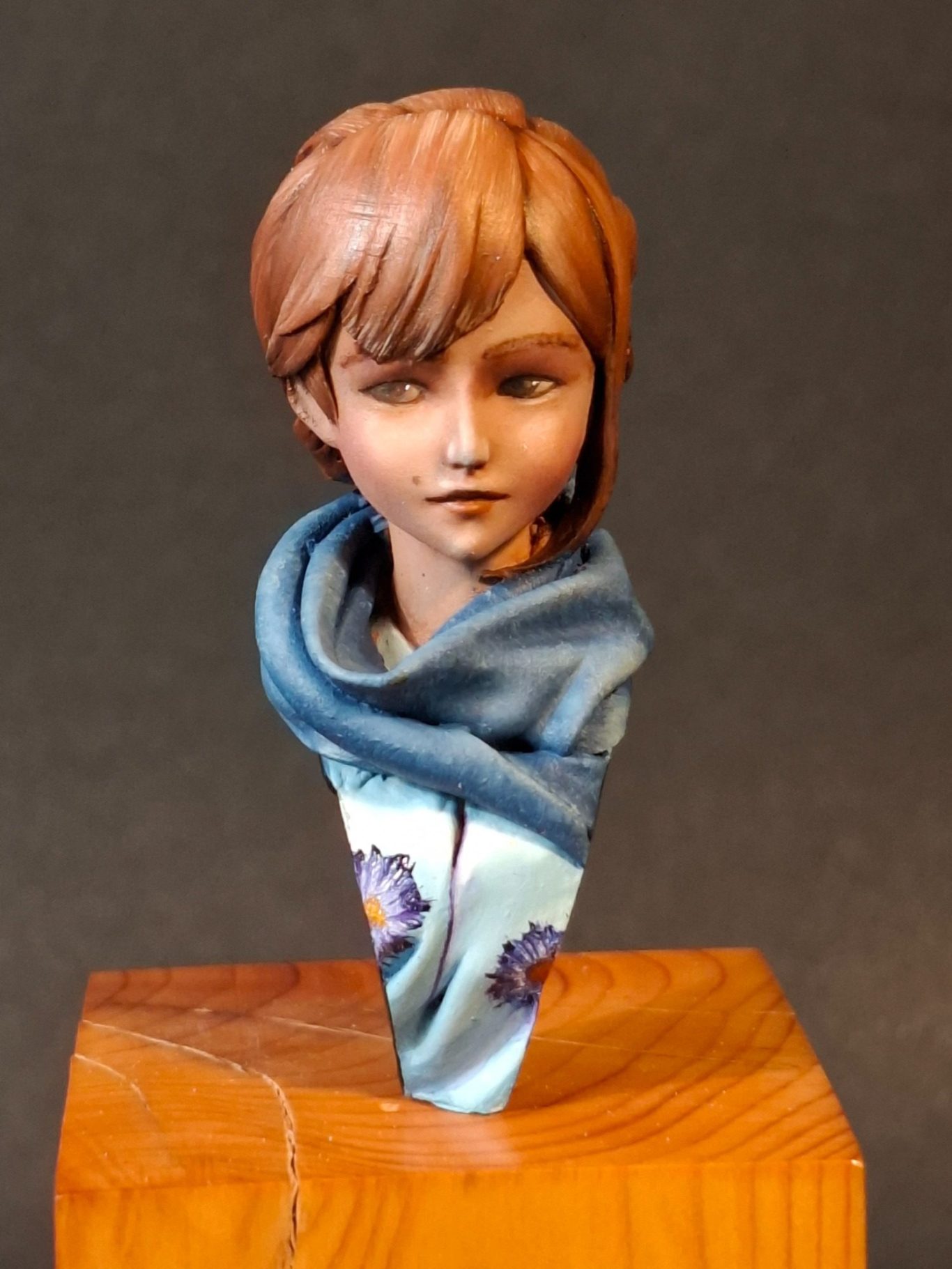
Photos #9 and #10 and I’ve completed the scarf. I wanted to make this look like a coarse woollen item, so I’d need to add some texture.
The idea here is to use oils and to begin with – in this case, Prussian Blue – painting this over all of the scarf area. I then used a soft brush to stipple the dark blue paint so that there were no brushstrokes visible, and after wiping the brush, added a very small amount of Titanium White oils to the blue already on the palette.
This slightly lighter colour was then gently stippled on to almost all of the scarf, leaving only the deepest undercuts untouched.
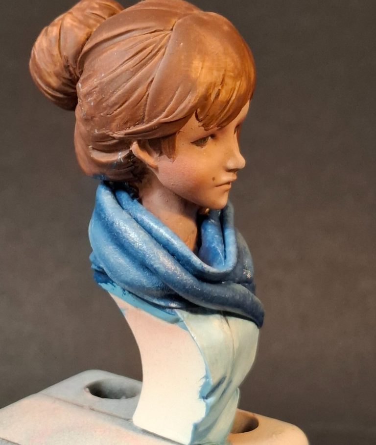
A little more white into the blue mix, a quick wipe of the brush, and again the lighter colour is stippled on, but this time not covering all the areas that the last coat covered.
The idea here is not to get a smooth blend, in fact, it’s quite the opposite, in that whilst lighter and lighter blue colours are added, there is a dotted effect building up that appears to be a texture.
The palest blue is probably a similar colour to the shirt, but because the shadows and mid-tones are so much darker, the scarf remains separate.
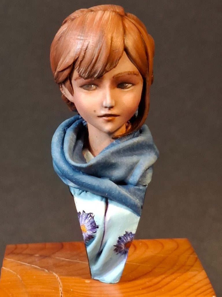
Photo #11 and I’ve painted the hair getting an overall oil layer of Mars Brown established, then using an old brush to add Light Red and some Yellow Ochre to the volumes of the hair, using a combing motion and allowing the brush to leave streaks in the paint. These streaks are fine enough to look like separate hairs and the effect can probably be seen best on the top centre of the hair.
I’ve also added a couple of flower decorations to the blouse, using a very old brush that the bristles have separated on, and charging this with paint and then pushing it onto the surface of the figure. The bristles splay out creating a fine flower petal effect.
Darker paint is used first, in this case Prussian Blue, and then lighter and lighter colours are added, with the centre of the flower being the final touch with a little Yellow Ochre and Chrome Yellow for a highlight.
A note about using oils.
Photo #12 shows how I lay out new oil colours, or ones that I’ve not used for a while and the oil carrier has separated somewhat from the pigment.
This separation is good in a way, in that the less carrier there is in the paint you use, the less shiny it will dry.
So actively removing the carrier by putting small blobs of the required colours out onto a piece of card as shown in this shot, helps.
The discolouration of the yellow card can be seen around each blob of colour, and this is after only a couple of minutes after the paint has been applied to the card.
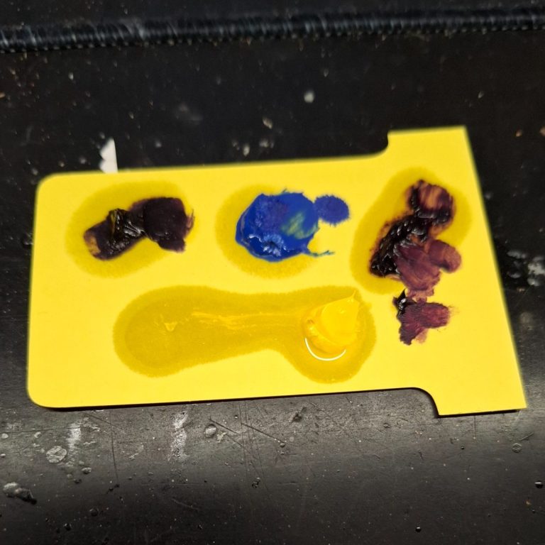
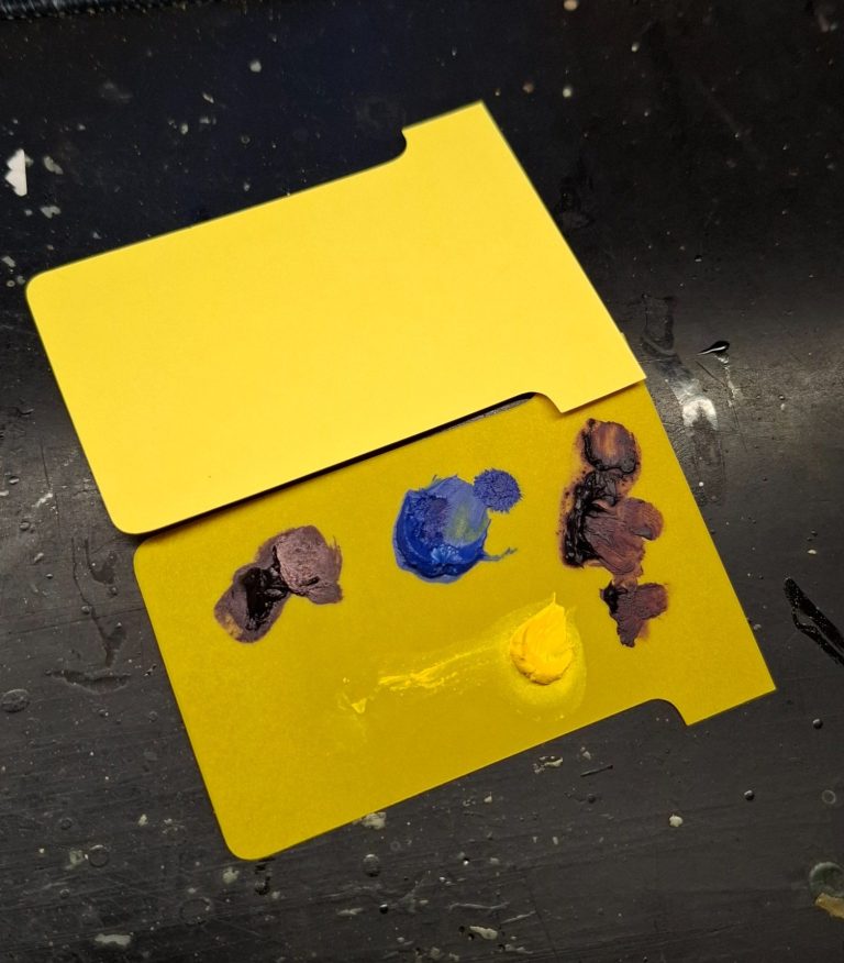
Photo #13 shows the same card after about six hours, compared to the colour of a clean piece of the same card.
The discolouration from the leached away carrier oil can be seen to have completely covered the piece of card.
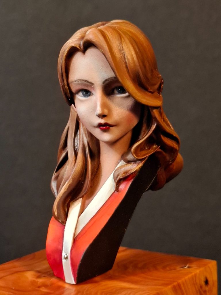
Photo #14. Moving to the Hanayama Umeko bust, The face was treated in much the same way as the Rinke bust, the Carmine added with the soft brush very sparingly and then the eyes added and the hair undercoated.
I decided that this model would have ginger hair, and that the eyes would be blue, so whilst the whites of the eyes are painted the same colour, the iris is formed from Payne’s Grey adding a very small amount of Yellow Ochre to form the “U” shaped highlight under where the pupil will be placed.
The clothing – to me – seems to be some form of wrap or possibly a kimono, although there is a single button fastening it together, so I chose a Scarlet undercoat from the MP paints range, and used some of the Carmine oils as a shadow colour, bringing out mid-tones and highlights by adding Rembrandt Scarlet in small spots and lines, then using a soft brush to blend the two colours together.
The collar or border of the garment is painted with MP acrylic paints Cream which had the initial coats darkened with a spot of MP paints Leather, then establishing the cream colour as mid-tones and finally MP paints White for the highlights.
Photo #15 and the wrap and hair have had oil colours added, although the latter is still shiny because the paint is still wet.
Photo #16, Ah, that’s better, a night in the drying cabinet shows how the heat has dried the hair to a more silky finish.
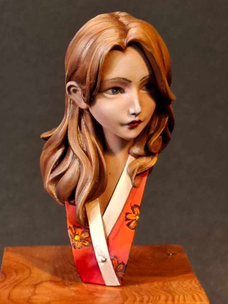
Photo #17 and to create a kind of “series” of these busts – If LH Craft is at SMC next year then hopefully I’ll be able to purchase a few more of these mini busts – I added some flower designs to the wrap.
Instead of forming the flowers with the old brush, I selected a new one and painted on the petals separately, beginning with a purple oil colour, then working through Light Red, Orange, and finally Yellow for the centre.
Both busts were attached to matching plinths from Oakwood Studios, and nameplates printed off – “Blue” and “Red” – keeping it simple really.
Final thoughts.
Very nice little pieces, with enough to keep a painter occupied if they want to add some freehand detailing, but simple enough to still look cool with relatively simple paint-jobs.
One thing I did note was that on “Blue” there are several fine mould lines – particularly on the sided of the model running up the neck and through the hair.
I cleaned most of these off pretty successfully, but know I’ve missed a couple in my haste to add paint.
It’s not a disaster, jut a little laziness creeping in because I wanted a simple and uncomplicated paint-job in between painting a couple of very involved commissions.
For me the attraction in these busts comes partially from their relatively small size and simplicity, their understated animation that is just enough to lift them from being “straight up and down” pieces and their very reasonable price tag.
They allow the painter to practice new ideas on, whilst being easy enough to complete fully rather than have yet another half-finished piece at the back of a cabinet.
Highly recommended.