Cadwallon Bodyguard
Resin Kit from Journeyman Miniatures
Painted in 2025
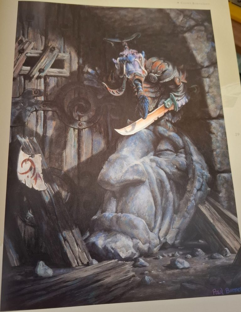
This piece is modelled after a particularly nice painting by Paul Bonner, a superb fantasy artist that brought a lot of Rackham figures to life, and now ( thankfully ) seems to have a few other companies interested in making his drawings and paintings into kits.
I’ve not painted anything produced by Journeyman Miniatures before, so this was a very pleasant unboxing of the components which needed very little in the way of clean-up, just a few very restrained mould part lines and some mould pour blocks to remove.
The resin is relatively soft and very easy to work with, and the fit of parts is very good leaving no need for any filler.
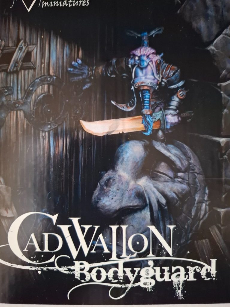
Photo #1 shows the box art, and here’s the first thing I noted.
Colour reproduction is tricky at the best of times, cameras sometimes alter the colours they’re supposed to pick up, then there’s printing ink mixes, the paper might absorb ink slightly differently etc.
I worked in printing for nearly 20 years, so I know some of the problems that can be encountered.
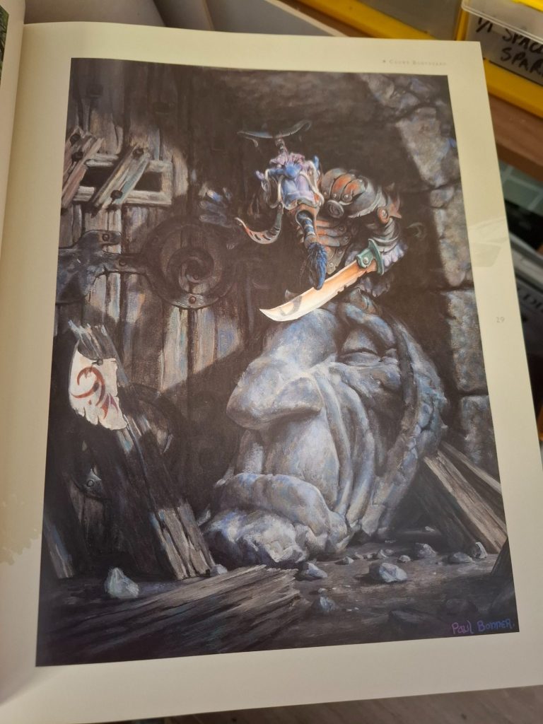
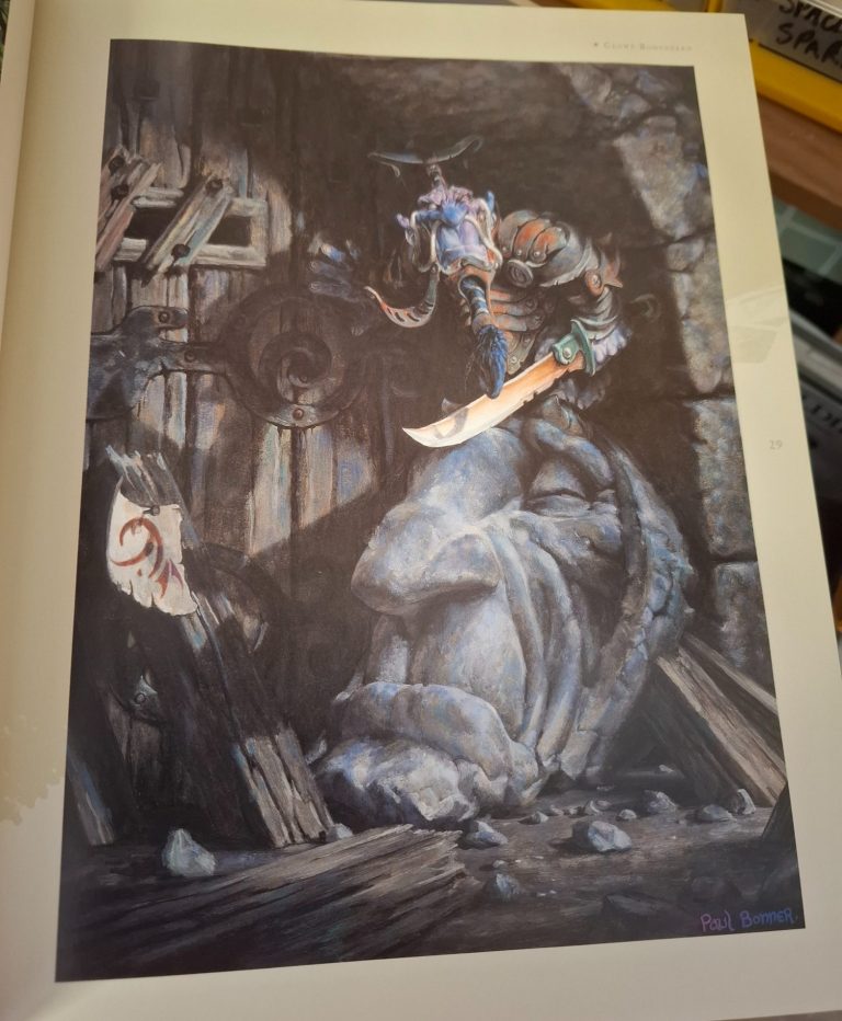
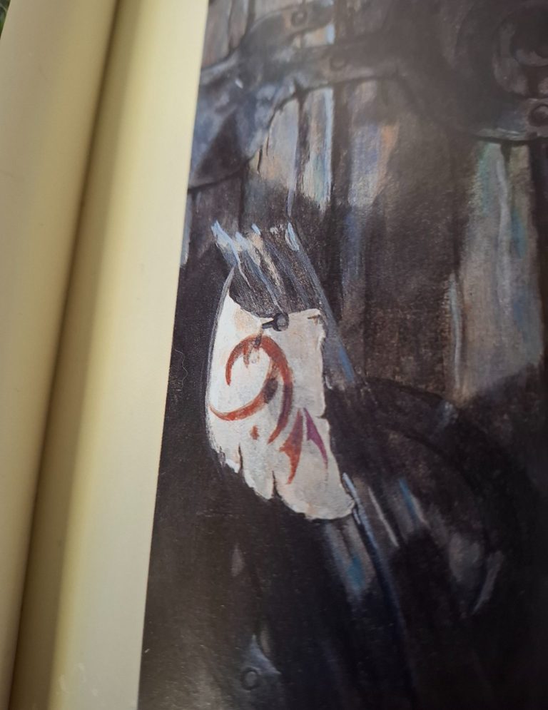
In this case, photo #2 shows Paul Bonner’s art of the same subject from the book I have. The colours are more muted, the blue is more pronounced and there’s a few other details that appear slightly different in colouration.
So which is right ?
Well, to be honest, I’d say both of them are probably a little different to the original, so in some cases they’re both right, and possibly in others they are wrong.
As I say, the differences are only slight, but the reason I chose to point this out is that I wanted to follow the colours represented in the book.
Others ( and it would be perfectly acceptable ) may want to follow the box art, and yet other people may want to take parts from each to make a blend of the two images.
On the other hand, you could paint it completely differently, and there’d be nothing wrong with that.
Painting begins.
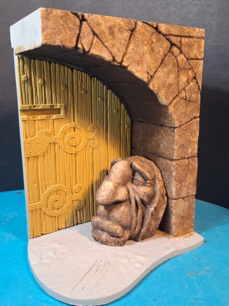
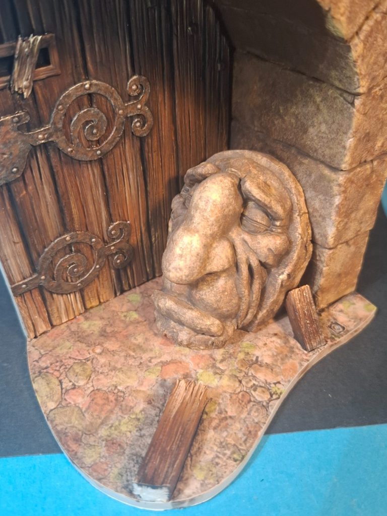
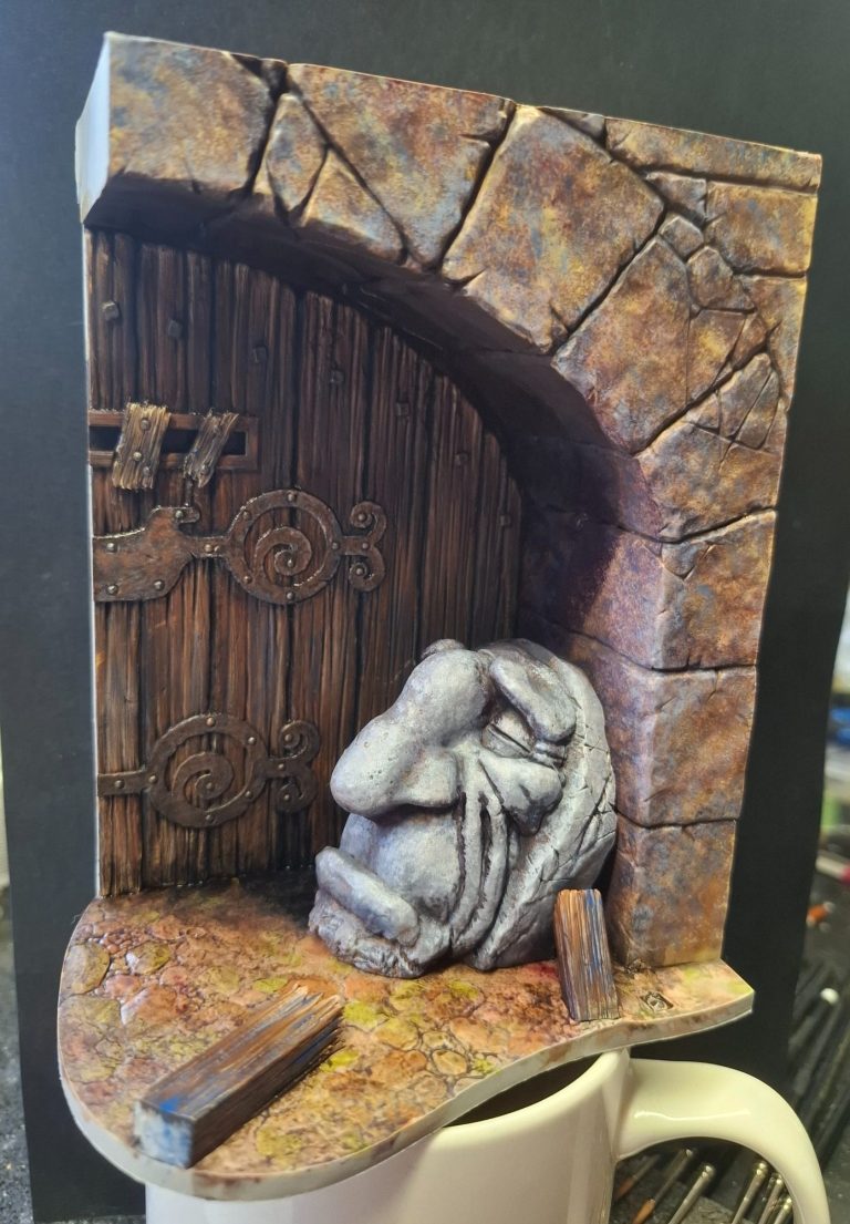
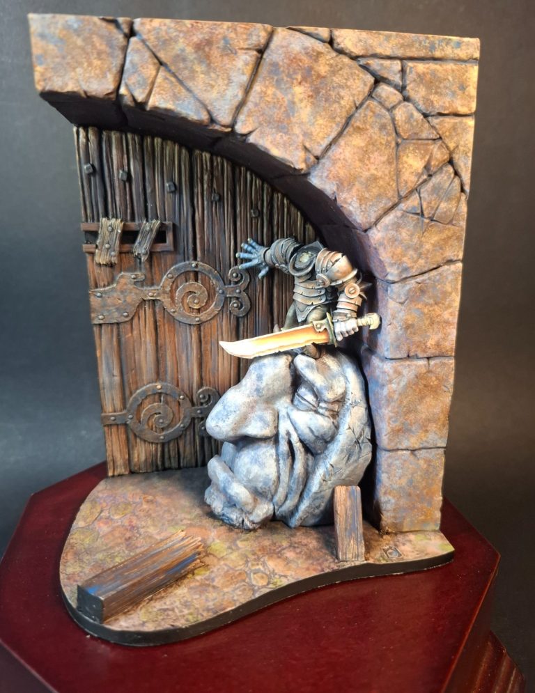
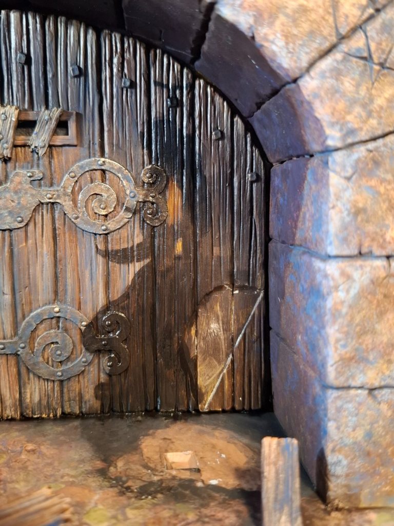
Photo #3 shows how I began the doorway. This comes in three main parts, two to make the archway, and a third to make the door.
The stone head is a separate component too, as are the two small pieces of broken wood that will cover the vision slot.
At this stage I’ve primed and undercoated the door and archway, the door displaying the sand coloured acrylic used so far, and the archway having progressed beyond this with several different brown acrylic colours being added with a fine sponge to get a varied spotting effect to look like stone.
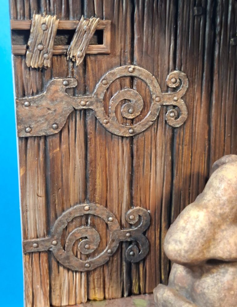
All well and good, and satisfied with the stonework, I painted the wood effect on the door, this time using oils and a wide brush, beginning with a mix of Burnt Umber and Mars Black, over which I added Mars Brown, Venetian Red, Mars Yellow and Buff Titanium, wiping the wide brush before recharging it with paint to gently brush over the detail creating a striped wood-grain effect. See photo #4
This was allowed to dry, and then the hinges were primed again with sand coloured acrylic mixed with Isopropyl Alcohol, and then various shades of Darkstar metallic colours ranging from bronze through to a bright silver were added.
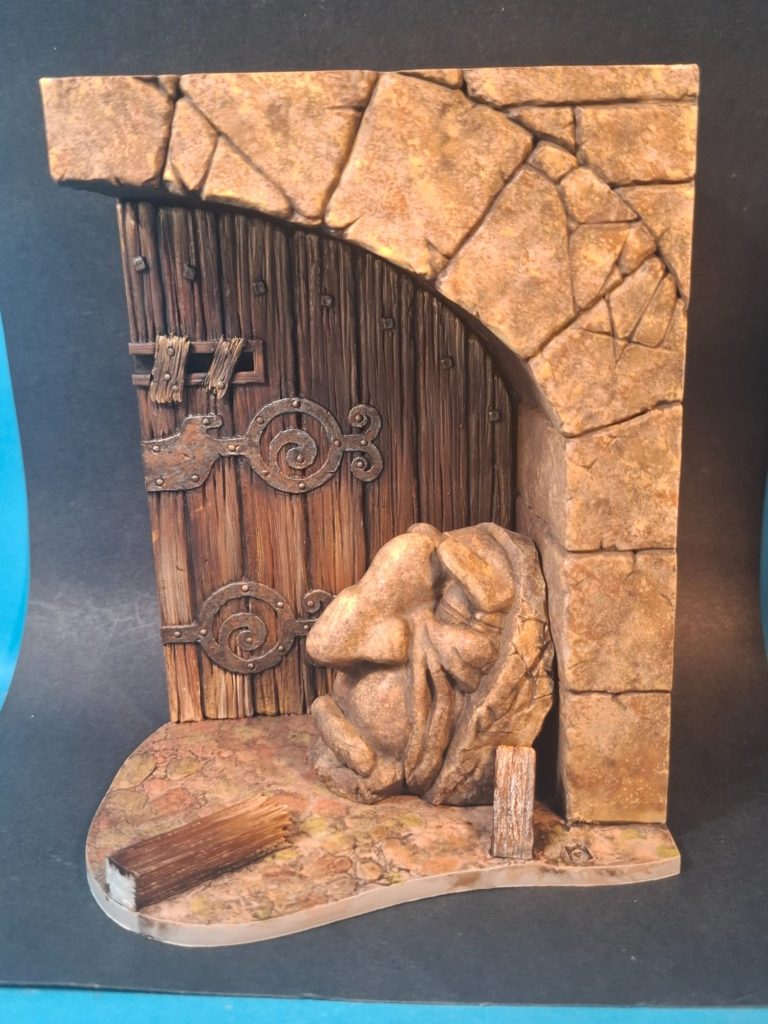
Photos #5 and #6 show these areas completed with a little Venetian Red oils on the hinges to depict a little bit of rust.
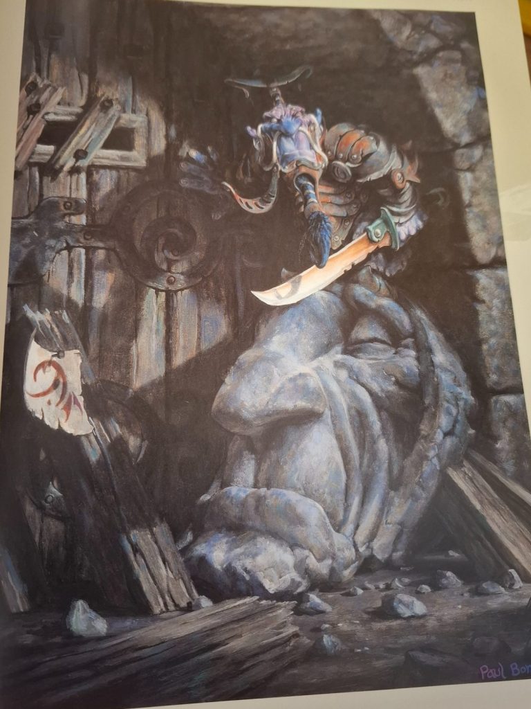
But no, lets just have a glance at Mr Bonner’s picture again – photo #7 ( I could have asked you to go back to look at photo 002, but thought I’d save you the scrolling ), the colours aren’t really right are they.
The stone head is a lot more grey, appearing to be a completely different stone to the archway, and there’s a lot more blue colouration to the archway itself and hints of blue on the door.
It’s OK, I could alter that.
Photo #8 shows the beginning of the process of correction, the head being almost completely repainted to be much paler and, well, grey, not brown.
By adding thinned washes of oils to the archway, using Cerulean Blue and Titanium White oils, adding hints of Vandyke brown as well, I ended up with something a lot closer to the artwork in the book.
At this stage the stone head is drying still and requires the green and blue additions to pull it closer to the image in the book.
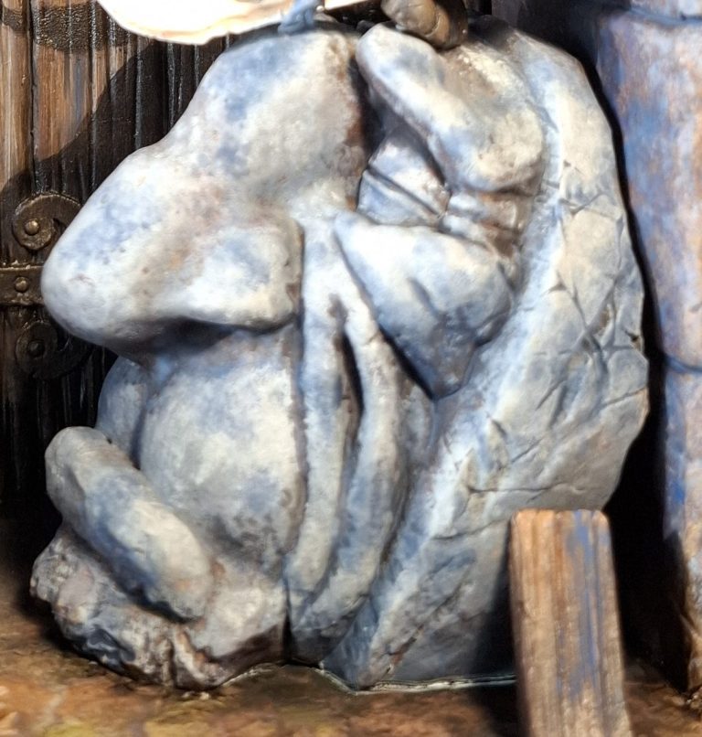
Ah, there we go, photo #9 and the blue and green colouration ( OK, not too much green really ) has been added to match the picture. I used Cerulean Blue oils for this, thinning them a little with white spirit and then applying clean white spirit to the model with a damp brush, then spotting the blue on and allowing it to spread out in a random manner.
There is a white line along the bottom of the head where I’ve sprayed accelerator on the superglue when fastening the head to the base. This will be covered with some dark brown later on to form a shadow around the base of the head.
Speaking of shadows in this shot you can just see the cast shadow on the door from the head and the figure’s sword. I’m getting ahead of myself here ( Sorry, pun intended )
Photo #10 - The cast shadow painted on the door is show here, minus the figure. Clever eh ?
I’ll tell you how it was done later, first, let’s move on to the figure.
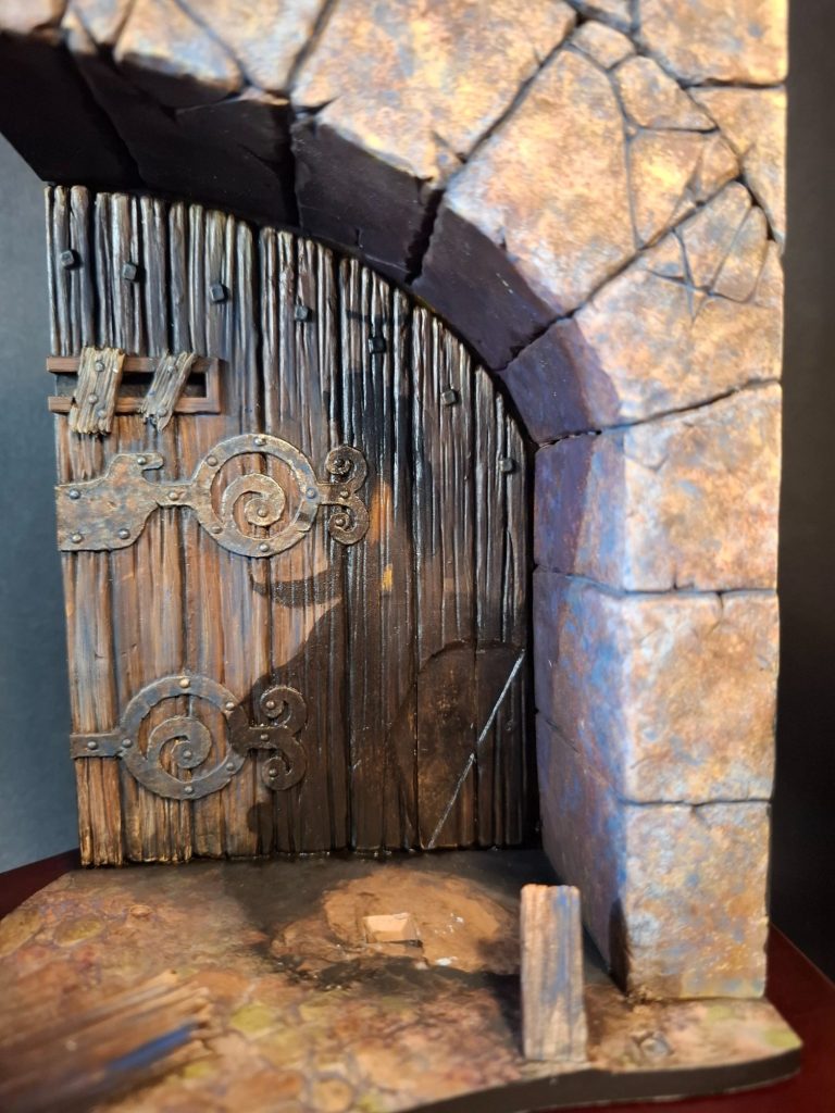
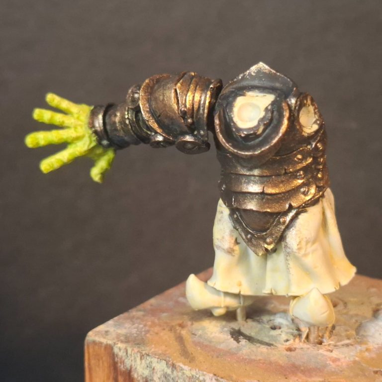
Photo #11 my initial thought – and I have no excuse – was to paint the armour with metallic colours. The Darkstar range is superb and would do a good job.
So here you see the armour painted up with lovely dark steel and black mixed for the shadows, some Dark Steel for the mid-tones and some Bright Silver for the highlights. All nicely blended and absolutely lovely…… Un, maybe not.
It just didn’t look right, and relly, if I’m copying the picture, shouldn’t it be done in Non Metallic Metals ( NMM ) ?
“Yes, it should ” is the easy answer, and photo #12 shows the beginning of this, simply using Mars Black and Titanium White to get the effect. The armour in the picture isn’t shiny, it looks dull and battered, and there’s some rust in places too – this’ll be added once the grey colouration has dried fully.
The sword has been painted too, again referring to the picture, and using Venetian Red for the rust colouration, a lot of Titanium White to form the lighter areas and then Chrome Green with some Titanium White to paint the fist guard.
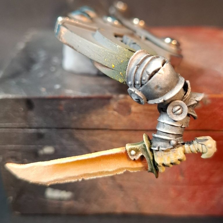
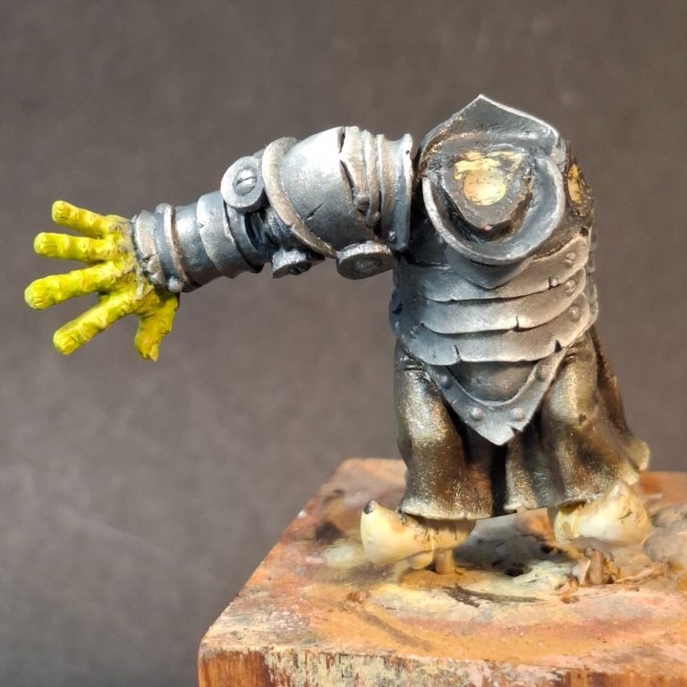
Photo #13 shows the body brought up to speed with the Mars Black and Titanium White oils, and altering the colours slightly with some Vandyke Brown, I painted the skirt which is very difficult to see on the picture, so I’m making that bit up.
Yes, the hand is still green, and completely wrong at this stage too – fortunately I’ve only undercoated that at this stage.
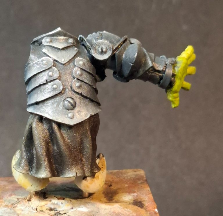
Photos #14 and #15 and a view of the back and the side of the figure showing off the slight texture I left in the paint on the skirt.
“That armour’s not right yet ?” I hear you say.
And you’re quite right, it isn’t, but it’s on it’s way.
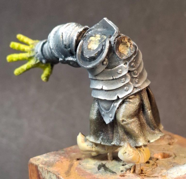
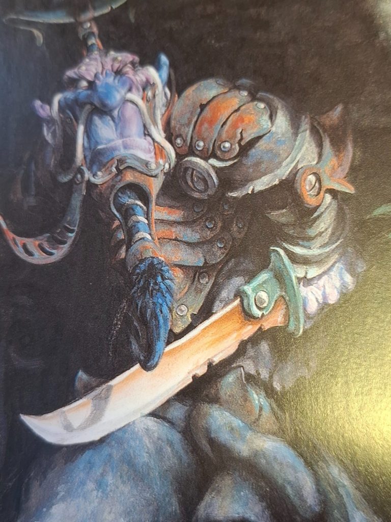
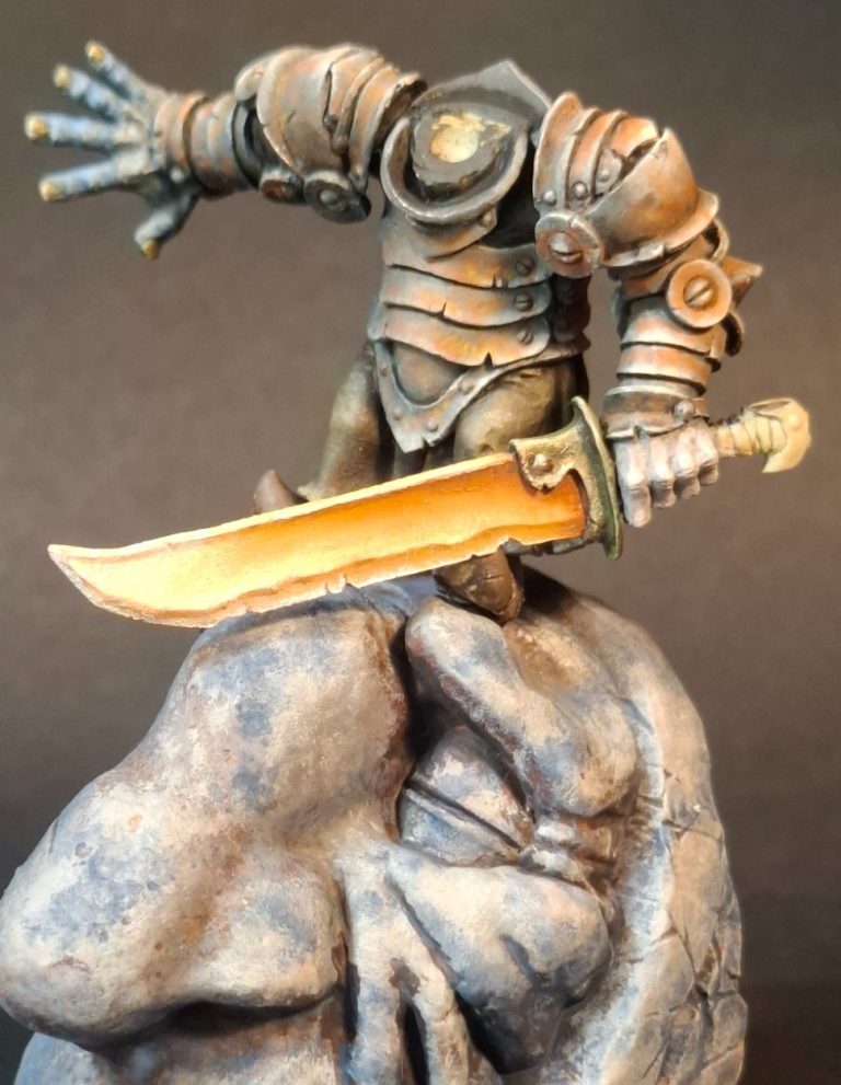
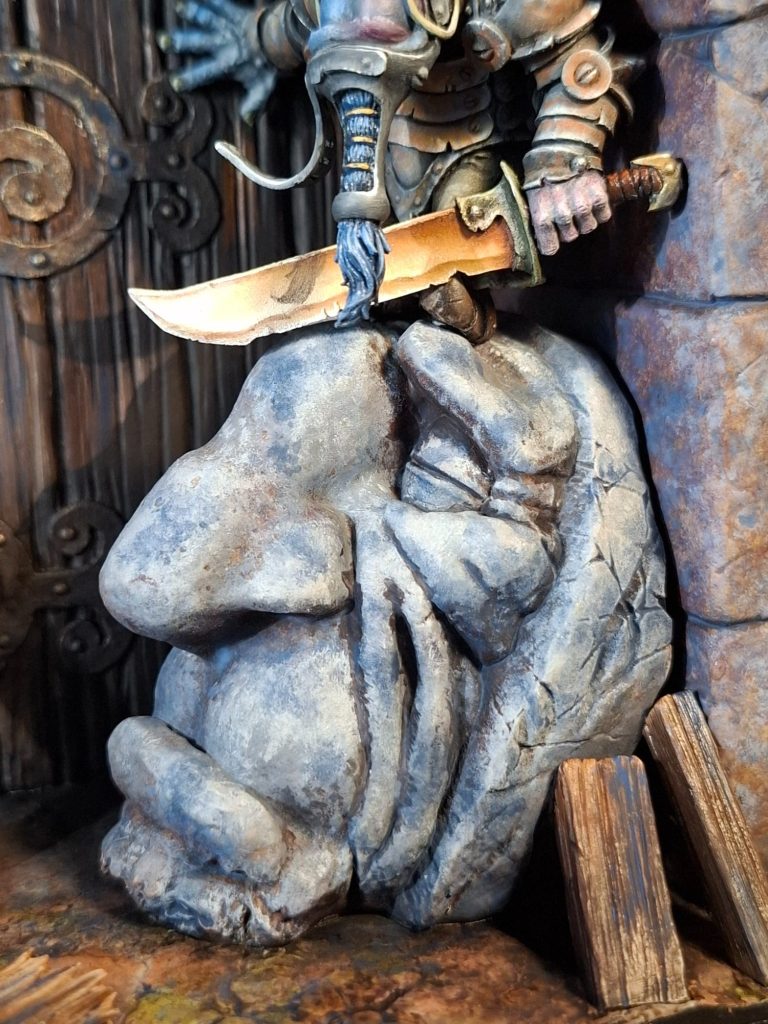
Photo #16 brings back up the picture, this time I’ve taken a close-up of the figure, and there’s a lot of rust colour on that armour…..
Photo #17, ha, that was pretty simple, Venetian Red oils, thinned a little with White Spirit and painted on to similar areas as shown in the picture in the previous shot.
The arm has now been added and the figure pinned to the top of the stone head.
As with the skirts, I wasn’t too sure on the colour for the shoes, although they look like armoured coverings, so I painted them with the same grey colours as the armour and added a little Venetian Red to them to match the rust once the grey oils had dried fully.
I’ve painted the hands in this shot too, they’re completely different colours although very pale. The left one has hints of dark red and purple, whilst the right one has a lot of blue. I undercoated both hands with White acrylic, then set about painting them with oils, beginning with a very pale grey oil mix and adding either Carmine and purple Madder Alizarin for the left hand, and Cerulean Blue for the right.
Photos #18 and #19 So this shadow painting idea…..
As you can see, a real shadow will move around the model depending upon the position of the light source and whether it’s a single light or in this case a crescent of LED’s held overhead on my painting table.
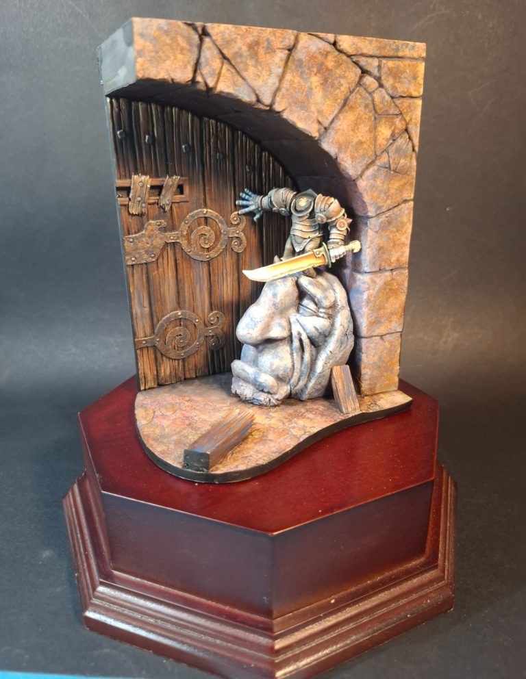
Photo #19 is perhaps more defined as I’ve switched off the LED’s and have just got a single spot lamp shining on the model, and this gives you a clue as to how the shadow is actually done. Of course the head needs painting and fastening in place first, so let’s go do that.
Oh, and I found a nice plinth from Pete Watson that I must’ve bought years ago – I knew when I bought it that it’d come in for something !
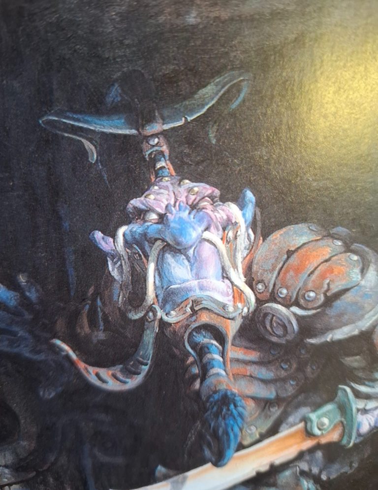
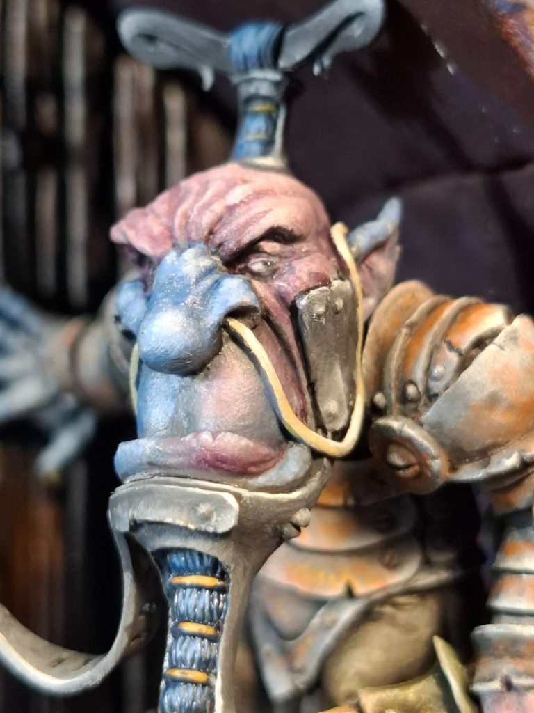
Photo #20, and a close up of Mr Bonner’s Bodyguard’s face.
If I thought the hands were a little odd to replicate, the face is a doozy !
More purple and blue, in the oddest of positions, and not at all the way I’d normally paint a face, let alone the unusual colours used.
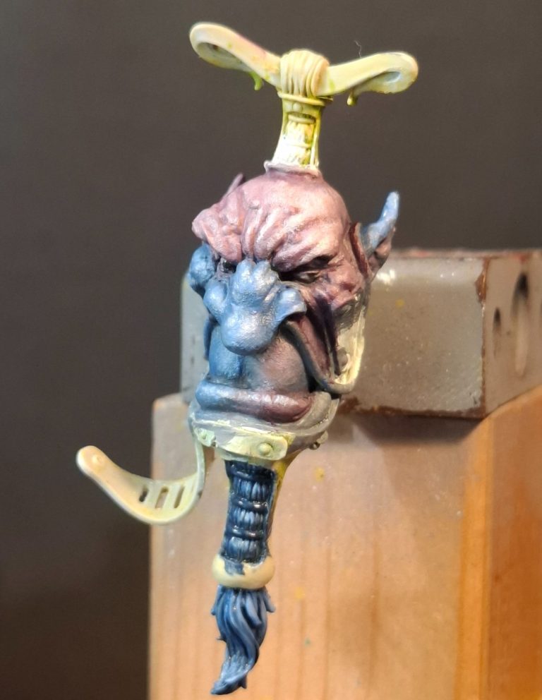
Photo #21 is what I managed, again using the same colours on the hands over a pale cream undercoat of acrylics.
The casting has a bit of a rough texture to it, so my rendition isn’t as smooth as the painting, but the colours are in the right kind of areas.
Still looked proper odd ( not pretend odd, proper odd ) to me.
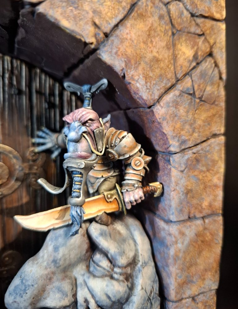
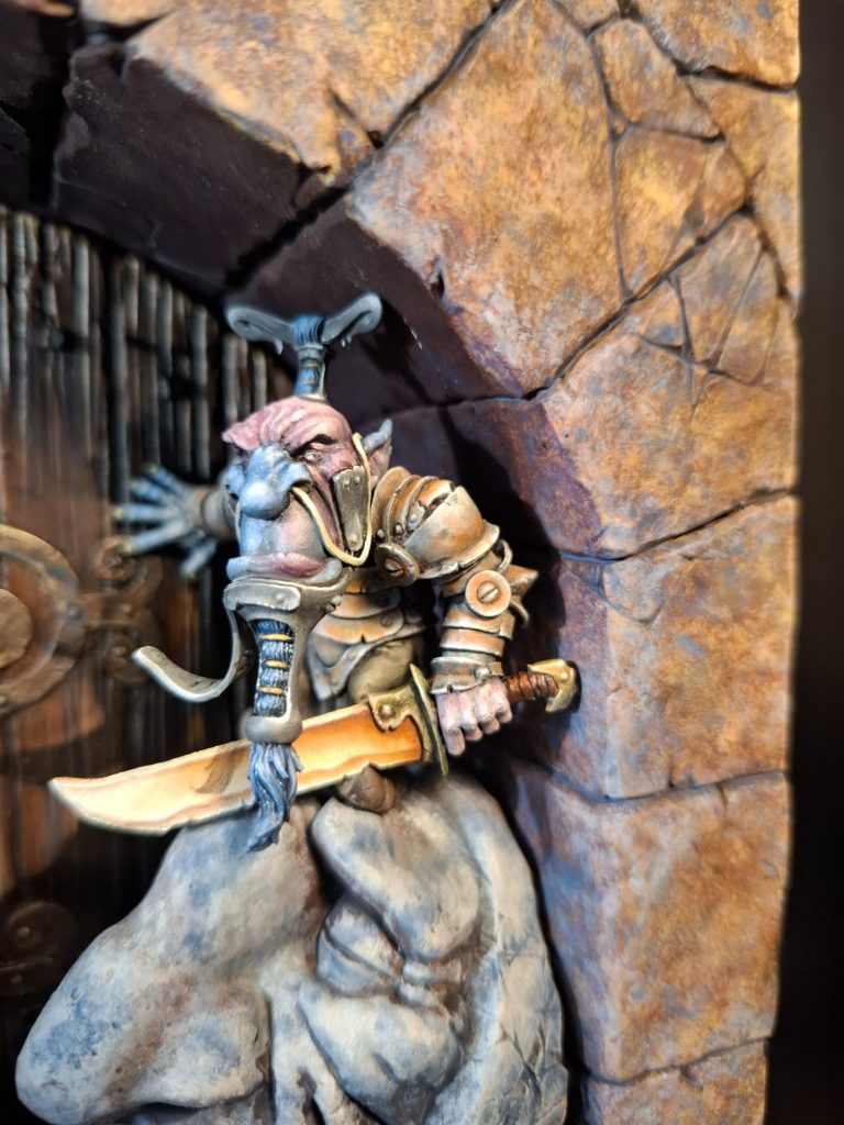
Photo #22 and the head is in place, and the colours seem to work. It actually looks kind of like a three dimensional representation of Paul Bonner.s picture.
And yes, that is a shadow from his beard painted on the sword blade.
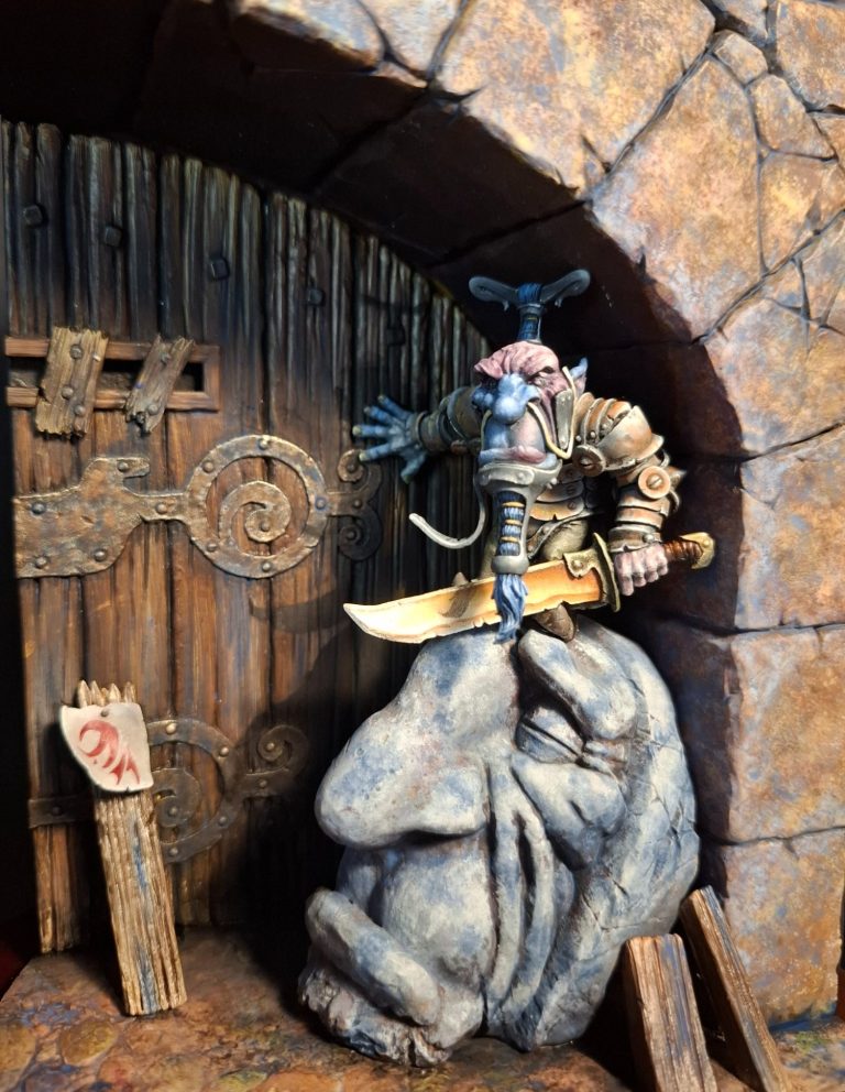
Photo #23 shows the figure and stone head in position, just held in place by gravity at this point, and the shadow has been painted on the door…..
“How ?” you ask.
So, referring to the artwork in the book again, you can see the shadow cast on the door as the light source must be coming in at an angle from the front left of the figure.
So, theoretically, if I shine a spot-lamp from a similar angle, hold the model really still and paint around the shadow that is actually cast by the spot lamp, then by rights, the resulting outline should “look just right”
Remove the lamp and the figure / stone head, and fill in the outline, all using a mix of Mars Black and Vandyke Brown oils.
Back to the shot without the figure – we’ll call this photo #25 so you don’t need to scroll all the way back – and the shadow without the figure can be seen.
It looks just like the figure and stone head have become invisible, because the theory works.
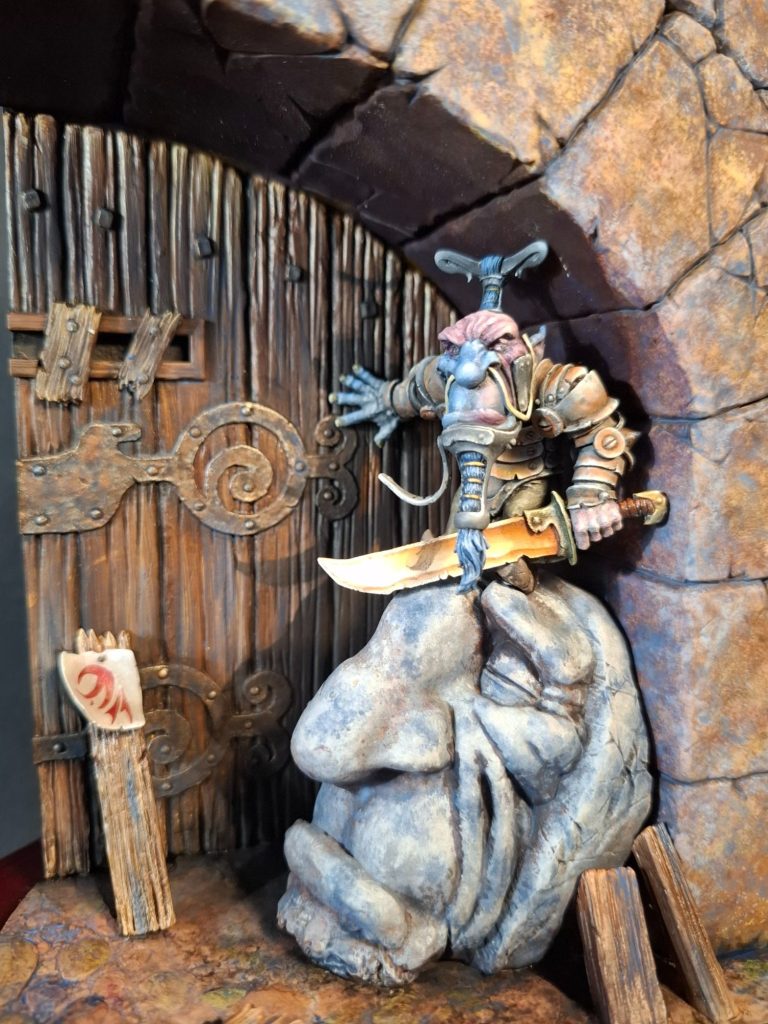
Photo #26, and speaking of cast shadows, there needs to be one on the sword blade so that it matches the original picture, and, well, so that it matches the light source casting a shadow on that particular area.
Again a spot-lamp can be used to get the positioning and shape right and the use of a dark sepia paint with a fine brush sorts this little detail out.
Returning to the picture in photo #27, there is a plank of wood propped up against the door with a piece of vellum nailed to it and some sort of sigil or rune painted on the vellum.
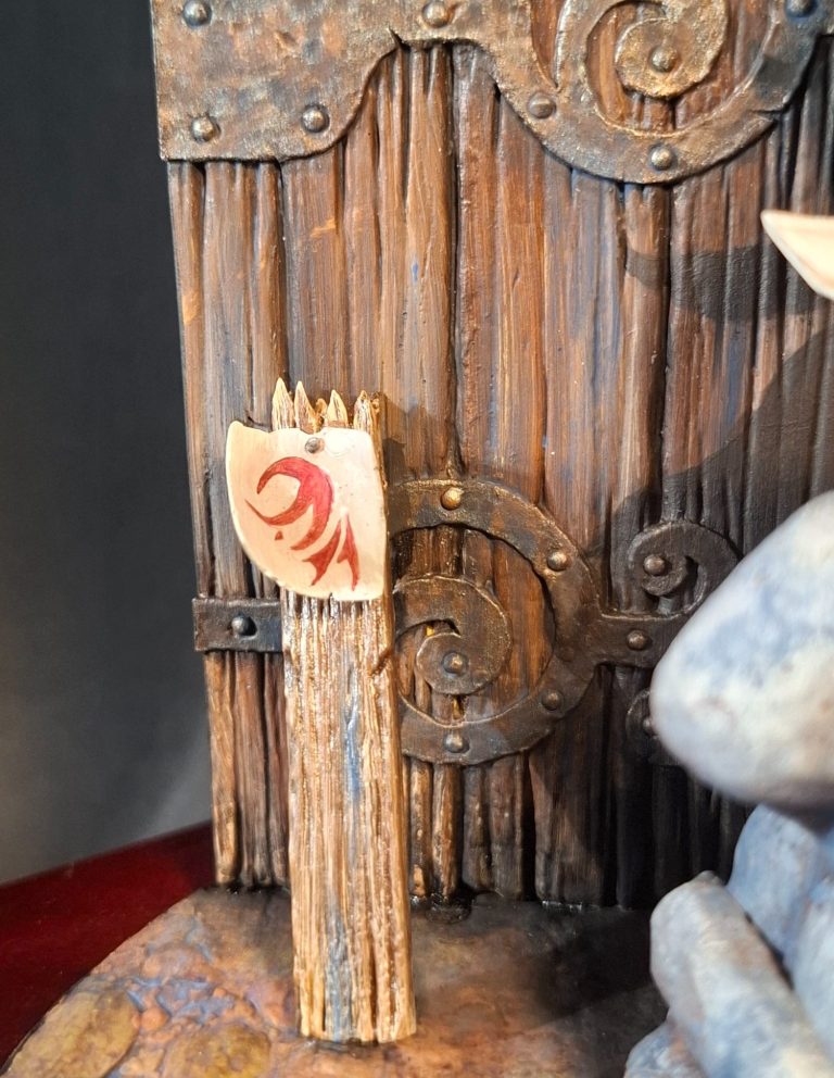
Photo #28 shows the resin plank having painted and the “vellum” section glued in place with the sigil copied onto it.
The vellum was painted with various cream coloured oils, allowed to dry for several days in the drying cabinet, and then the sigil added with some Carmine oils. I used a darker mix – Carmine with a little Mars Black added – to sketch out the design, then filled in with the pure Carmine.
Final thoughts
As I’ve already mentioned, this is the first piece I’ve painted from Mindwork Games, and I was impressed enough to go and buy the Minotaur ( again taken from a painting by Paul Bonner ), and I’ll be having a good look at what’s on offer on their stand at SMC.
Fit of parts and casting is great, with them being split logically to aid access when painting.
The price tag might seem quite steep when you look at the box, but the model is large in comparison to the packaging, and it’s more evident how good a value the kit is when you see one made and painted.
Highly recommended.