Chinese Lady
1/10th scale resin casting from Pegaso Miniatures
Painted in 2006
When I first saw a picture of this model, I instantly thought it was of a Japanese subject; and as I’ve already got the PiLiPiLi Geisha Girl bust, this was definitely added to the list of “I want that one !”
There are a couple of shocks ( albeit pleasant ones ) with this bust. First off, the price – bearing in mind that Pegaso 90mm figures are up past the £50.00 mark, this 200mm bust is just over thirty pounds.
The second surprise is that it’s made completely from resin. I was expecting some, if not all of it to be white metal.
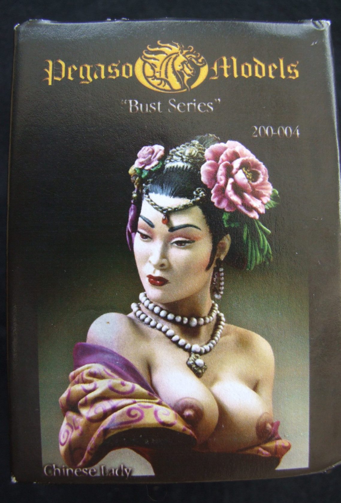
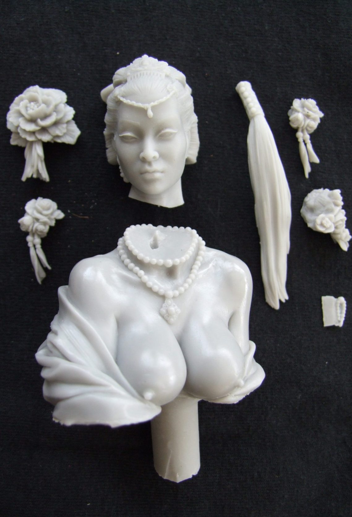
But I’m getting ahead of myself. I’ll start with the box that the model comes in, which is a bit of art in itself. There’s a wrap around cover with several views of a painted and finished model for colour scheme ideas – the front view of which is shown in photo #1. Once inside the box, the parts are protected with quite a lot of paper shreddings, all the parts being kept together inside two little zip-lock bags – and photo #2 shows these all laid out.
Moulding seems to be improving – if you remember I was quite disappointed with the resin casting on the Minotaur – the parts here are well formed, and the separations logical and the model should require no filler when assembled. There is some clean-up to do, the T-shaped mould line at the back of the head looks worse than it actually is, simply because the flower component that is added to that area will cover a most of it up, the line does extend onto the hair, but this is relatively flat, and detail is not compromised too much as the area is worked on.
There is a fillet of resin around most of the flowers that needs to come off, this is quite thin, and initially would appear to be easy to remove, however I suggest caution here as the petal detail is very fine, and if you attack the excess resin with too much gusto, then you may damage the flowers.
The main casting has a rather long stem to enable the modeller to attach the finished piece to a plinth. I thought that this was too long, so I used a razor saw to remove a small amount of it. I think that this is intentional by Pegaso, and allows the individual to cut the stem to the preferred size. I’d suggest a bit of caution here, because cutting too much of the stem off could then give you a problem with the ponytail hairpiece fouling and not sitting in place. This is because the ponytail is quite long, and I would test the bust on whatever plinth you’re going to use first, before making any changes.
After a quick wash of the parts to clean off any dust or oils, I could then begin painting.
Painting begins.
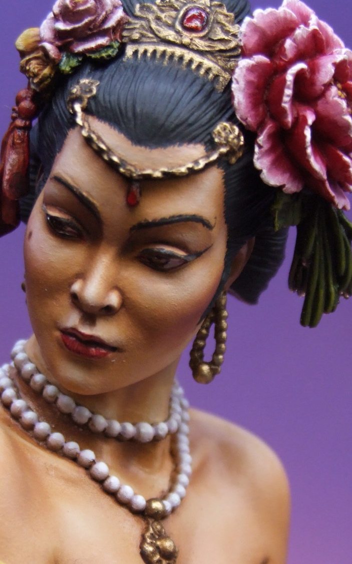
Recently I’ve been painting anything but the face when I’ve started a new figure, I have no idea why, but I returned to the old habit of doing the face first on this piece, probably because there is so much flesh to do.
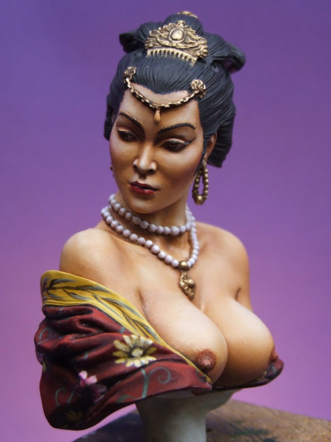
The flesh is painted in exactly the same manner as face that I’ve done in the Resources section – oils over an undercoat of acrylics. The only difference here is that there is a yellow bias to both the undercoat and the oils, given simply by adding more of the sand colour acrylic to the undercoat mix, and more Mars Yellow to the oils. It’s not a great deal of change, as I didn’t want the piece to look like a caricature, but just enough to establish a non-European cast to the colour.
The flesh areas have been roughed out in photo #3, the shadows blended into the mid-tone and some highlights built up.
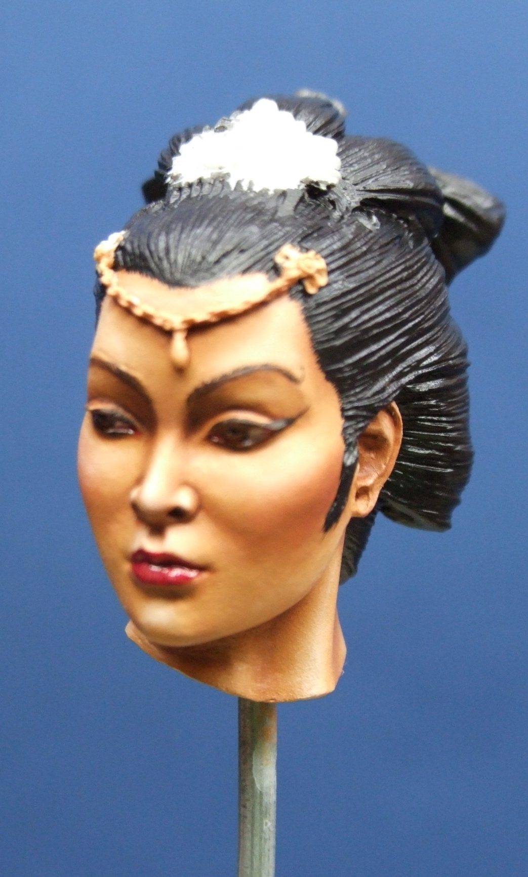
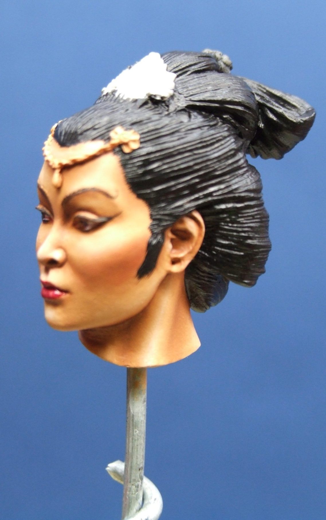
Photo #4 shows how the colours in photo #3 have been built upon, by adding some more shade around the eyes and under the cheekbones. Burnt Umber has been used here (oils) having been thinned with some White Spirit. It is also used to deepen the shadow around the underside of the nose and around the nostrils, and beneath the chin.
A small amount of Titanium White has been blended onto the tip of the nose, the point of the cheekbones and over each eyebrow on the forehead.
The eyes and lips have also been added – the lips are Carmine with some of the mid-tone flesh colour for a highlight, and then some Burnt Umber to mark in the separation line between upper and lower lip. The eyes are slightly more involved, having built up a U-shaped iris on each eyeball with a Mars Brown / Mars Black mix, and then taking the most of this paint off with a clean damp brush, so that a thin line is left marking out the iris. This is then filled in just with Mars Brown, and some Mars Yellow used for highlights. A pupil of Mars Black was added after that, and a tiny catchlight of Titanium White to make the eye look wet. This was allowed to dry fully before adding some Gloss Varnish with just a spot of Carmine in to give the impression that the eye has more of a wet look, and the addition of red gives the illusion of the “pink” areas of the corners of the eye when the gloss varnish pools slightly in the corners.
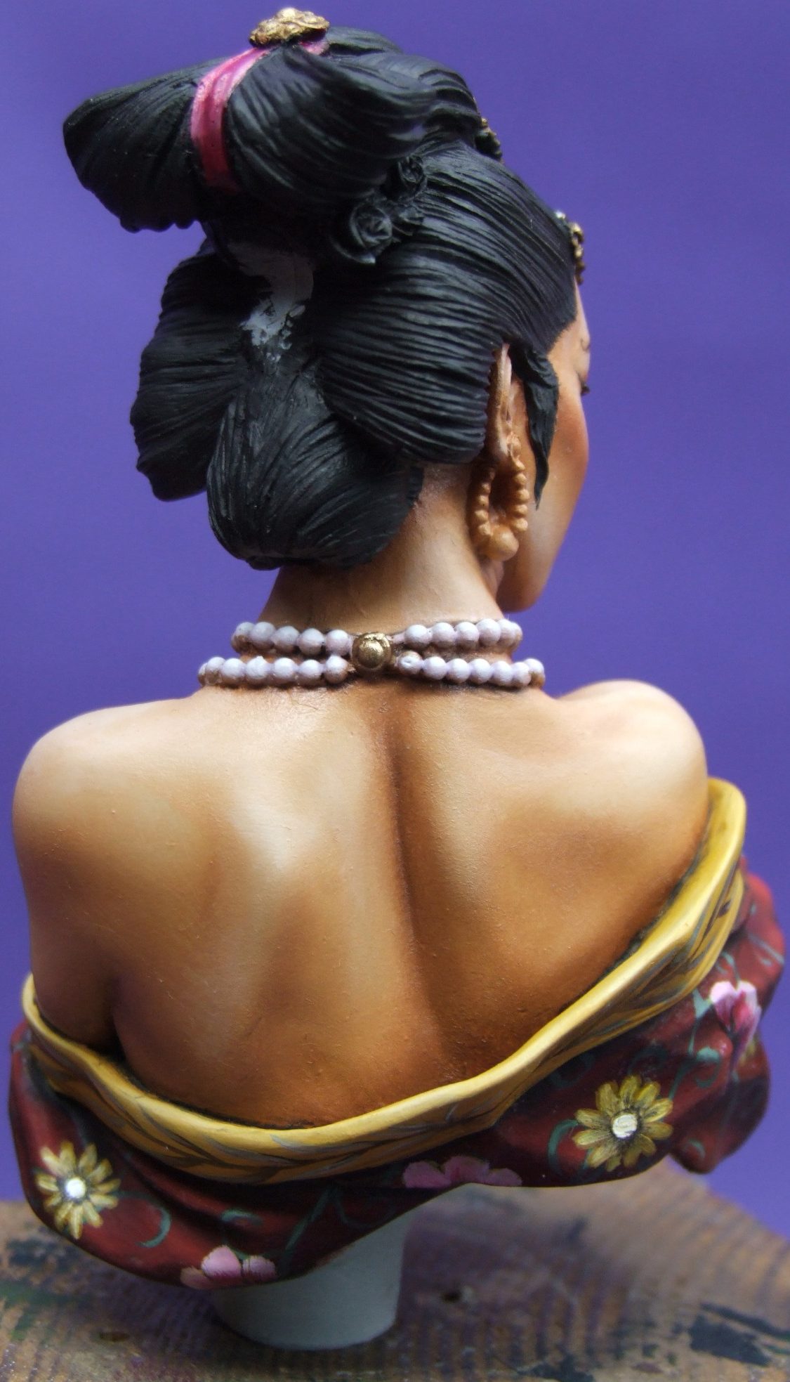
I’ve added a rough coating of Black acrylics to the hair. This serves two purposes – one to give a solid undercoat for the oils that will follow, and two, so that I can get a better idea of how the flesh will appear against the hair once it’s finished.
Disappointment here at this stage really, as the skin tone is not yellow enough and it is altogether too dark.
I added more highlights and also a very thin filter coat of a pale cream colour, building a lot of the highlights up to almost pure white. This looked a little cartoonish but once the light colours had dried fully, I added a second filter coat of Golden Ochre. This gave a more yellowish cast to the skin tone, which looked a lot better.
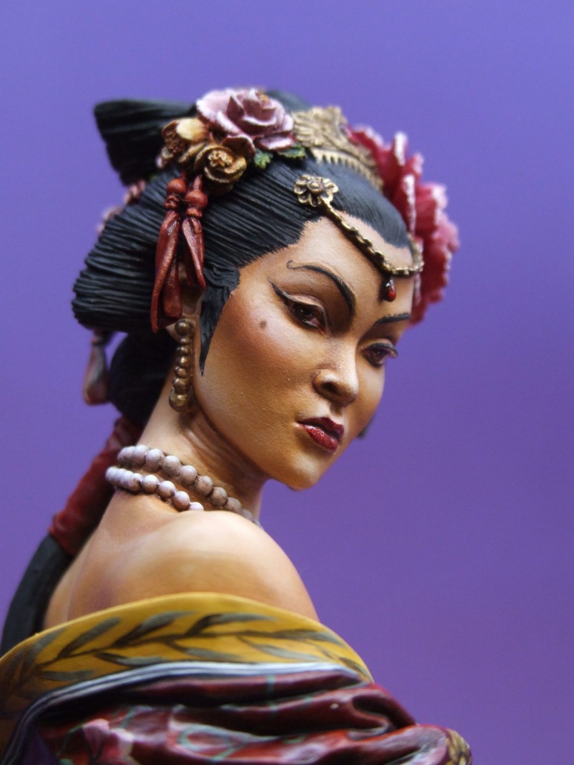
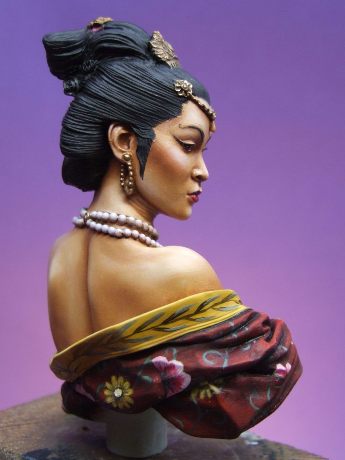
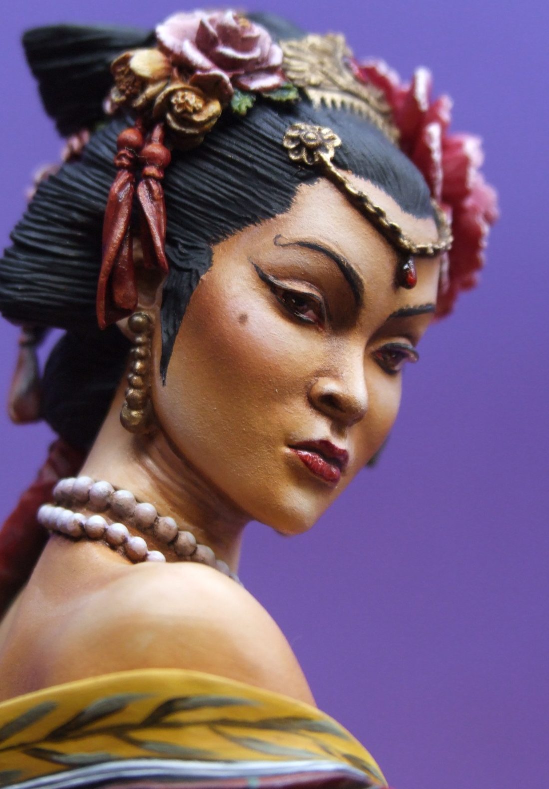
Photo #5 shows the face in profile, and this demonstrates the very small amount of Carmine oils that have been added to the area just under the cheekbones. Basically watch a woman apply blusher when she’s doing her make-up and that’s the effect I was going for. I used small spots of Carmine, and then spread these out using a large soft brush to move the paint to the area that I wanted to stain. Usually I have to add several small spots of the red colour to get the effect I want, and by doing it that way, rather that trying to get it all in one go, I can watch the gradual build-up of colour, and control the effect a lot more.
In Photo #6 I’ve really got going, having added the red to the cloth wrap around her shoulders, and the yellow band to its edging. The red areas are undercoated with acrylics ( Crimson – Humbrol, mixed with Forest Green GW ), and then once fully dry, an oil coat is added with more of the Carmine and some Olive Green added to build up shadows. Highlights are from Rembrandt Crimson. The Yellow band is again an undercoat of acrylics – although I have found yellow to be a problem in the past, I reckon I’ve cracked it simply by making sure that the undercoat is absolutely solid. Then, and only then do I start adding the finishing coats of oils.
I built this up using GW Bubonic Brown ( Basically a sand colour ) and after several thin coats of this, added a coupe of thin coats of Sunburst Yellow ( GW ). Onto this I then painted some Mars Yellow, and used this as a mid-tone. Highlights were built up using Chrome Yellow with some Titanium White for topping off. Shadows were from Raw Umber, but this was only added after the other areas of the yellow were absolutely dry.
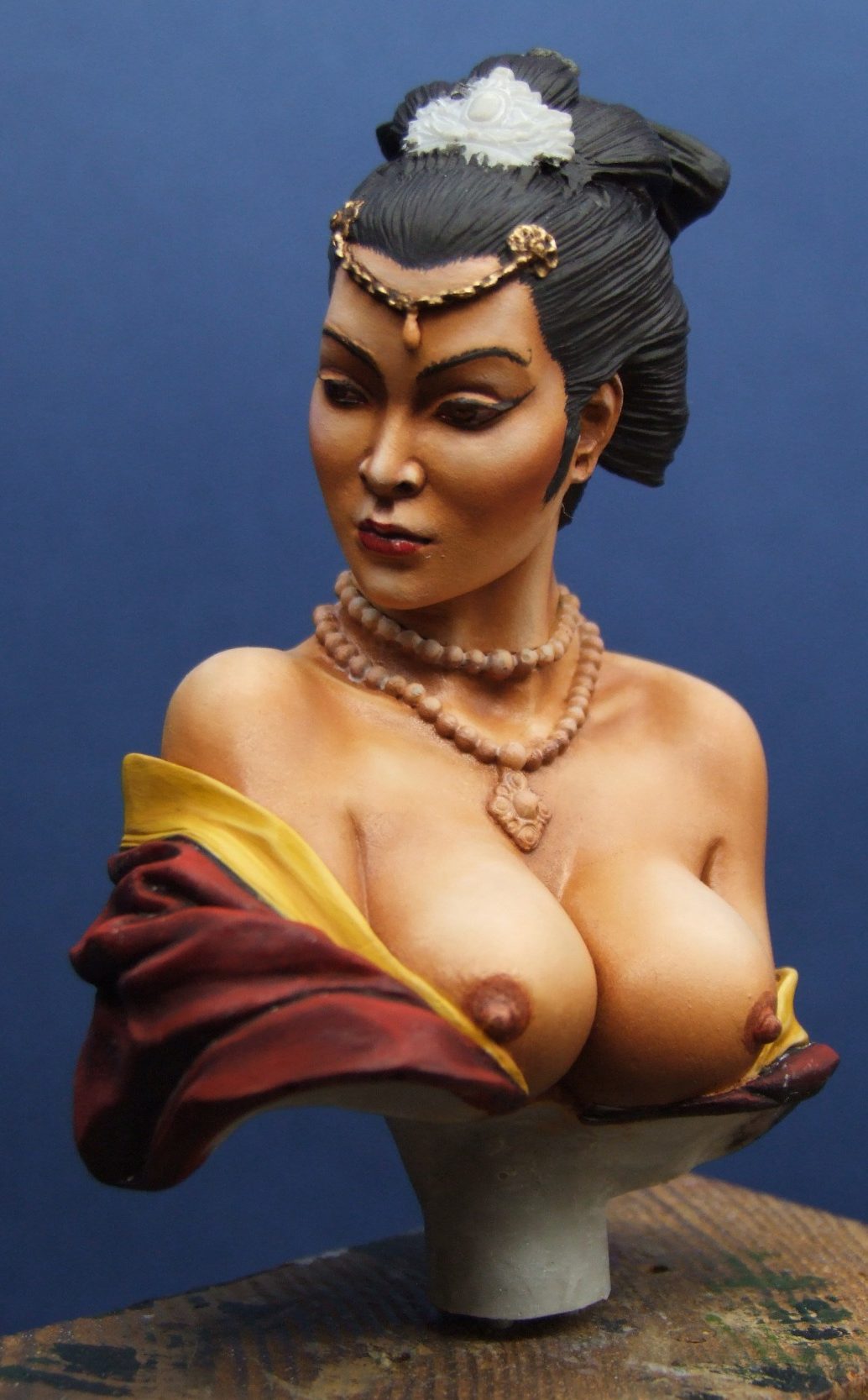
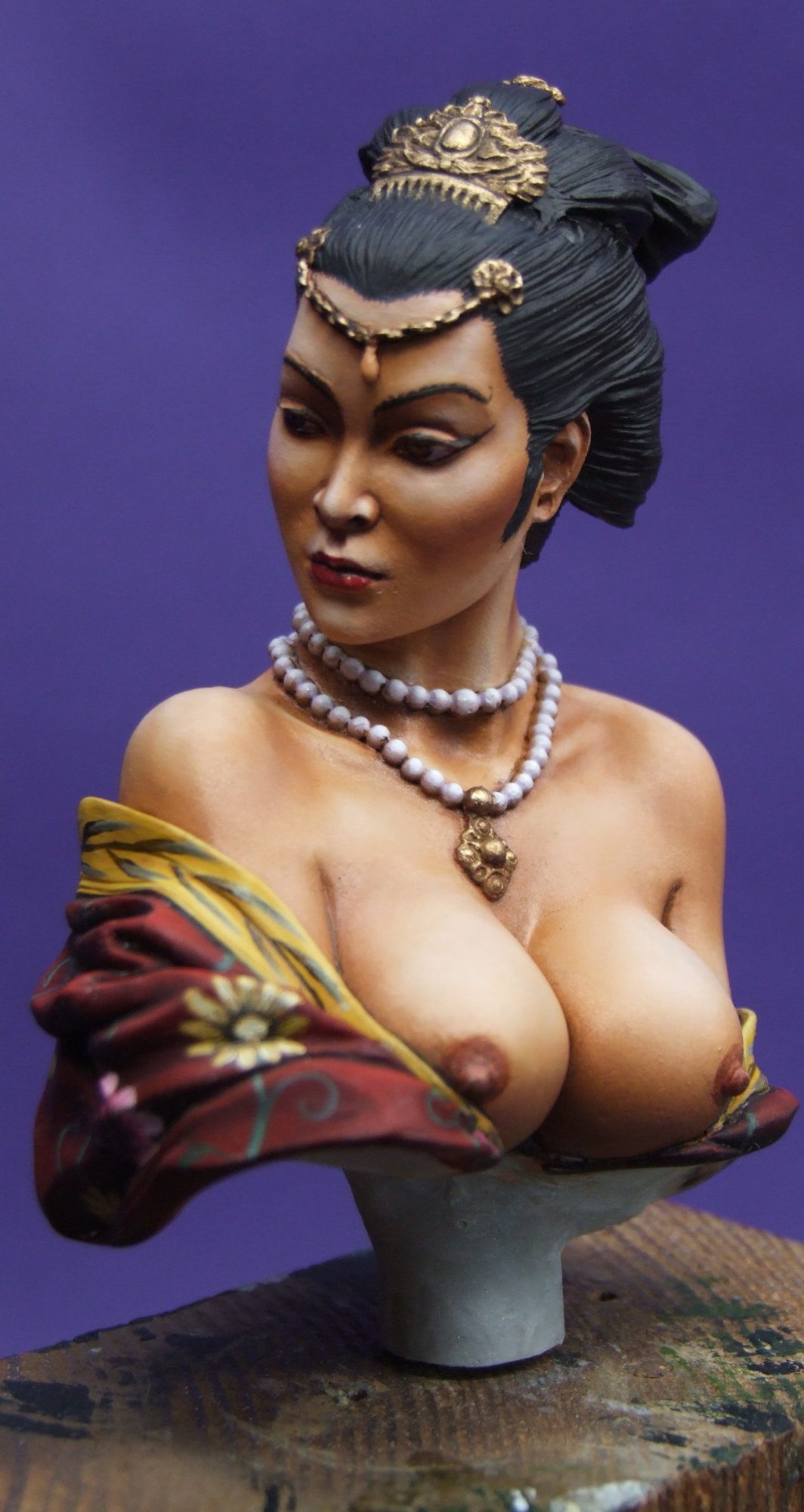
Now, in photo #7, it’s the small details being added; The gold jewellery is from Humbrol Gold over Bubonic Brown undercoat. The shadows being additions of Burnt Umber to the gold, and then just pure gold used to work up though mid-tones to highlights.
The pearl necklace was slightly more involved, being several coats of Skull white with a tiny dab of Ultramarine Blue and Scarlet acrylics added ( GW ). This is built up to a solid colour. Then a small amount of white added to the spare paint on the palette so that is lightens a little. This is then added to each of the pearls in several thin coats but remembering to allow some of the darker colour to remain visible. Again more white is added to the mix, and again the paint added to each of the pearls.
This is done several times until the colour being added is very nearly white. By covering smaller and smaller areas of each pearl, mid-tones and highlights are gradually built up.
For the patterns on the wrap, I used an art book that I’ve had for absolutely ages – you know, one of those buys that you think “Hell, that’s cheap, and I’m sure it’ll come in useful at some point !” Well, it’s taken around five years, but useful it was.
The design I’ve used is an expanded and amalgamated version of two in the book ( see references at the end of the article for it’s name, author and ISBN no. ). One of the designs was actually more Indian in origin, and that’s why I used the second design to bolster the Chinese “look”.
I marked out underneath the bust to split the circumference fairly evenly, and from these marks drew the swirly stem and curled leaf designs with GW Forest Green acrylic. Then using a variety of yellows and pinks, I marked in several stylised flowers, attempting to allow for the complex folds and all the while keeping the design as even as possible. Oils were used over the top of these so that the colours were richer and had more depth.
The bamboo leaf design on the collar is simply two green lines that start in the centre at the back of the bust, and travel down the middle of the collar. Alternating each side, the leaves are added with more green, and then each tip is given a very pale green tip. I used Olive Green and Titanium White for this, and once dry, some shadows were added to make the leaves and stem stand out a bit more.
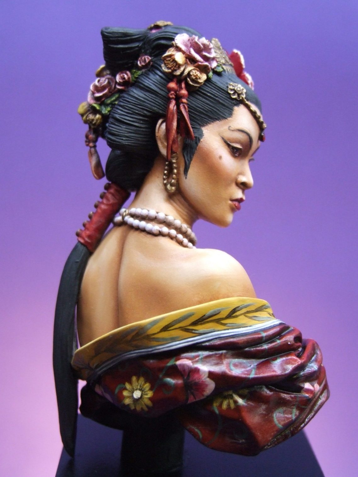
Photo #8 shows the back view, although some of the flowers still need final touch-ups to make them look a little neater. In keeping with the basic colour scheme, the ribbon ties in the hair have been painted with some pink oils, allowing more build up of the Titanium White on the upper and outer edges.
Some more of the fine details to be placed, and Photo #9 shows the addition of the separate left earring, and also some shading added to blend the flowers in to the rest of the wrap. Also in this picture, you might be able to see some small flecks of white in the deeper folds of the wrap.
These are the result of adding a little too much Humbrol Dull Cote to the red oils mix, and are simple enough to deal with. Simply wash in some Burnt Umber oils to the deepest shadow areas and the white flecks will be blotted out.
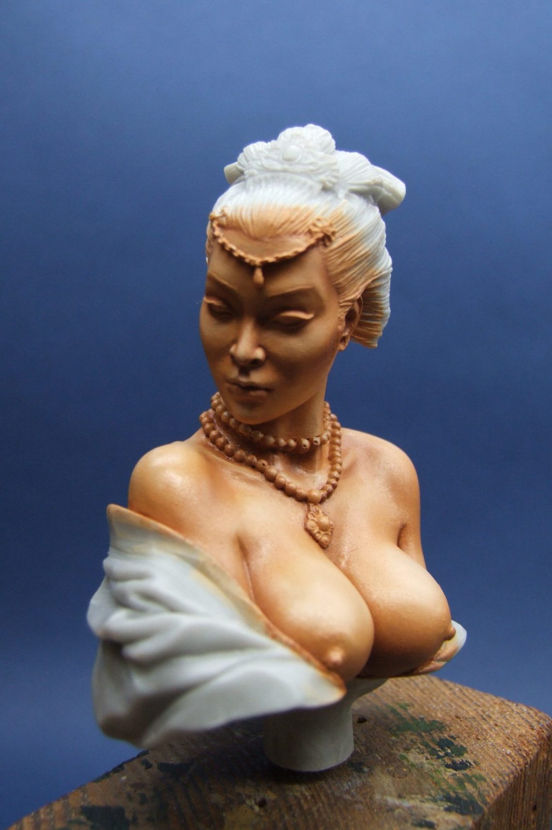
Photo #10 shows the profile of the figure, which is definitely Oriental.
The two engraved lines on the lower edge of the collar will be painted a very pale grey to finish off the main castings, but before that, let’s paint some more flowers !
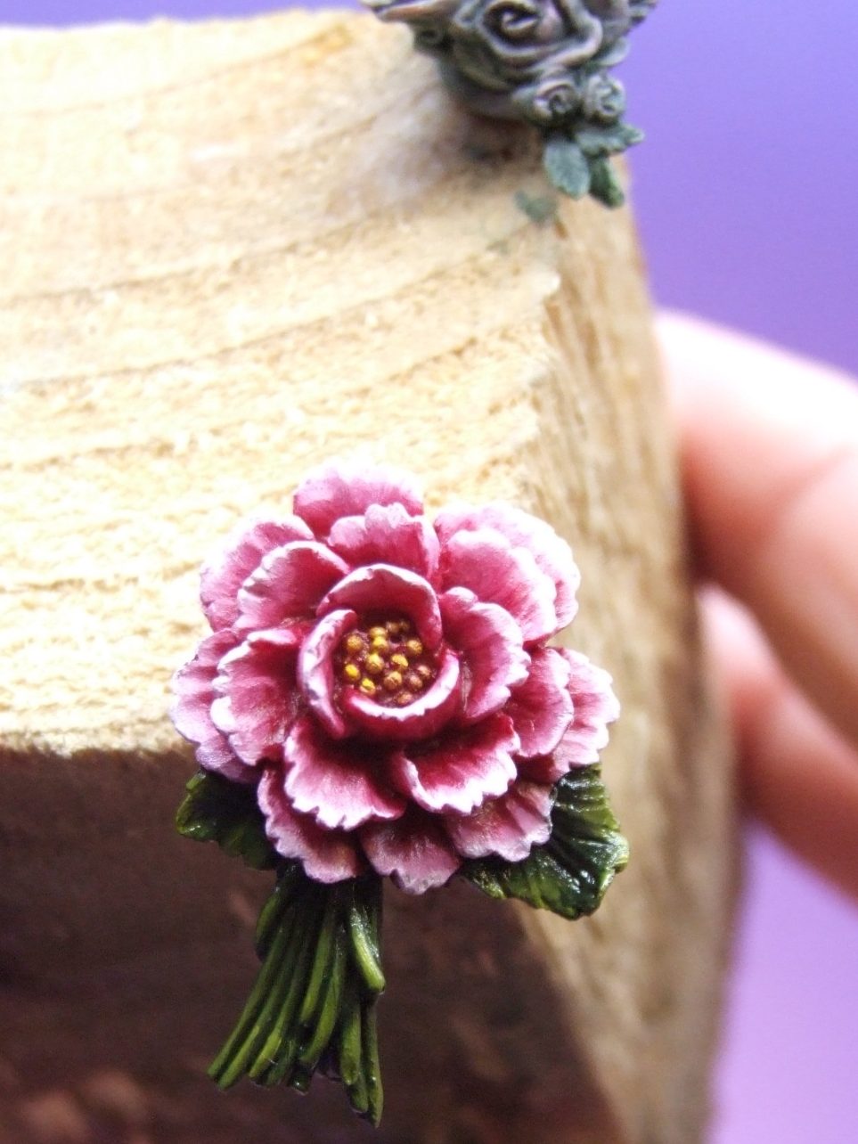
I’ve shown two of the flower castings in photo #11. The larger ( lotus blossom ? ) has been painted, but it started off looking just like the flower bunch at the back of the shot – being a greenish grey.
I used Carmine oils, thinned a little so that they flowed into the recesses, and then gradually added Titanium White to the outer edges of the petals building this up to a lighter pink at the very edges. The yellow stamens are just spotted in with a little Mars Yellow, topped off with Chrome Yellow highlights.
The green leaves began as very dark Olive Green, again adding Chrome Yellow and some Titanium White to the mix to gradually work through mid-tone and up to highlights.
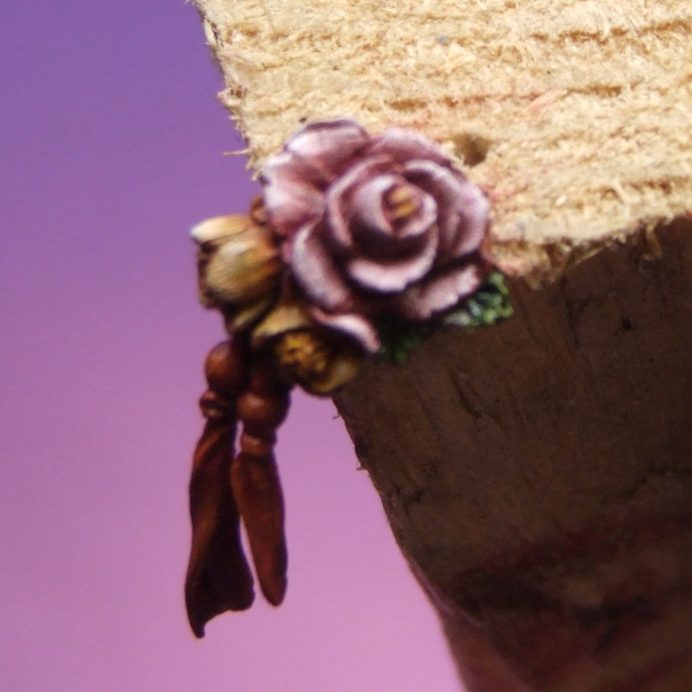
I wanted the flowers to look similar, but different, and in photo #12 you can see the rose and crocus ? piece that adds on to the right temple area of the head. I’ve used slightly different colours of pink here, by just adding a little bit of the green to tint the initial Carmine, and then still adding more of the Titanium White to build up highlights – that’s the roses done. The crocuses were painted with Mars Yellow and then mid-tones and highlights built up with Chrome Yellow and Titanium White.
Having painted all the flowers, and allowed them time to dry, they were added to the model, and the result of that can be seen on the final shots.
The dropper adornment at the centre of her forehead has been painted with red acrylics, adding shadows and highlights “upside down” . This creates the illusion that the jewel is actually transparent and light is shining through it. By adding shadows to the top of the object, and highlights near the bottom, the illusion is begun. The final addition of a couple of coats of Tamiya Clear Red helps add depth as well as blend in the effect. The same technique was used for the red jewel on the comb.
I added a satin varnish to the red area of the wrap, this is to even up the different levels of paint from when the flowers were added, and also to make the finish of the whole thing tie together as one.
To complete the bust, the underside of the main casting was painted with Chaos Black acrylic ( GW ) and the model added to a black plinth from Armstrong Bases of Peterlee.
I’ll add some Chinese decoration to this plinth later, together with a nameplate from Name-It
Verdict.
Although some folk might point to the sculpting being ambiguous to whether it accurately depicts an oriental woman, certainly concerning how well endowed she is and the facial bone structure as it appears from the front. There can be no doubt at all that the profile is that of an Oriental person.
As usual with a lot of models, it comes down to personal taste.
I like this bust because not only has the sculptor managed to produce a beautiful face, but also some stunning details such as the flowers and the jewellery. Painting the different textures is fun, and it can be as complex and colourful as the modeller desires.
Admittedly I do like female subjects, and this one goes close to the top of my list of favourites.
I’d like to thank Lynn and David Sangster at Historex Agents for sending this kit in as a review item. If you want something to test your flesh painting, pattern rendering or just something totally different, then this must be worth considering.
Available from :-
Historex Agents. Wellington House, 157 Snargate Street, Dover, Kent. CT17 9BZ U.K.
Tel. 01304 206720
E-mail Sales@Historex-Agents.co.uk
Website www.Historex-Agents.com
References :- "The Grammer Of Chinese Ornament" by Owen Jones ISBN:- 1-85585-383-3