Twitchy Mary
65mm white metal kit from Andrea
Painted in 2004
There’s something about this figure, several something some might say, which made me want to buy it and put it in my grey army. As usual the thoughts of painting it were running to “I’d really like to paint that” the “someday” is quite silent, but with hundreds of kits stacking up, well, what I paint next is anyone’s guess – I for one sure don’t know !
However, I wanted to paint something sci-fi, a full figure rather than a bust, and something that I could perhaps add a little something too, but not have to really work at converting or altering.
This kit sort of jumped out at me, and to be honest I’m glad it did.
Andrea kits – in my experience have been darn good – I’ve made quite a few now and have had no real problems with them that a reasonably practiced modeller shouldn’t be able to sort out. Andrea’s casting is usually good, joints of parts are placed logically and where they are easily hidden and sculpting is usually pretty spot on.
This little kit was no exception, and although there are the usual mould part lines to clean up, none were excessive or troublesome and the only joint I foresaw having any problems with would be the one at the base of the neck.
Although I’d identified this very early on, I chose to fix that part of the way through the painting so that I could paint the suit and the armour sections before putting on the putty.
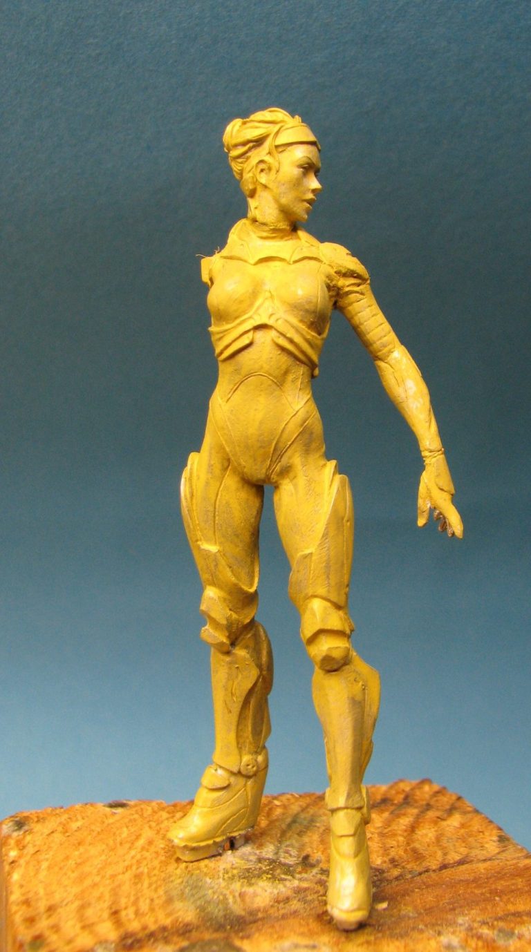
Photo #1 shows the model primed and undercoated with a thin layer of Games Workshop’s Orc Brown.
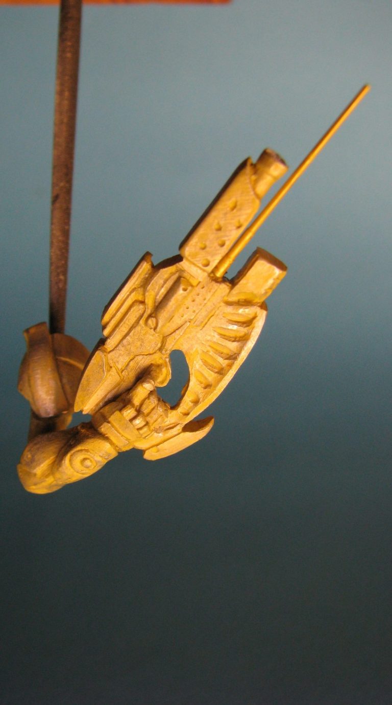
Photo #2 shows the alteration I made at the beginning to the gun that she’s holding. I removed the small tube under the barrel because it was slightly oval in section and replaced it with a very fine brass turned barrel off a 1/350th scale ship. Later I’d add a new gun barrel, but not yet.
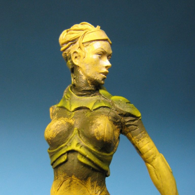
Usually I work from the skin outwards as though dressing the model, but lately I’ve come to change that and paint in the sections as I feel necessary. In this case I decided to paint up the appliqué armour and chose to colour them green – photo #3.
Undercoating these areas ( very messily ) with GW Forest Green and then adding oils over the top.
The shadow colour was a mix of ………Green and a little bit of Mars Black to darken it, then more of the original green to build up the mid-tones and finally Chrome Yellow to form the highlights. I allowed this to dry and then added really deep shadows with controlled washes of Mars Black.
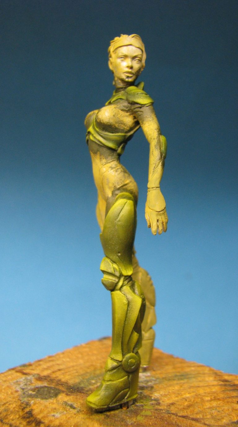
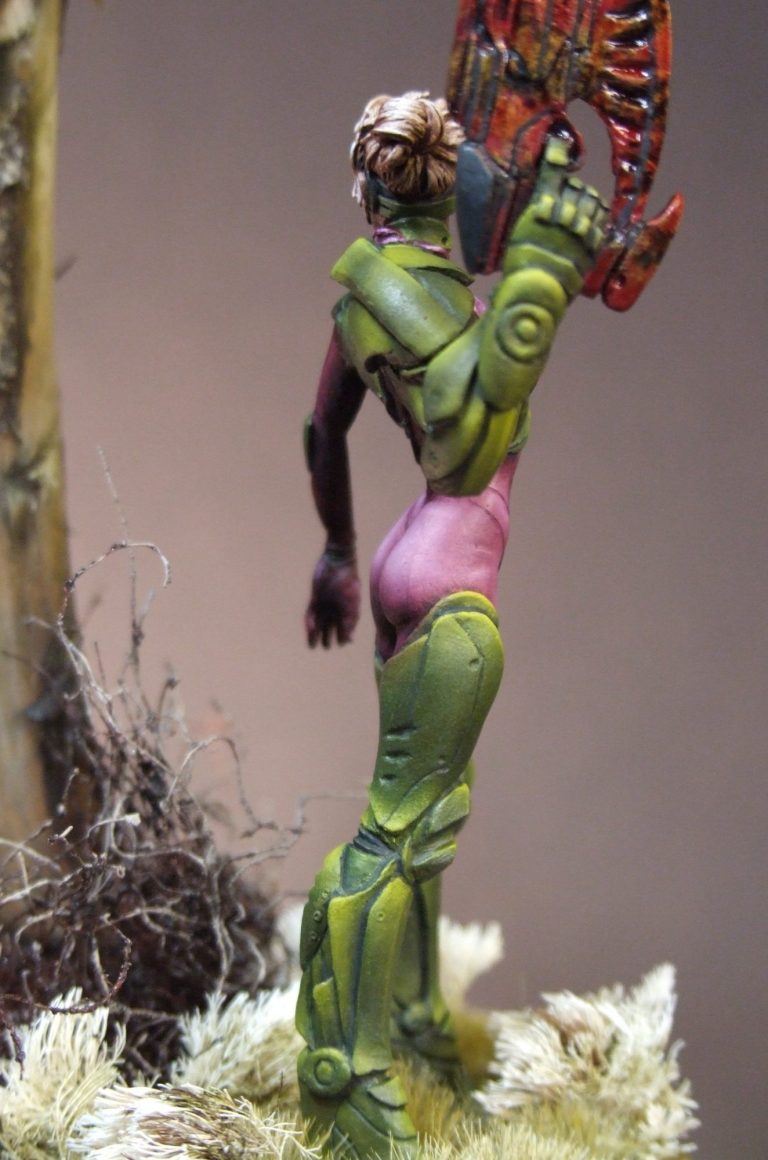
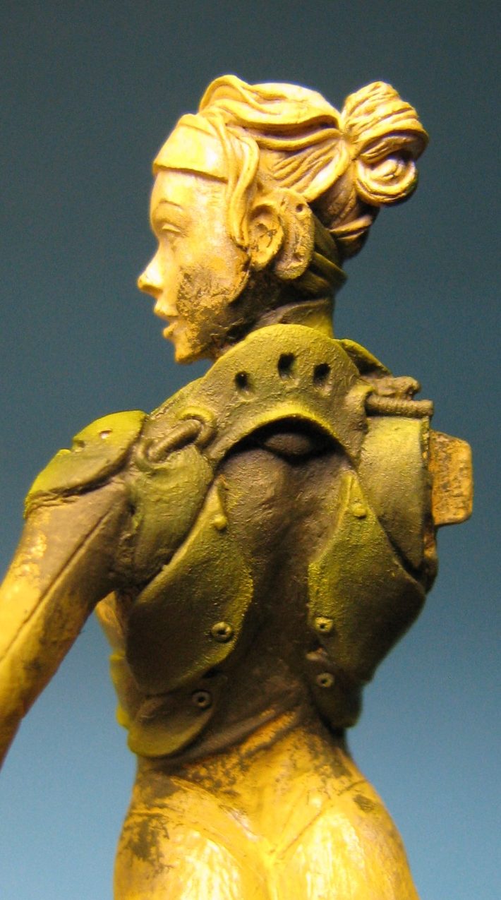
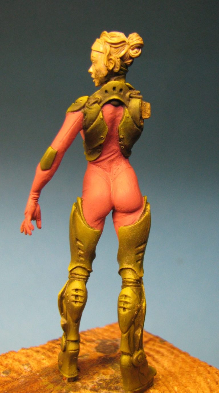
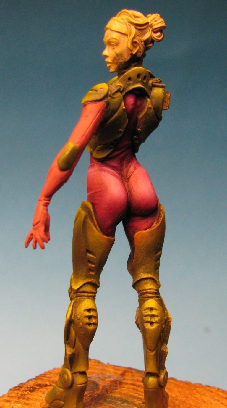
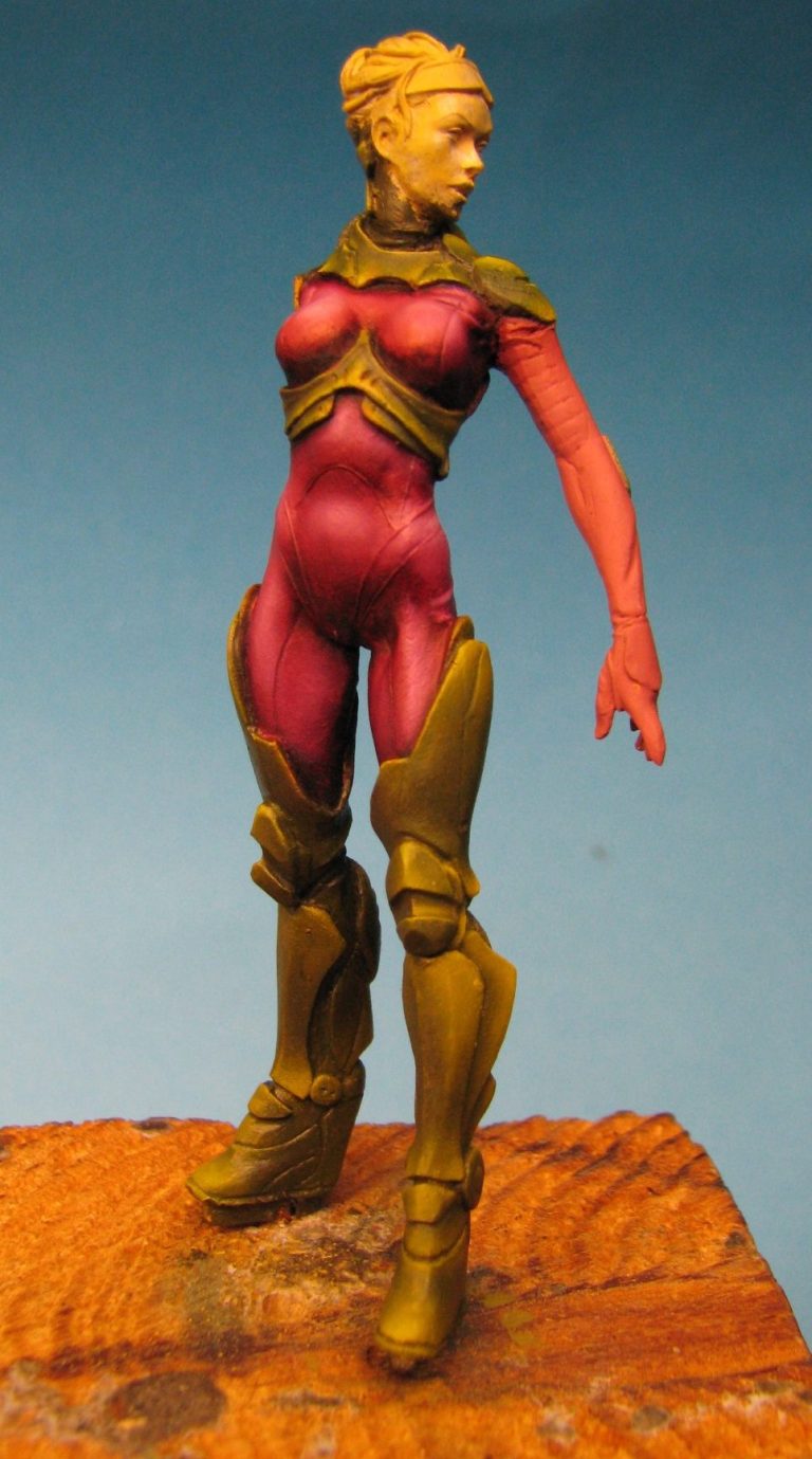
Photo #4 shows the back view of the upper body as I’m working on the armour, and photo #5 the whole figure once the initial painting was done, but prior to adding the really dark shadow colour.
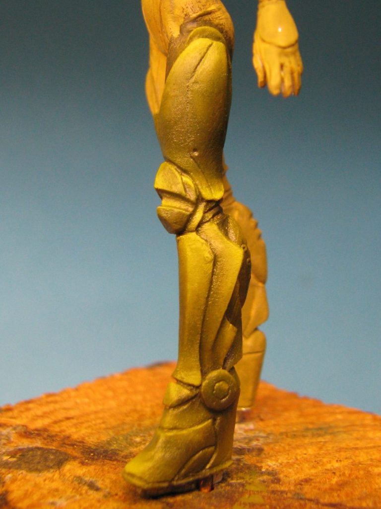
In photo #6 there’s a close-up of the left leg, showing how smooth the transition of oils can be made with just a little bit of effort.
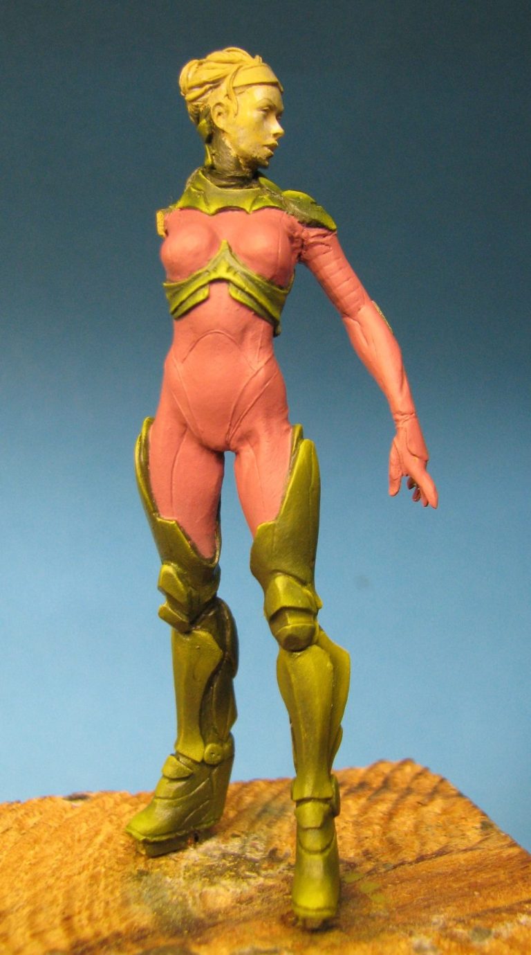
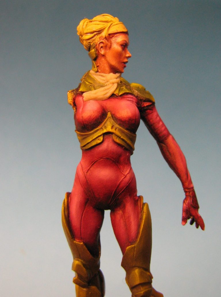
At the moment the model looks pretty messy, but in photos #7 and #8 I’ve undercoated the skin-tight suit with a pinkish colour, getting rid of the overlaps of the dark green oils.
This fulfils two functions – one is that the green areas now stand out and can be viewed more realistically against a colour that is close to what will surround them, and the second function is to see what the model will look like with a pinkish suit next to the green armour sections.
Also what you’ll notice here is that I’ve missed a small section of armour on the back of the left hand. I’ll come back and paint this in when I do all the armour on the right arm.
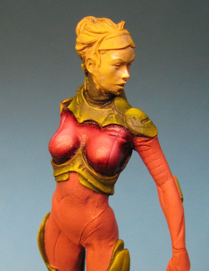
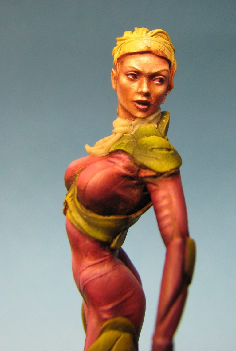
Having established that I wanted the suit to remain a pink, albeit a darker shade, in photo #9 I’ve begun the process of adding oil paints over the top of the acrylic undercoat.
The upper section of the chest has been painted, beginning with a mix of Carmine and Light Red with just a very small amount of Mars Black to darken it as a shadow colour, then adding more Carmine and Light Red to build up the mid-tones.
The Light Red is a rusty orange colour really, but is a very dense pigment. Small amounts of this added to the Carmine make the resulting colour slightly lighter admittedly, but add to the opaqueness of the paint as the Carmine on it’s own is very transparent, and it would be difficult to make any headway altering the shadow colour because of the Mars Black – even in small quantities – being very strong.
Usually to lighten the colour further I’d use Scarlet as a highlight colour – that’s if I was aiming for a solid red colouration to the suit. As it is I wanted more of a pink colour, so I used Buff Titanium and Titanium White to build up through the highlight areas.
Photos #10 and #11 show me working my way down the length of the figure with the pink colours on the suit – to blend the colours I paint on a small amount of the lighter colour ( mid-tone or highlight ) to the desired area then use a small soft brush shaped a bit like a mop to stipple the paint into the darker colour that is already in that area.
This blends the two wet paints together to make a gradual change in colour. The mop-like brush is wiped on a clean rag to remove any excess paint. The brush doesn’t see any thinner’s until the blending process is finished for the session.
To complete the suit photos #12 and #13 show the arm having been painted. Because – like the armour – the suit id formed in sections with seam lines within it’s construction, there are logical points at which the painter can break off and leave the model – some of us still have a day job to do J
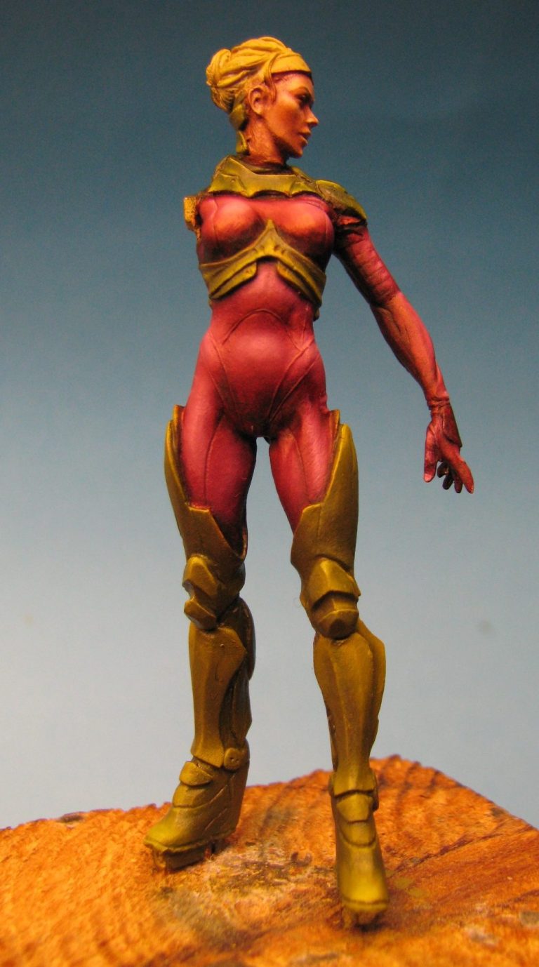
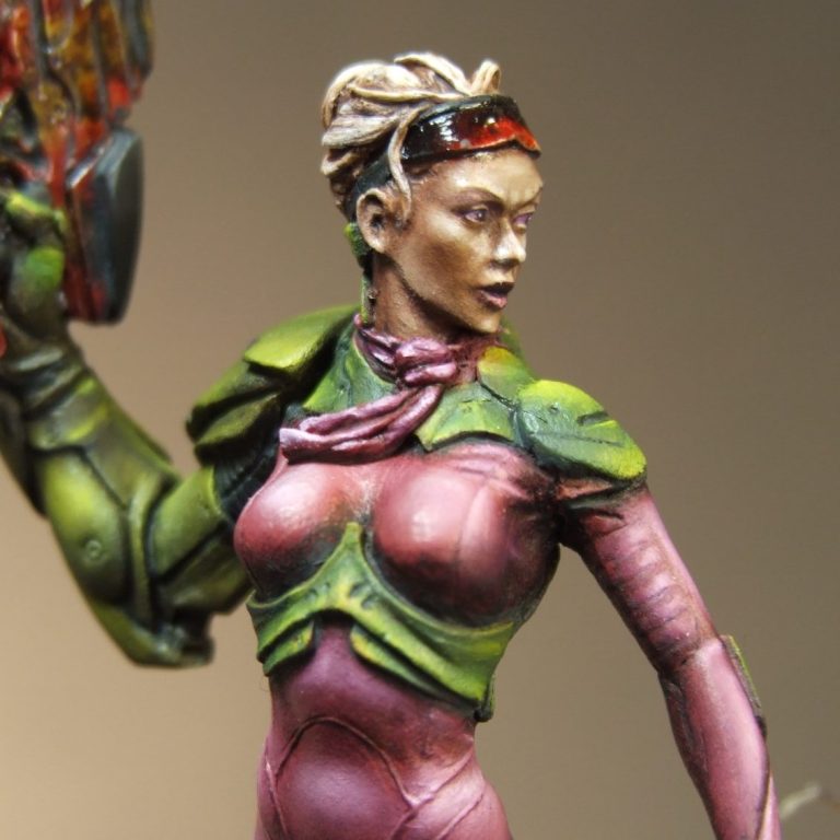
Photo #14 show how I’ve added the scarf around the neck. In previous shots you might note the joint between the head and main body castings. As mentioned at the beginning of the article, this was the only joint that I felt needed some work. I used a small amount of Magic Sculpt putty to form the scarf, using a home-made sculpting tool to form the creasing.
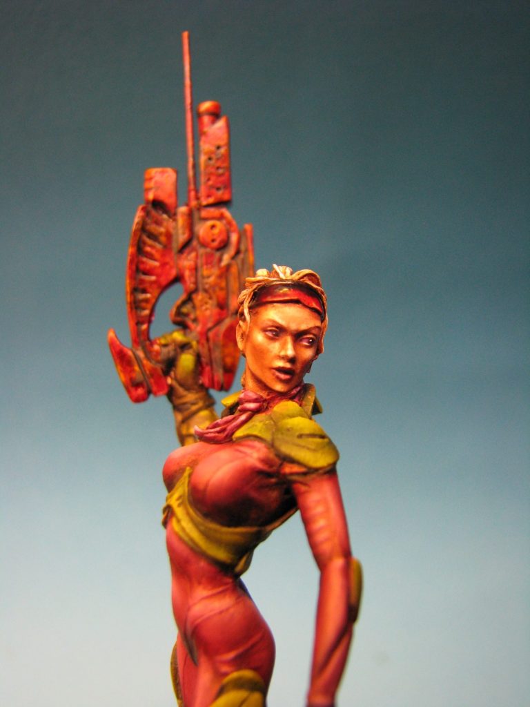
One of the most important parts of any figure with a bare face ( OK Knights or soldiers with full faced helmets get you out of this ) is to get the eyes to appear life-like. Having them looking somewhere other than straight forward gives a different dynamic to the model rather than having them looking straight forward with that “thousand yard” stare. With that in mind I chose to have Mary looking to one side.
So, in photo #15 a little thought ( not much ) has to be given here – it’s no good having a figure like this one, where she’s twisting round to her left and then placing the pupils in the eyes looking to the right. It’s not that it couldn’t happen, but it’s more logical to have the pupils placed looking to the left and following the motion that the sculptor has already put into the figure.
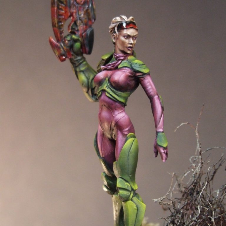
Having done that – put the pupils in, and you might note that I’ve used a darker version of the suit colour for them – it’s important to add a small white catch-light. These can be seen best in photo #27 and if you compare that picture to photo #16, you can see that in one shot they look dead and lifeless, and in the other the eye looks wet and the face looks more alive.
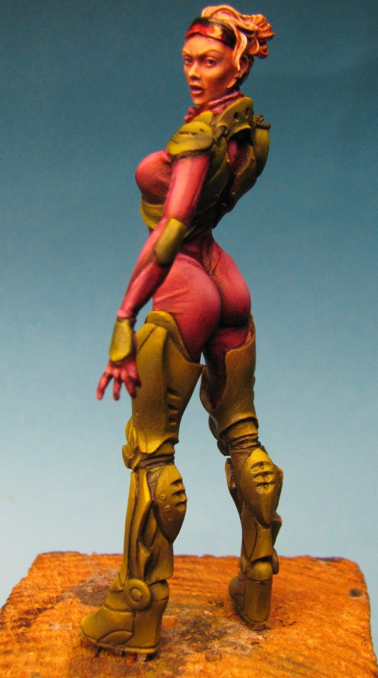
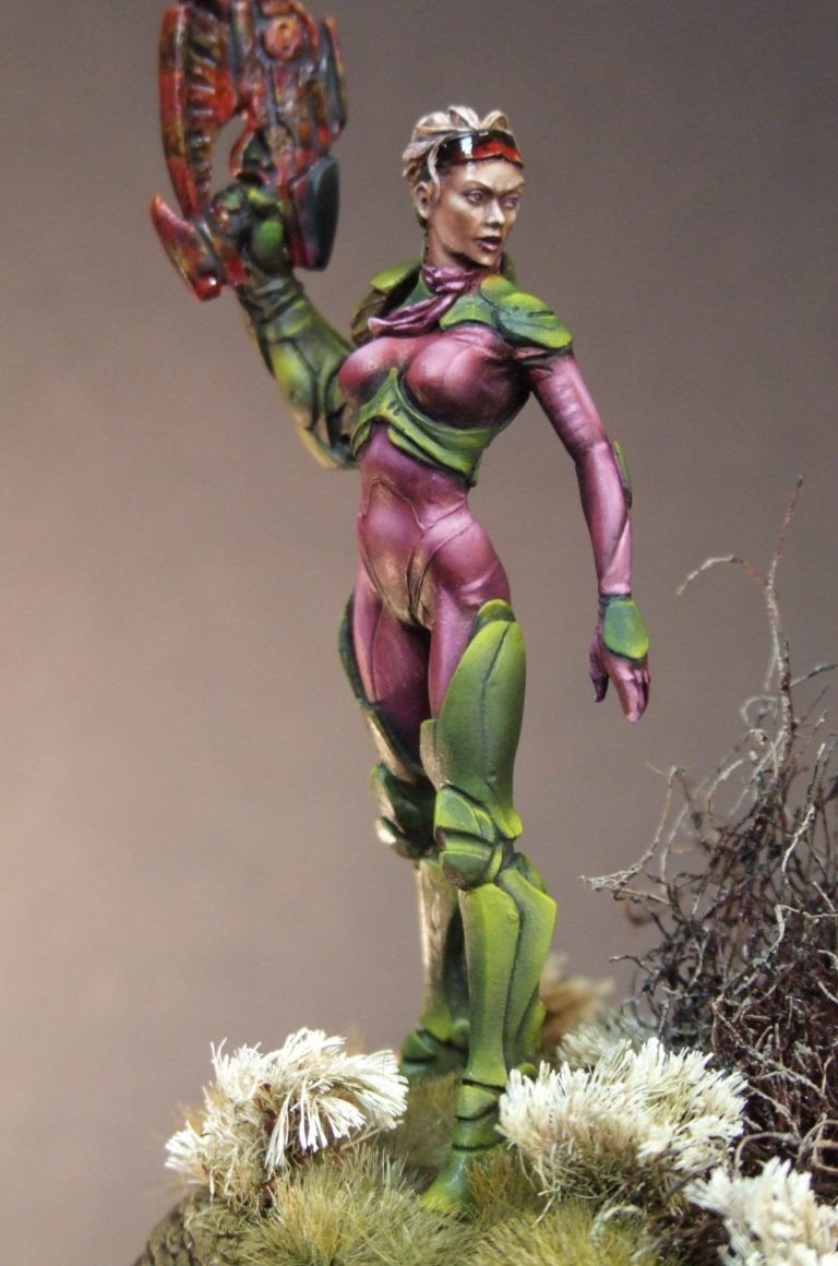
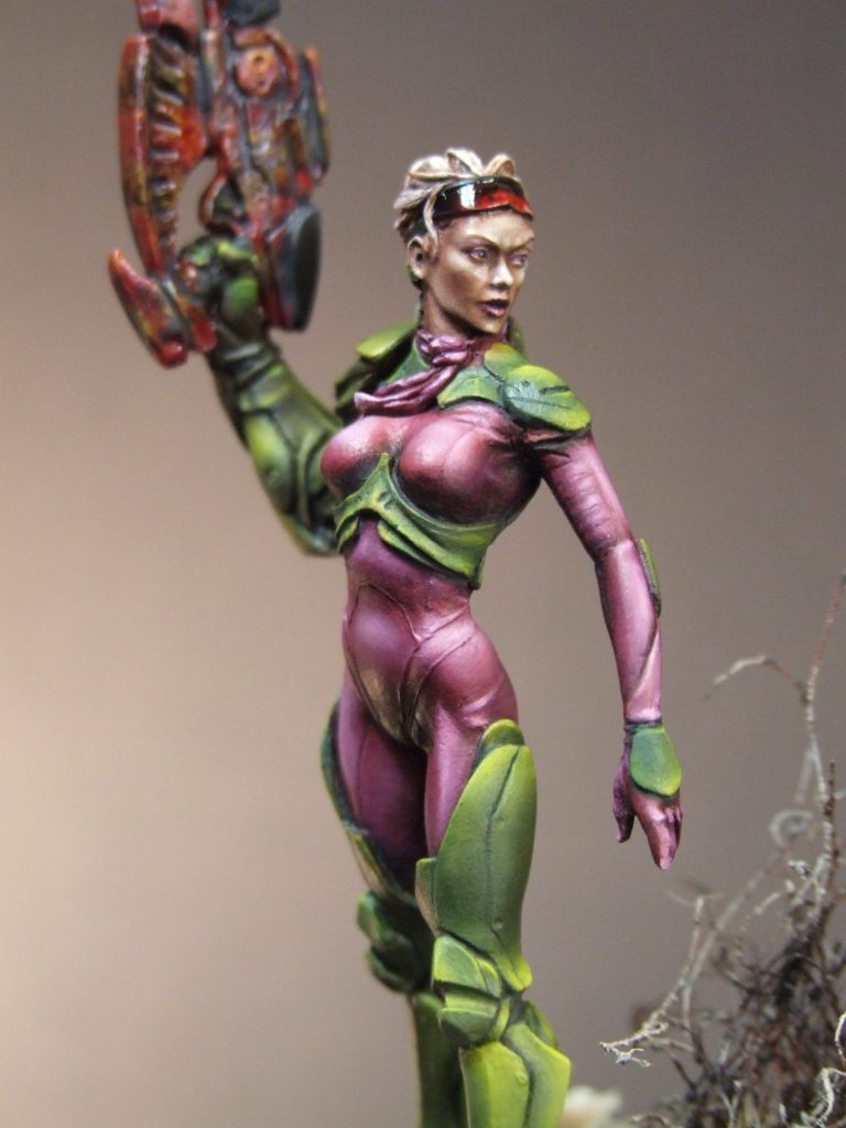
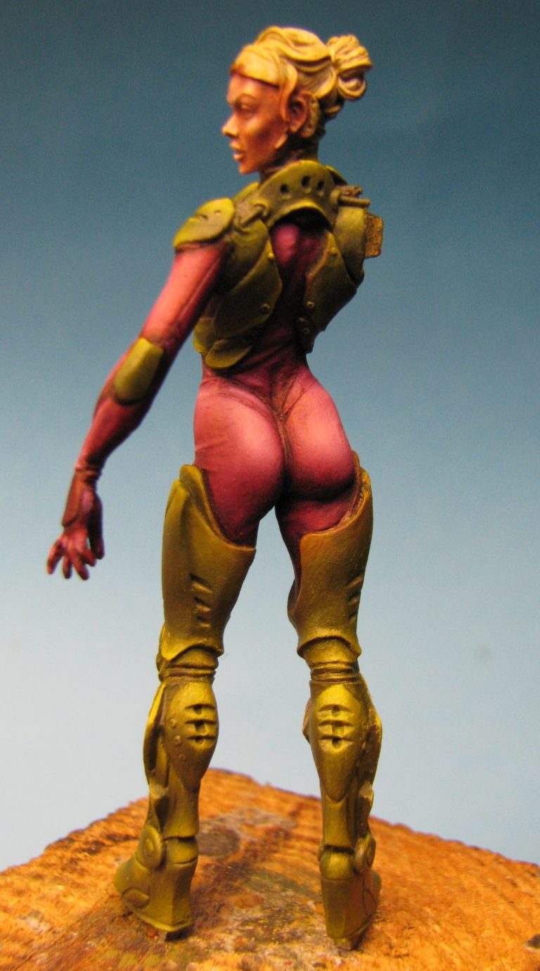
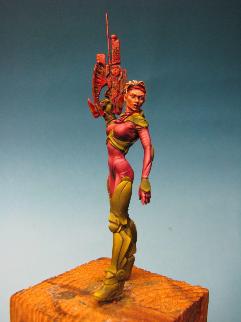
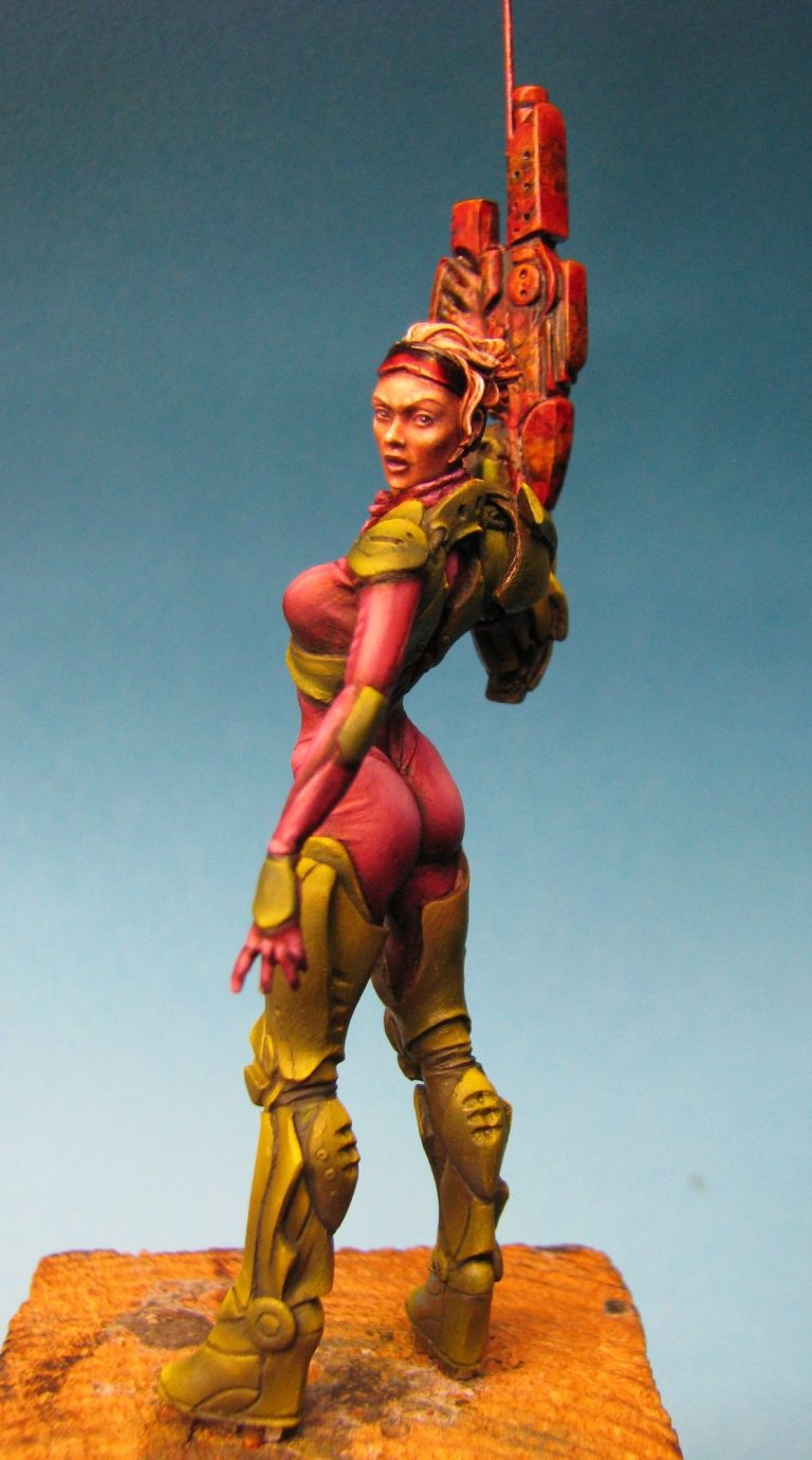
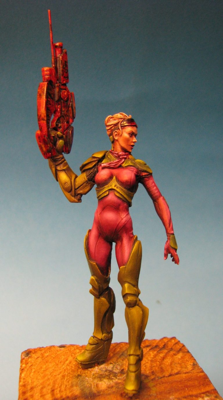
In photos #16, #17 and #18 there’s all-round views of the model being almost complete.
The additions here are small really – the glasses propped up on the top of her head have been painted ( black acrylic, white gradually built up on the lower edge and then coated with Tamiya Clear Red lacquer ). The hair also has been painted, along with the scarf.
Finally a very dark green has been added to all the panel lines on the armour. This accentuates the separations between each piece and deepens the shadows to make the recessed detail appear more pronounced.
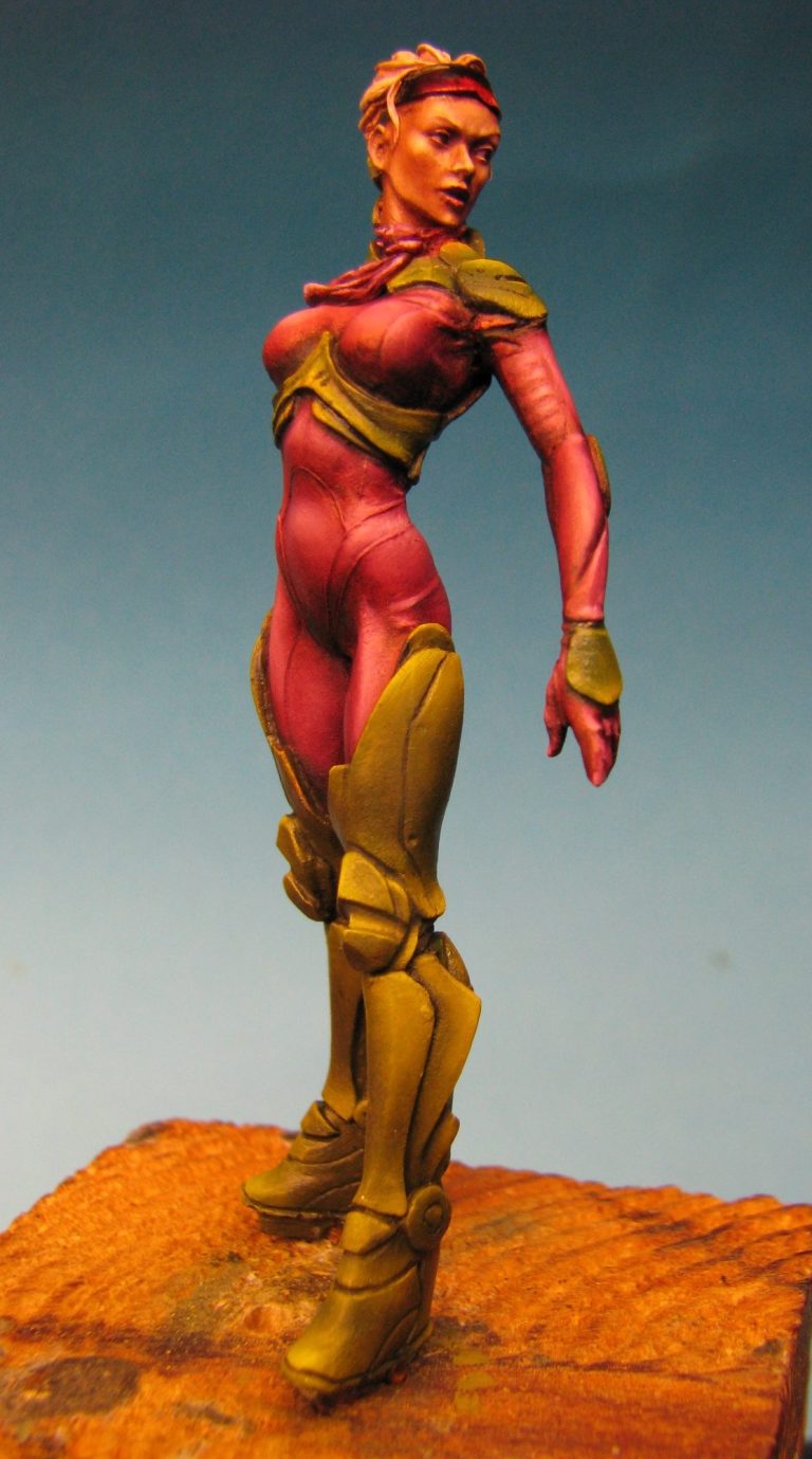
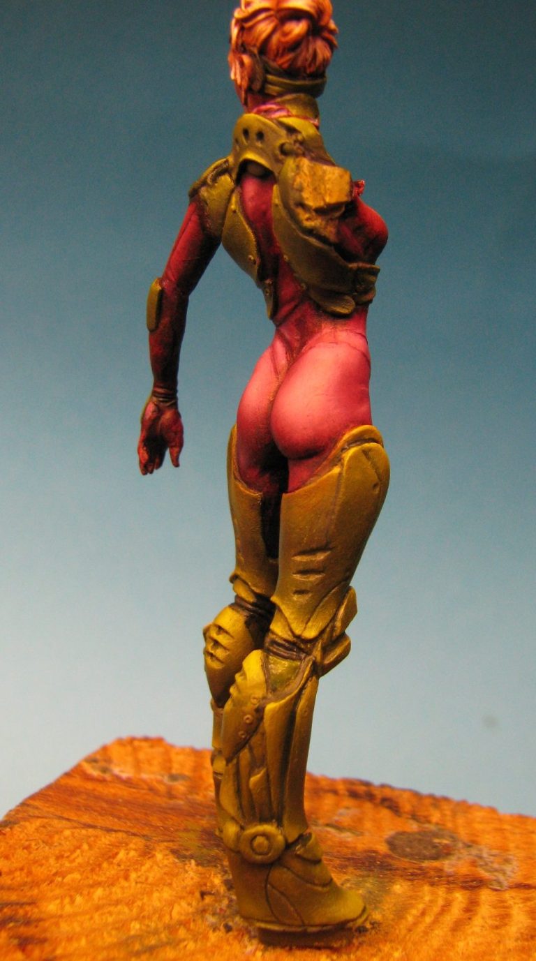
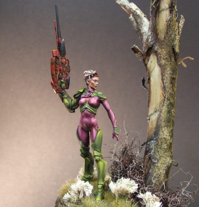
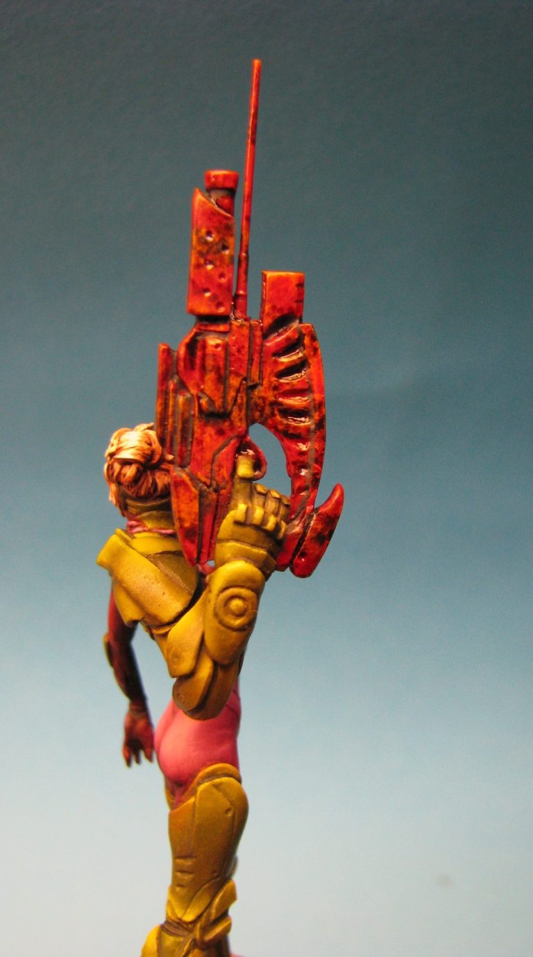
Photo #19, yes, photo #19. This and the following few shots show the figure completed prior to putting her on a groundwork base. I’ve got to admit that I’m not happy with the colour of the gun – granted, the camera isn’t picking up the true colours of the weapon, as there’s a lot more green camo pattern in real life.
However, what I’m unsure about is that the colours don’t fit in with the rest of the figure – they do match the glasses, but because the skin-tight suit is a lot more evident to the viewer, the gun really needs to tie into that.
On top of that problem, the actual barrel of the gun – the thicker tube above the slim brass turned barrel that I added – just doesn’t look “mean” enough.
In the next few photos – #20 through to #25 I’ve enhanced the green camo colours on the gun. I decided against altering the colours of the whole gun as I really liked the chaotic pattern I’d painted on – and I struggle getting chaos usually – and the red wasn’t troubling me too much with it’s difference from the overall colour scheme of the suit.
In the finished shots you can see that I’ve added a new and longer barrel. I searched through my stock of 1/350th scale warship barrels for this, coming up with something that extended the original fat barrel of the gun, but didn’t appear unwieldy for our heroin to handle.
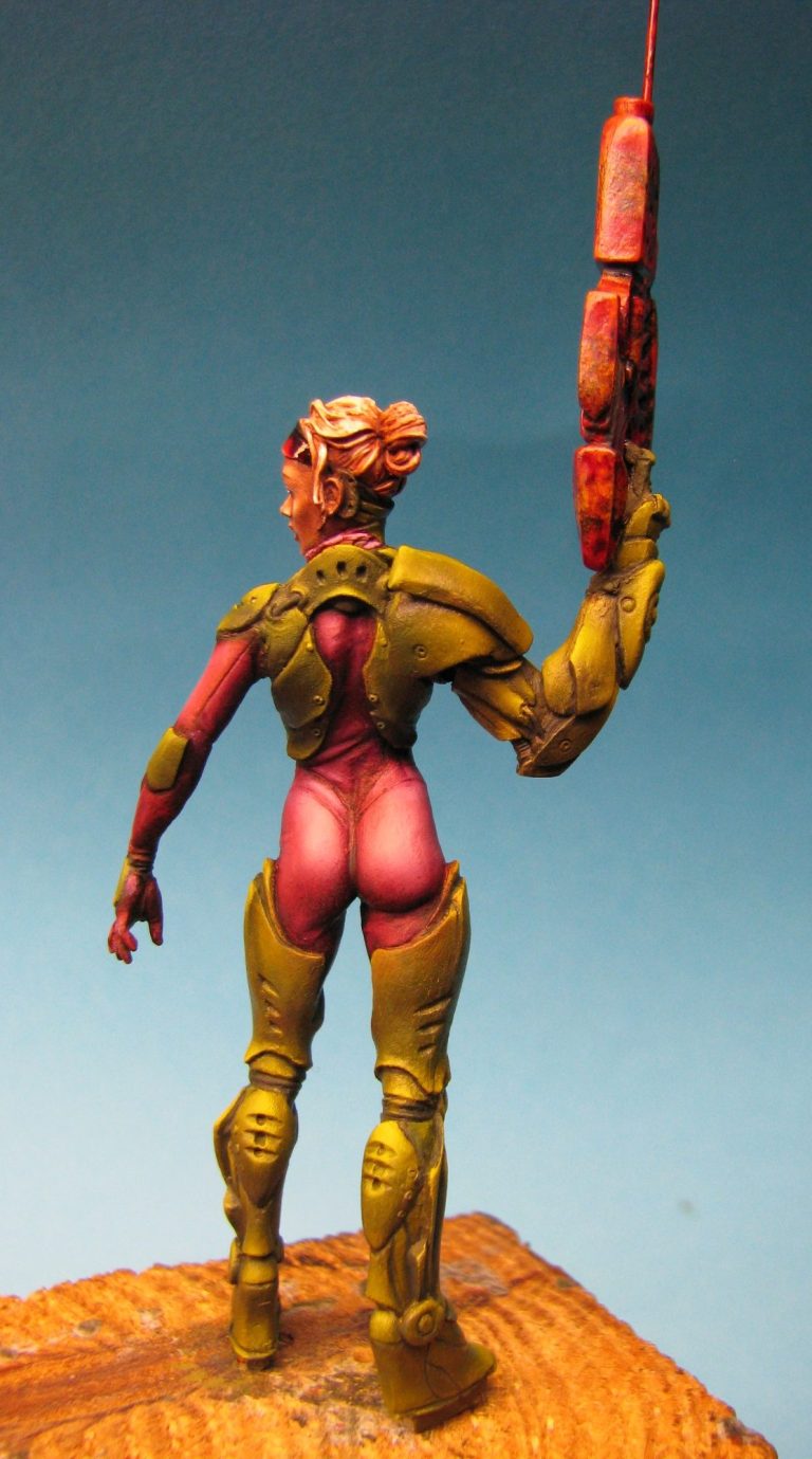
It meant that I had to drill carefully into the painted gun, and align it with the rest of the firearm, and once attached I decided that this would be a removable addition to the gun, and so it wouldn’t have been anodised with the original body and other section of the gun.
Painting it black, along with a couple of other sections of the gun enhanced the “clip together” appearance and broke up the camouflage effect a little bit more.
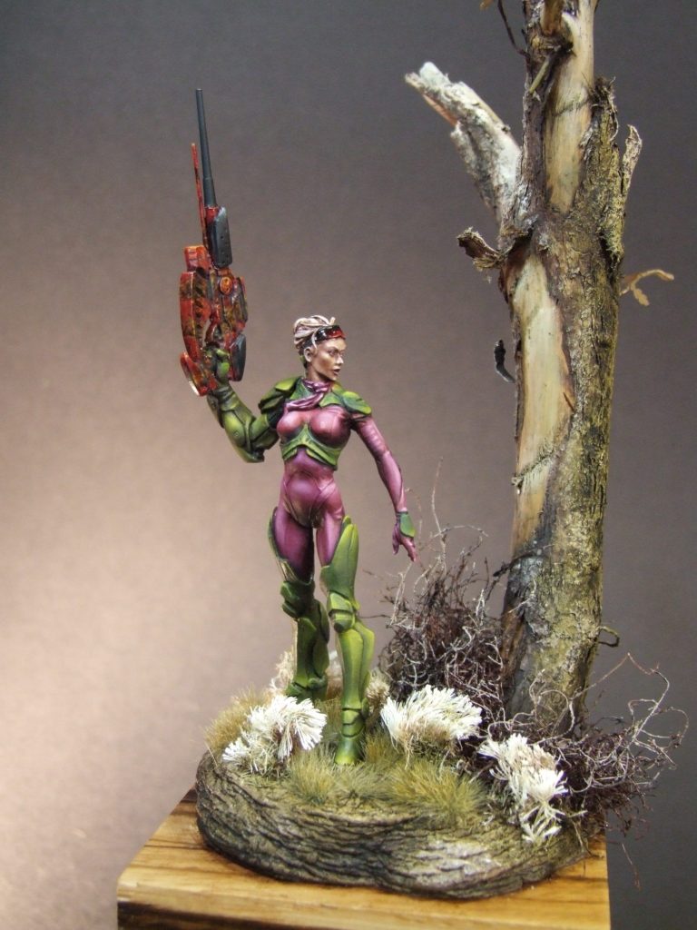
Now to the placement of our figure.
I toyed with a few different ideas – a broken cityscape with the obligatory ruined girders and rubbish lying around ( boring and involved ), perhaps placing her in an armoury and she’s selecting this gun or some of it’s parts from a table ( a cool idea, but it’s a difficult scale to source things for – 54mm accessories are way too small, 90mm way too large so I’d be scratch-building a lot of bits ).
I hit on the damaged tree and wooded scene simply because I saw this section of twig on the bench next to a load of other collected “rubbish” that had piled up there.
I’d rejected a lot of other ideas simply because I wanted to see all round the figure easily – I like her rear end a lot, but the front of the figure needs to be visible too. A lot of clutter or building walls would hide too much of her, and the pose suggests that she’s on the look-out for the enemy.
Partial cover supplied by a hefty bit of timber might work though. So that’s what I went with. The other plant-life is supplied from some coarse floor buffer pad ( the brown twig-like bushes around the base of the tree, and there’s ready-made static grass along with some Spanish seaweed bulking out the ground around her feet.
Again I didn’t want to hide the figure – the cool sculpting and the colourful painting was meant to stand out, and as mentioned I wanted the viewer to see her.
Overall I’ve enjoyed painting this little figure – the stance and sculpting is well up to what I expect from Andrea – there’s nothing to catch the modeller out and it’s kind of a relaxing piece to work on.
As for the title – Twitchy Mary – well she looks like she won’t question things much before pulling the trigger J