Goblin Wolf Rider Bust
1/9th scale Resin Kit from Sean Green
Painted 2026
You may remember Sean Green’s sculpting from times past, but be unaware of his name. The large Rackham Tarascus was one of his, and a short run of large scale pieces based on 28mm Rackham figures – The Crow, Ninja Goblin and the Pumpkinhead figures were all his.
He’s sculpted for quite a few other companies, even historical pieces like the Scottish Nobleman bust for Pegaso…..
All the above I used as examples of how good he is at his craft…….. Very good actually.
But then he kind of disappeared for a few years – work, family, and loss of interest in sculpting probably all had a part in this. A very sad loss to the hobby, because his sculpting was very detailed, the anatomy and poses were dynamic, and parts were engineered from a modellers point of view to fit with little or no filler with positive location lugs and holes.
shows, he returns to sculpting by producing this bust of a Goblin Spearman, posed as if on the back of a boar.
The model is based on the old GW metal Wolf or Boar Riders from the late 1980’s and 90’s, and so the original pose of the kit is to have the spear held wide from the body, because the metal casting back then needed the 28mm sculpture to go in a two part rubber disc mould, and so the model needed to be fairly two dimensional if it was to be cast in one piece.
I really liked the Boar Riders, having made four or five of them at the time, so my version has switched mounts, and is now upgraded to a rather bad tempered pig on steroids.
So for the collector who wants to imitate this pose in a much bigger scale, Sean’s nailed it.
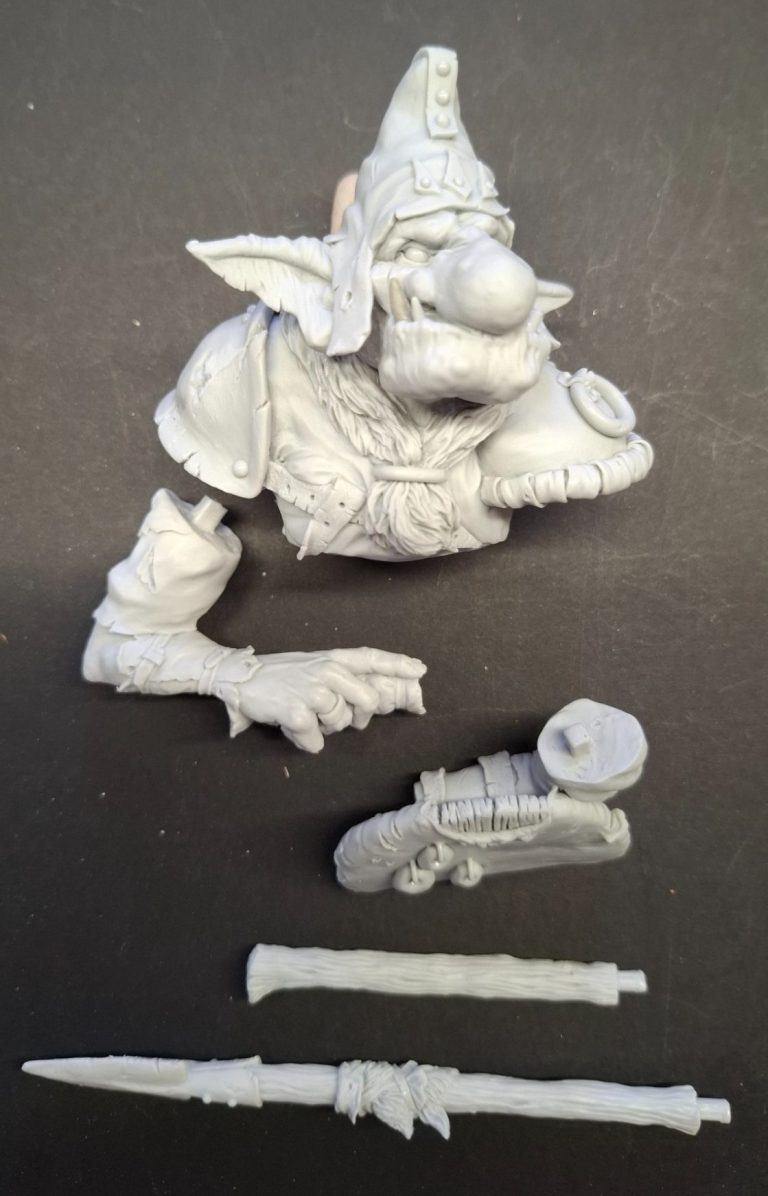
The parts of the kit are shown in photos #1, #2 and #3, the arms fitting under the shoulder armour without filler, and the spear split so that it fits into either end of the handgrip.
I’m not sure why the left hand wasn’t sculpted, but it allows for some different things to be done if the modeller wishes, plus, as I found out, once assembled, it’s pretty much hidden anyway.
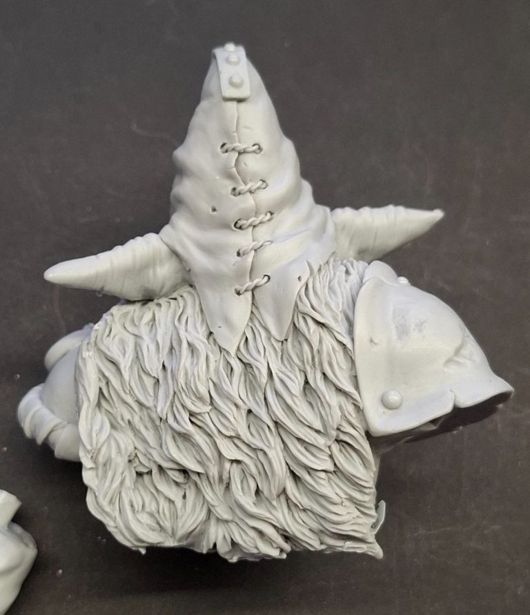
If you ever got chance to get any of the old, large-scale Forgeworld kits, then that’s the kind of detail you can expect to see on this, but with far, far better casting.
A couple of lines to clean up where the moulds have been cut to allow them to be opened, but nothing that needs any great amount of work to sort out.
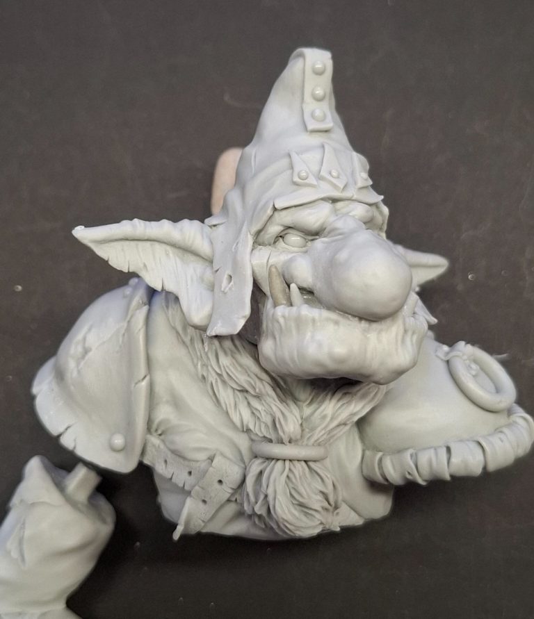
Photo #4, OK I changed it a bit.
Whilst the original pose, as noted, mimics the boar riders of old, I thought that mine might look more threatening if the right arm is twisted through ninety degrees to have the lance pointing forward, like he’s charging at an enemy.
The change is simple – remove the locating peg on the top of the arm, swivel the arm through ninety degrees, mark the position and add a wire strengthening pin for a secure location when coming to gluing the arm in place, and add a small amount of putty to the area between the upper arm and the underside of the shoulder guard to fill in the small gap that the alteration creates.
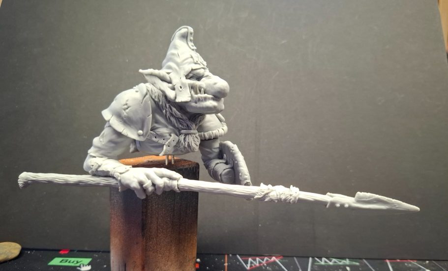
Photo #5 shows the model at this point from the front.
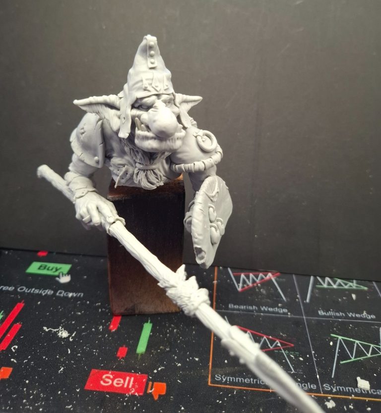
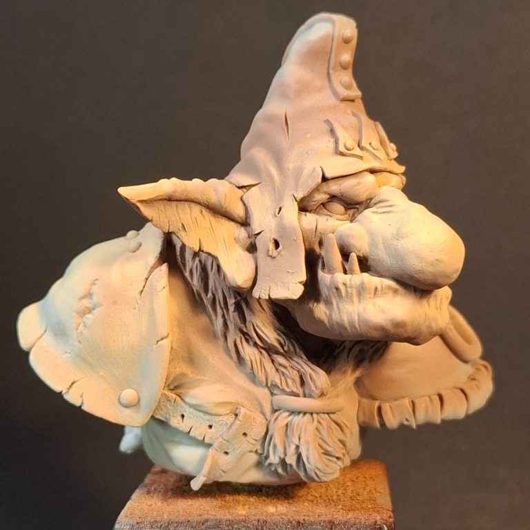
Photo #6, painting begins.
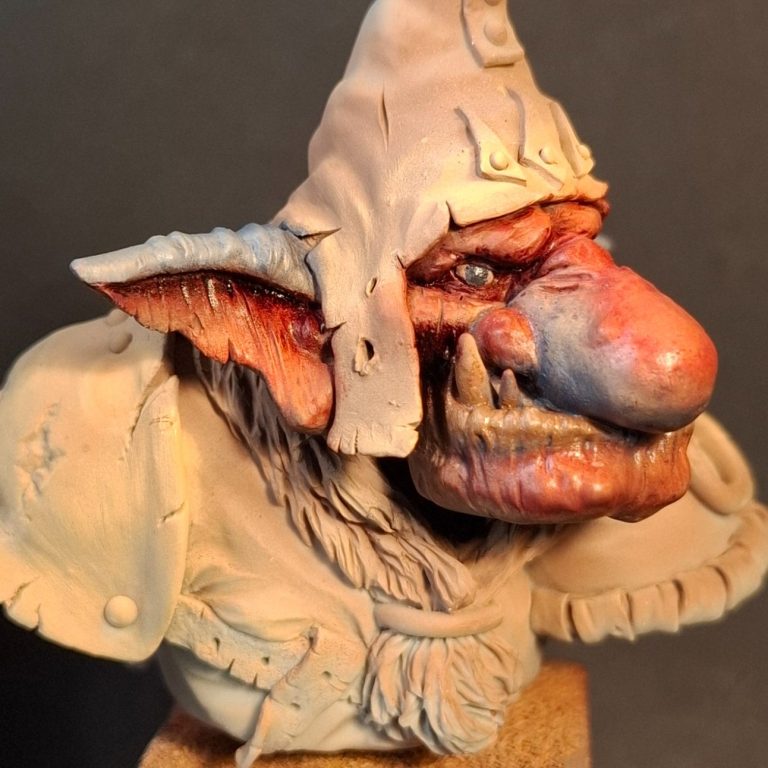
A primer coat of White from a Falcon aerosol can topped off with a couple of thin coats of Tamiya flesh colour through an airbrush……. But Goblins are green I hear you shout !
Yes….. but everyone’s going to paint them green, I thought I’d have a go a t reproducing the colours used in the artwork of Paul Bonner – blues, reds and purples.
Photo #7. Aaaargh ! That’s bright.
Yes, it is, but that’s because there’s no colours surrounding it bar the flesh coloured undercoat. Nothing to give it context.
I used Carmine oils for the red areas, darkened with Purple Madder Alizarin and Prussian Blue darkened with Payne’s Grey for the blue areas.
Rather than painting these colours on, I used a very soft, rounded brush that had seen better days to apply tiny, tiny amounts of colour, almost scrubbing the colour into the underlying undercoat. This is then blended out to fade to nothing, keeping the stronger colour in the recesses of detail or towards the edges of each area.
At this point the paint is still wet, hence the shine given off by the lights.
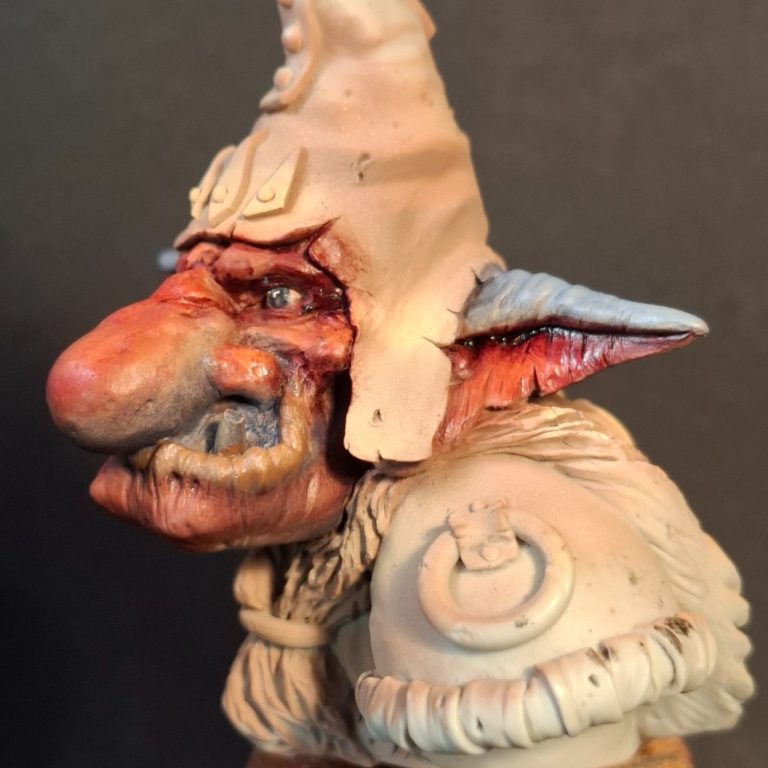
Photos #8 and #9, and maybe the colours are a little too strong….. Possibly some white might be mixed in with the Carmine and the Prussian Blue and some highlights built up ?
Perhaps, but until some colour is added to the surrounding areas, I’ll leave it as it is.
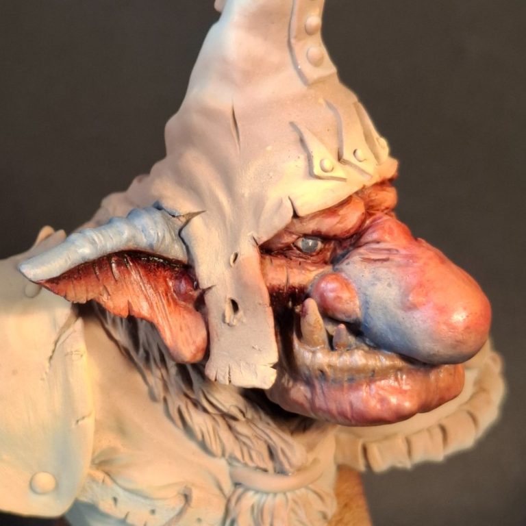
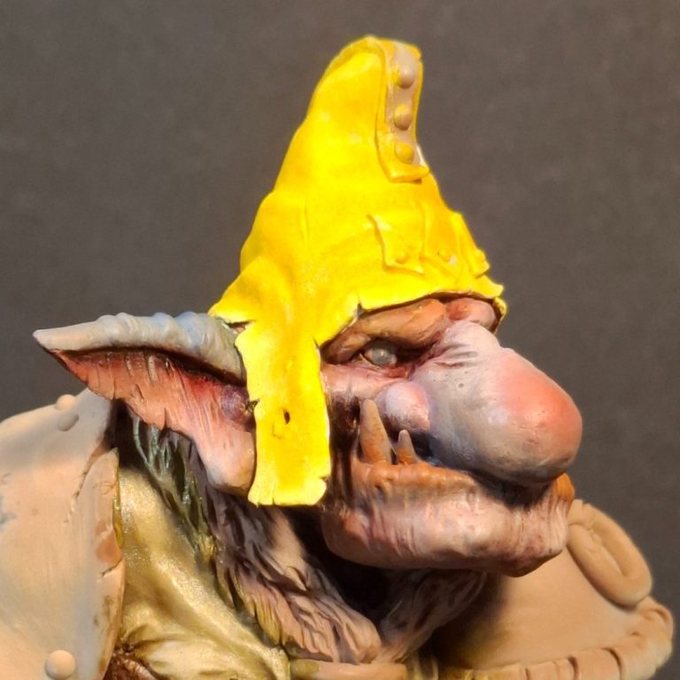
Photo #10, and you thought those skin colours were bright ??!!
I planned on doing some “ever so 80’s” chequerboard patterning on the hat, so it’s easiest to begin with the lightest colouration, in this case yellow.
Several, and I do mean several coats of MP White Primer to get a solid ground for the Sunburst Yellow ( GW old pot of paint ) which was then followed by Winsor and Newton Chrome Yellow oils, shadows added with a tiny amount of Mars Yellow that was blended in carefully.
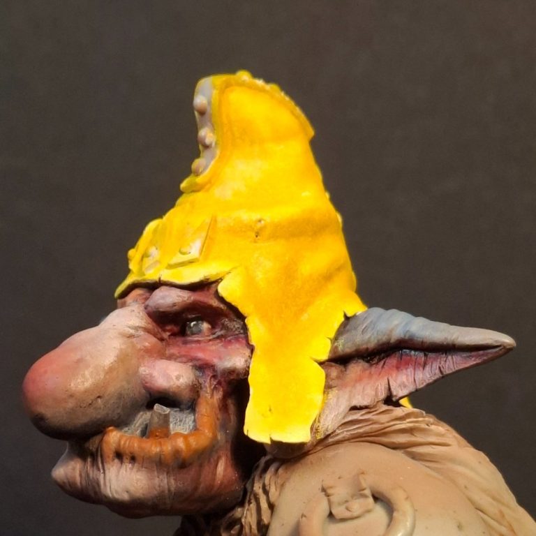
Photos #11 and #12. Yellow is a difficult colour to render, it’s so easily made to appear muddy / dirty, which I admit would be OK for our little goblin chap, but I wanted bright colours in the beginning. Toning it back was an option for later.
Yellow oils also take a while to dry, so this spent two weeks in the drying cupboard, constantly warm, and even then wasn’t quite dry.
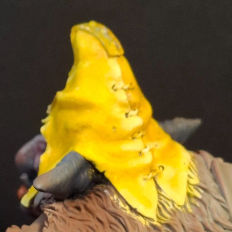
Photo #13 shows the beginning of marking out the “squares” for the pattern.
So there aren’t any actual squares on there. Plenty of rhomboids, oblongs and other four-sided shapes, but few if any actual squares.
This is because the hat tapers, and also has a lot of folds or creases in it.
It’s easiest to begin with the vertical lines, running several of these down the areas to have the pattern, allowing the shape of the sculpting to control where the line goes to some extent.
Then the horizontal lines can be added, again letting the shape of the hat dictate where the line runs to some extent.
And on the ear flap at the lower part of the hat, I’ve begun to fill in some of the “squares”.
I’m using a thinned mix of Mars Black oils for this, with a fine brush ( Winsor and Newton series 7 size 1 ), reforming the point when necessary.
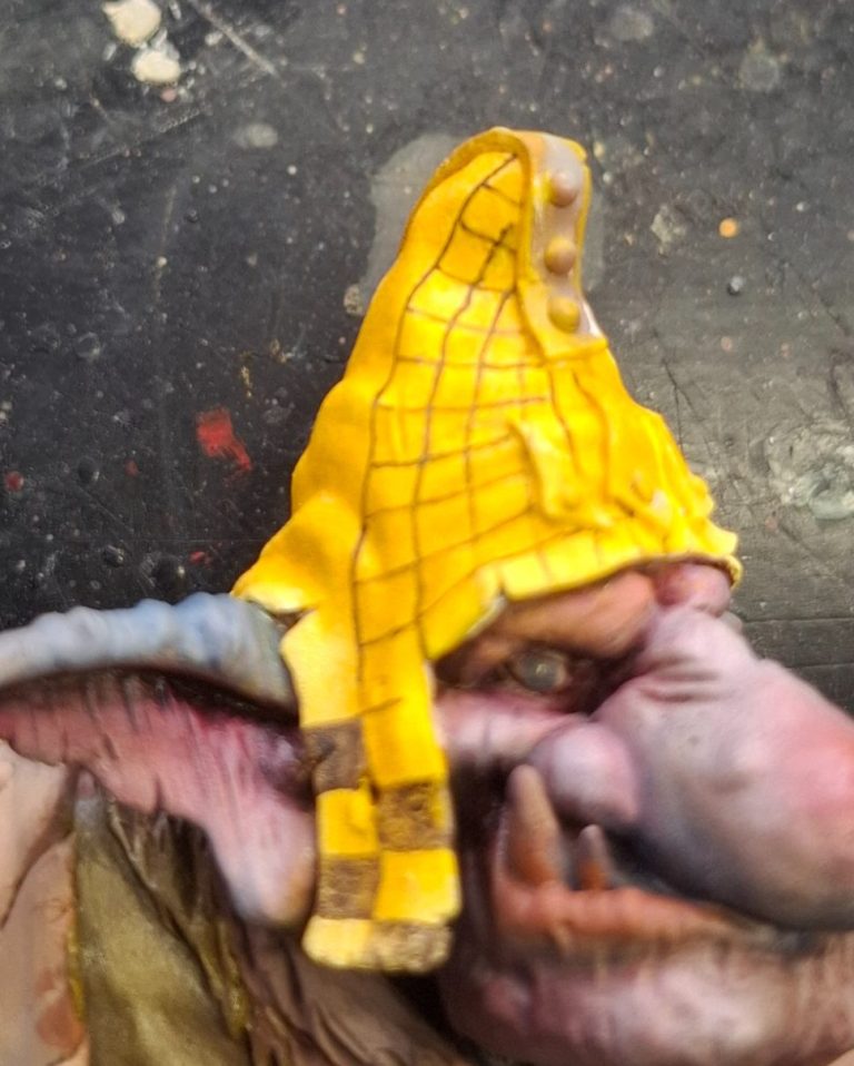
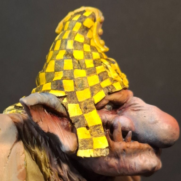
Photo #14 shows the hat with all the squares filled in on that side of the model. This is only an initial coat of the black paint, and needs a second coat to strengthen the colour.
Note how the shading on the yellow has almost completely disappeared now that a darker colour has been added – that’s a bit frustrating !
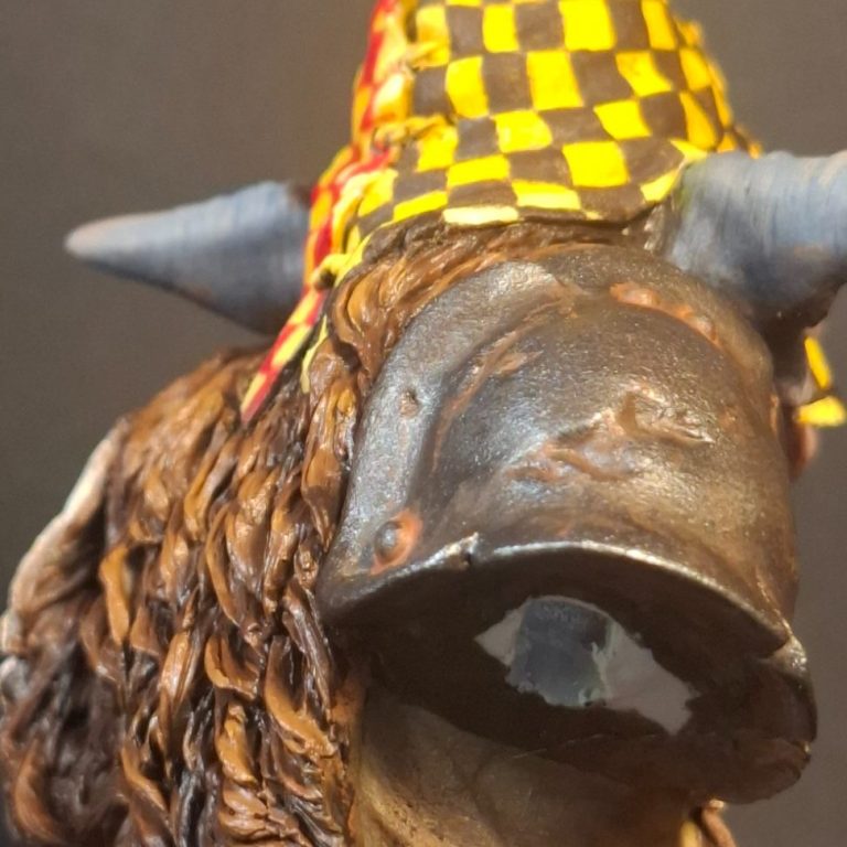
Photo #15 and the other side of the hat has been treated to more chequerboard pattern, but this time with some Carmine oils.
Same method though, same tedium to some extent.
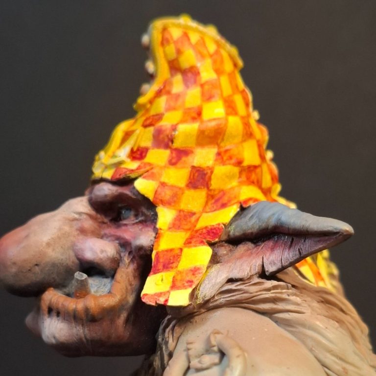
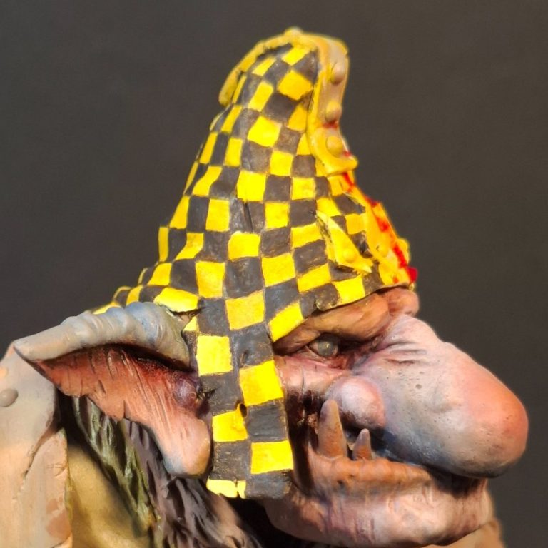
Photo #16, and the black areas have been recoated to make the colour more definite. I’ve allowed it to still appear a little faded – wouldn’t want our goblin to appear too fresh and clean.
Photo #17, and repeat with the Carmine, this time adding some highlights with some Scarlet oils.
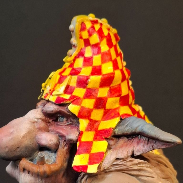
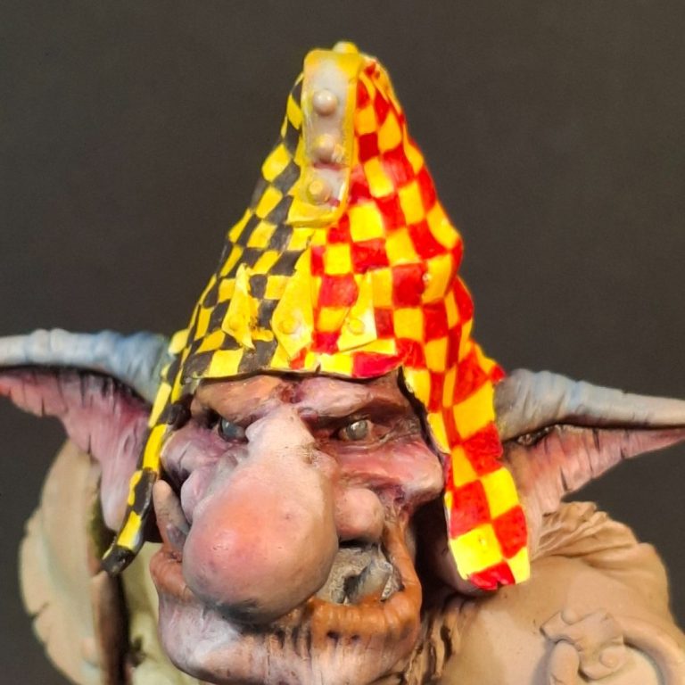
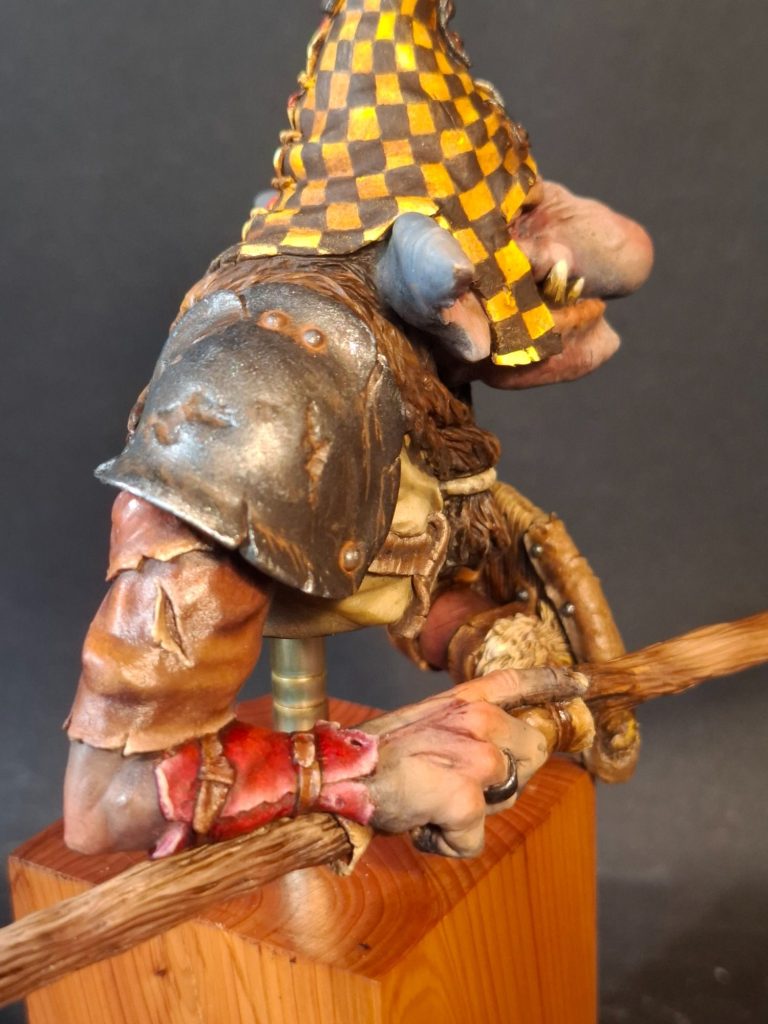
Photo #18, and a view from the front showing the two halves and how the change between black and Carmine appears.
The flesh areas now look to be a lot less bright, and I’ll probably have to strengthen the shadows later on.
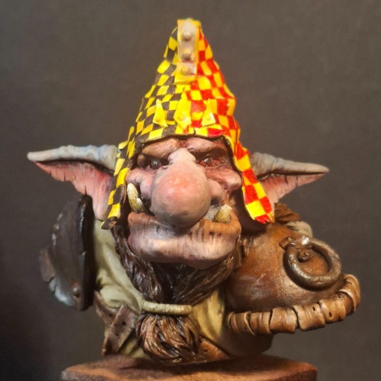
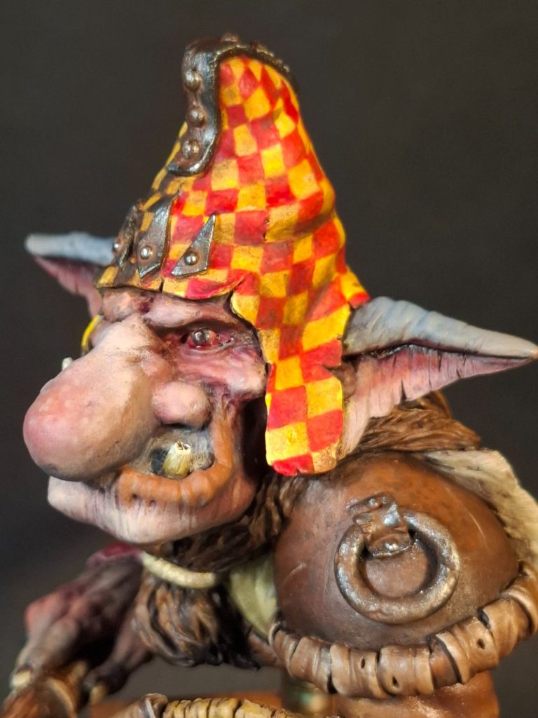
Photos #19 and #20 and I’ve painted in the shoulder armour. One side is obviously made of steel, the other side could be either steel with leather edging, or as I’ve painted it – a completely leather item.
Darkstar metallics for the steel, with a wash of Light Red oils to create some rust effects, and the usual mix of various brown oils for the leather side.
I’ve added paint to the cloak and painted the ring that holds it’s ends together at the throat to represent a bone or stone carved item.
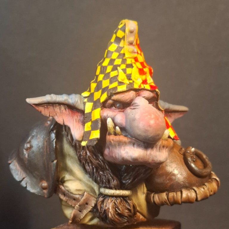
Photo #21 and while I had the metallic colours out, I added the steel ring on the left shoulder guard.
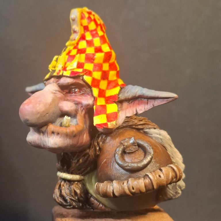
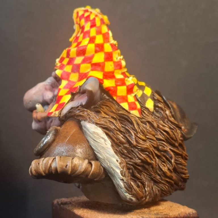
Photo #22. The cloak employs the same paints as used on the leather shoulder armour, but adjusting the mix of colours to make them appear slightly different, and the exposed skin of the item painted a very pale colour to hint at either no tanning have being used to make the cloak, or some process that kept the inner skin of the area very pale.
Photos #23 and #24 show the metal shoulder guard a bit more, with the rust streaks and pools of it around the rivets in evidence here.
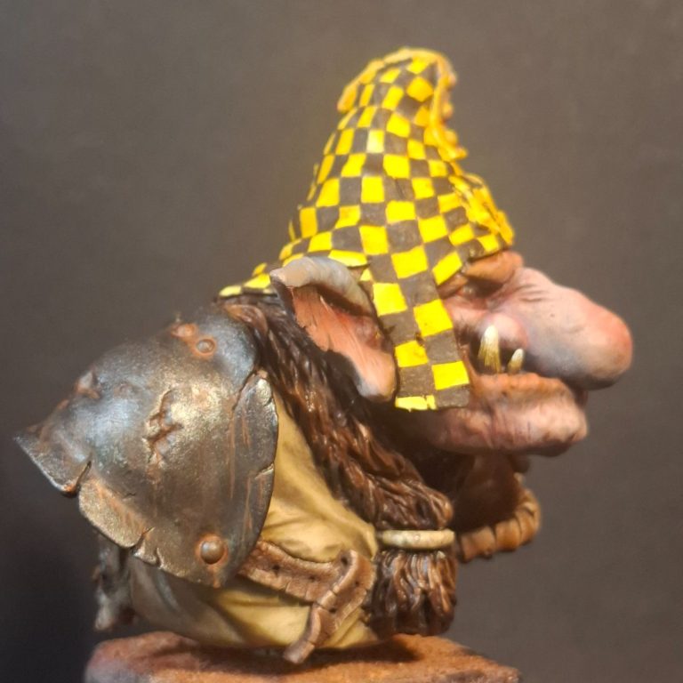
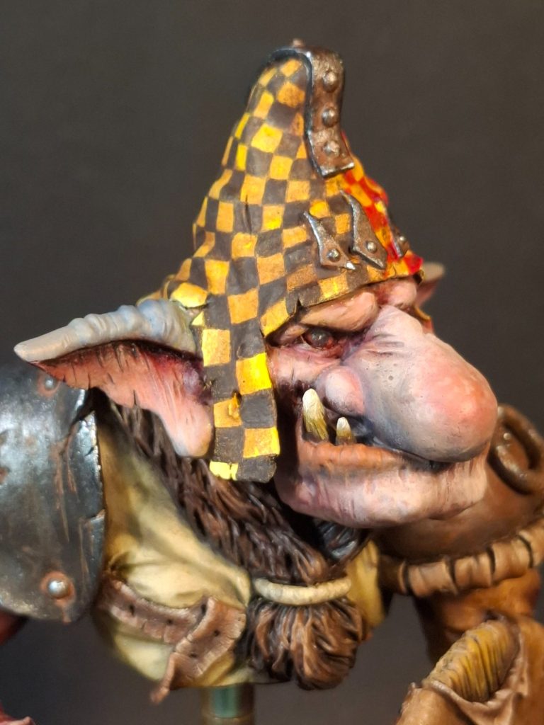
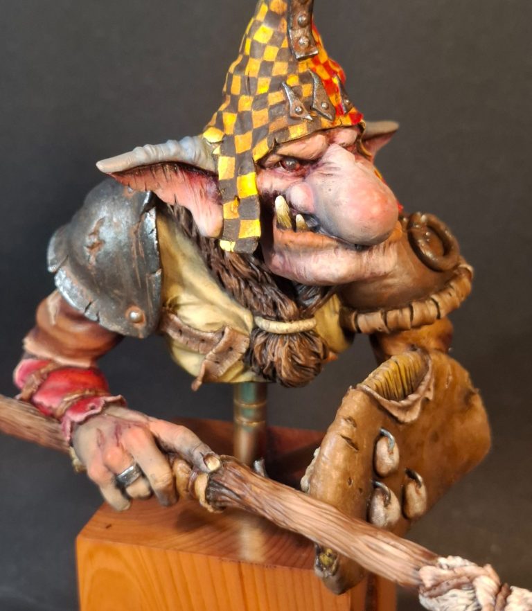
Photo #25 and a close-up of the face. It’s worth spending a little time on the eyes, They’re deeply recessed, so take a bit of patience to get the it is positioned correctly, but worth the effort in the end to get that grim stare that the model has.
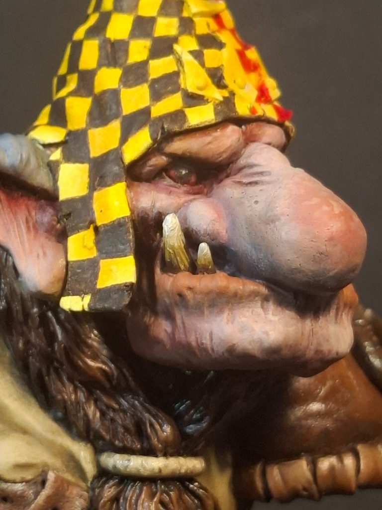
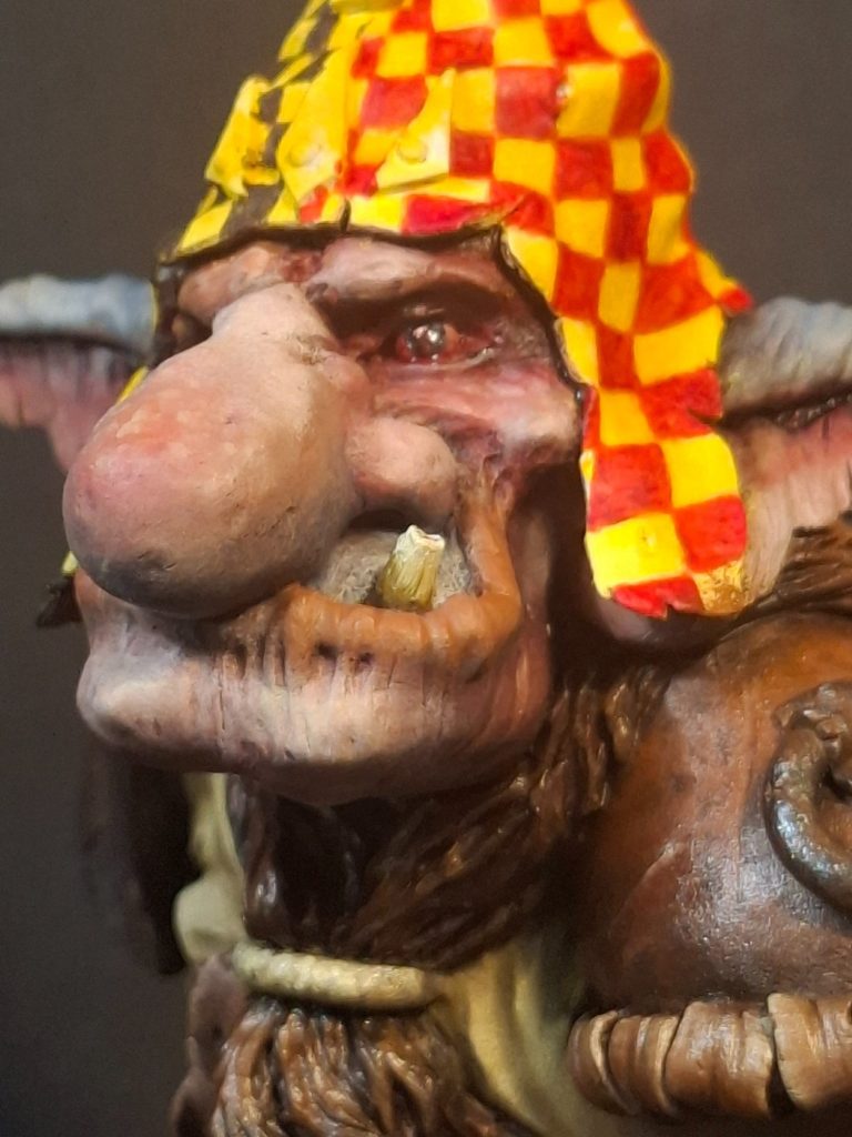
Photo #26 shows the other side of the face, and here I’ve strengthened the shadows in the deeper recesses, and added some very slight highlighting to the nose, brows and chin.
Photo #27 shows a face-on view, and the catch-lights added to each eye really stand out, even though they are pretty tiny additions of white paint.
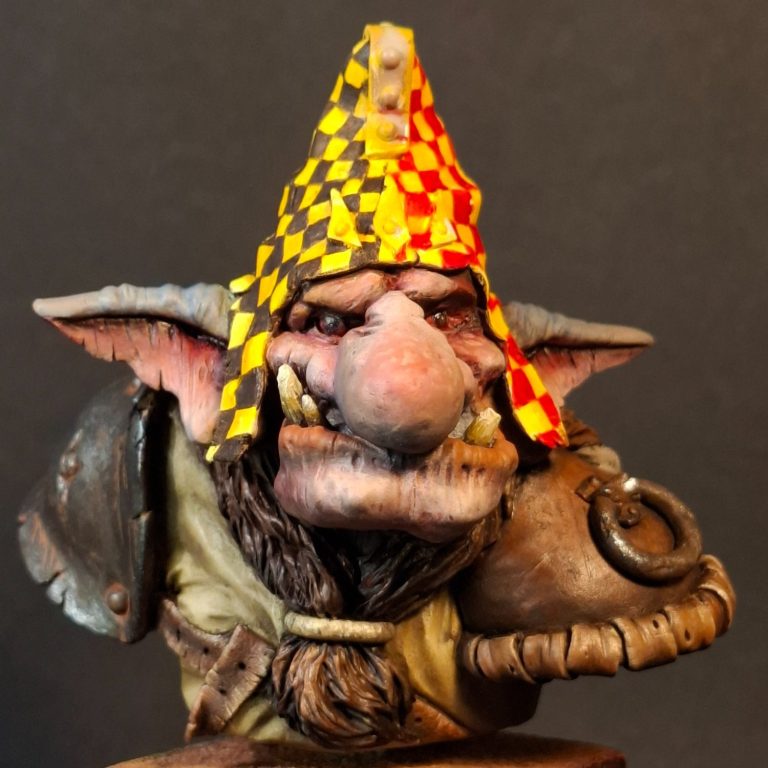
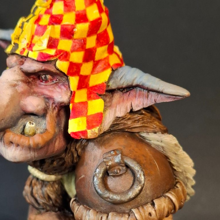
Photo #28 and the strengthened red squares can be seen in this shot. Whilst the black ones on the opposite side were added with dots and squiggles to allow some of the weaker “grey” to show through, hinting at a well-worn piece of material, the red squares have been painted to retain stronger colouration, simply because the red has less impact that the black, and so needs to be filling each of the shapes better.
There is still some imperfections allowed in some of the squares, but overall the colour is more definite.
Photo #29 and I’ve added some streaks of rust to the shoulder plate. I’ll leave the matt finish on this area, because whilst metal is shiny, rust isn’t.
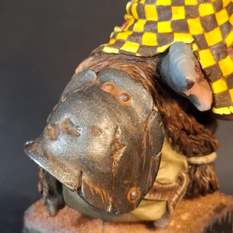
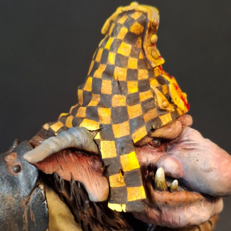
Photo #30 and I’ve had to add some shading to the hat because the yellow just appeared a single colour once the red and black chequer board patter had been painted on. I used some very thin washes of Vandyke Brown oils, which doubled up by making the hat appear dirtier.
Photo #31. The right hand has been airbrushed, first with some Tamiya Nato Brown mixed with Flesh Colour, and then highlights added from the Flesh Colour on it’s own. This was then treated to the red and blue oils in a similar manner to how I rendered the face, the blue colourations towards the fingertips and the wrist, the red across the knuckles.
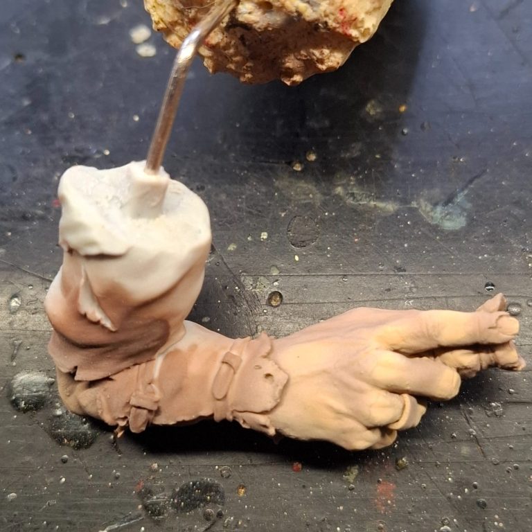
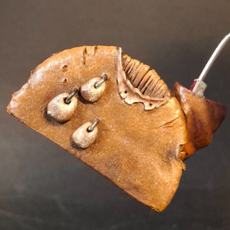
Photo #32 – lots of leather. So, plenty of browns now to colour the shield and the clothing on the left arm, the pebble decorations being done with similar colours, but adding in some Payne’s Grey to the lower parts of them to difference the effect.
Photo #33. The end of the left arm had bothered me a little, and so I though the addition of a hook might finish it off nicely, adding a fur coating to the leather tube that would socket over the severed wrist.
A thick paperclip cut to size and fastened into a hole drilled into the end of the wrist, then some Magic Sculpt added and fashioned into fur with a sculpting tool – easy.
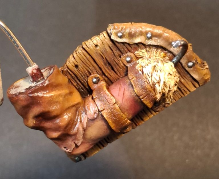
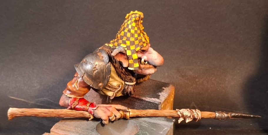
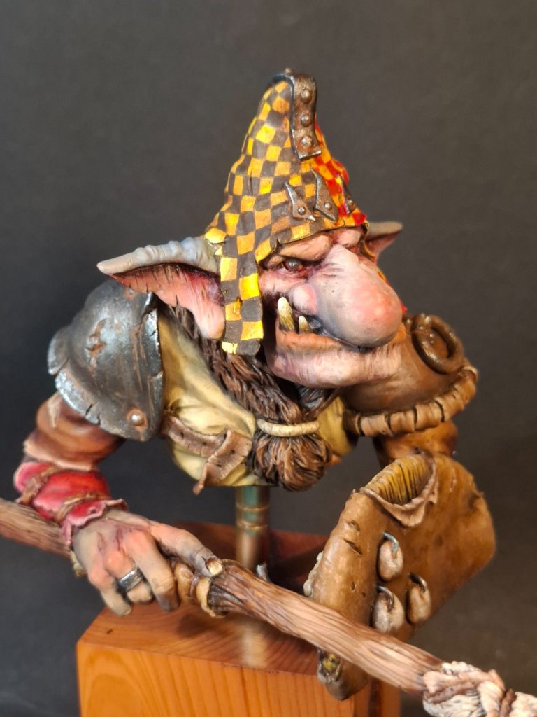
Photo #34. With the right arm painted, the spear could be added, and then the arm fastened in place on the model.
The finished shots work through different views of the model, although I did return and add part of a rune-like symbol to the front of the shield, as I thought that the area was a little empty ( and there’s a lot of brown there too ).
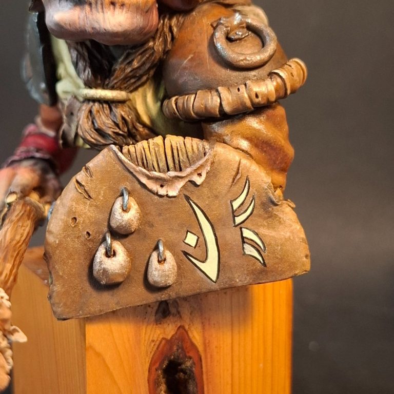
Photo #35 and the last thing to add were some runes painted onto the shield.
I browsed Google for some ideas, and came across an Orc alphabet. My thought was to add Sean Green’s initials – not sure why, but the two runes on the shield are an “S” and a “G”….. kind of appropriate.
Final thoughts.
Well, it’s so good to see Sean back sculpting. He works traditionally, using Super Sculpey and various sculpting tools rather than having migrated to 3D sculpting like so many others currently producing models.
I dare say that there are still the worries of parts cracking during the curing process of putting the Sculpey in an oven, but I think the volumes and pose of his pieces benefit from this way of producing his kits.
Sean’s kits are low production runs, very cleanly cast, and the resin used is very high quality stuff.
Whilst based on ideas from much smaller scale figures dating back forty or fifty years, the sculpting and concepts back then were pretty flawless, and Sean’s love of that period infuses his kits with a quality that brings back the feel of those pieces, but in much larger form, and with plenty of extra touches of detail.
Oh, and the increase in size, means that whilst memories, and even perhaps possession of those 28mm figures might possibly strain the eye to paint nowadays, Sean offers a canvas that is a little easier to deal with.
So, very pleased that Sean is back on the scene, and there’s already a second model in the works that I’m hoping will be released as a kit sometime soon.
Highly recommended.
If you're interested in buying the unpainted kit from Sean, DM him on Instagram - Sean Green - the cost of the model being £38 plus postage, which works out at £4.50 in the UK, but will be more expensive for worldwide shipping.
Photo #29 and I’ve added some streaks of rust to the shoulder plate. I’ll leave the matt finish on this area, because whilst metal is shiny, rust isn’t.