Roman Signifer
1/9th scale resin kit from Young Miniatures
Painted in 2013
The kit.
I’ve done one or two articles about Young Miniatures offerings in the past and always been complimentary towards them. So forgive me for gushing a bit about this one. It’s perhaps not as charismatic as the Hector piece, which after all is fashioned after an actor in a Hollywood movie. In fact it’ll have a bit of work to do to equal the Hector kit in my eyes.
In fairness, this being an historical representation, I should look more to the accuracy of the armour and accoutrements, rather than focusing on how photogenic it is.
Hmmmm, gives me a problem though, because after all, we’d like our painted pieces to stand out if they’re not in the display cabinet – to draw the eye.
I’m not sure ( at this point, because he’s still in bits as I write this ) whether that’ll be the case. However, the box art promises quite a lot, so I suppose it’s a little adventure worth following to see what’s at the end.
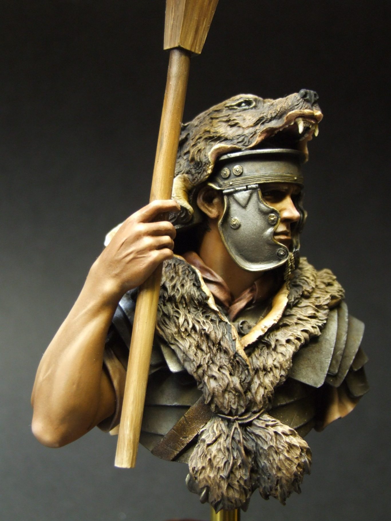
So let’s look at what we get. The box art as I’ve mentioned is competent, not too flashy and “you’ll never paint to this standard” flashy, which must encourage the beginner and intermediate modellers. The box art is lifelike, it makes you want to see if you can paint as well – I think that’s a good thing.
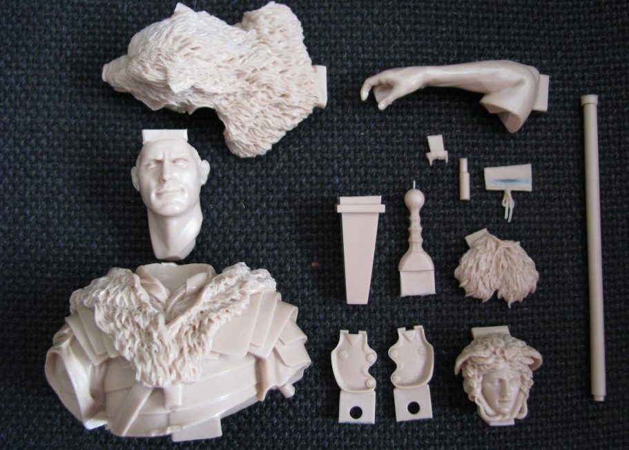
As with all Young Miniatures kits, the parts are well packed to guard against damage in transit, with plenty of padding to protect the components – and there’s plenty of those to protect at that !
I’ve laid them out in photo #1, because I’m a figure modeller not an AFV modeller, I get confused with more than five parts………..This has more than five parts……
Unusually for me, I’ve managed to take this shot with the mould over-pour tabs still on the model, as you can see they’re logically places, and in areas that are relatively easy to remove with a razor saw and then clean up with a file.
As for the fit of parts, well that’s very good, with the parts fitting into their sockets in a very positive manner. If painting the piece as separate parts, then it’ll be worth looking at how far the sit into the sockets, because shadows will need to be placed to reflect the fact that certain areas are overshadowed – we’ll come to that later.
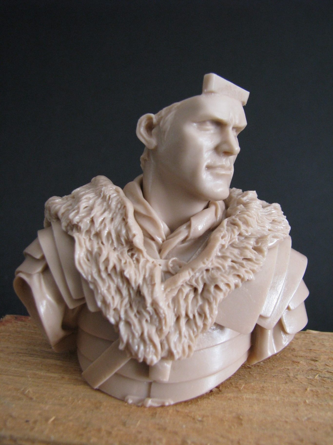
Photo #2 shows me test fitting the head into the upper chest. A good fit, that allows for a very small amount of movement, but nothing that will change the pose or attitude of the piece. Added to this, when the helmet and top of the bear headdress is added, there’s going to be less play still.
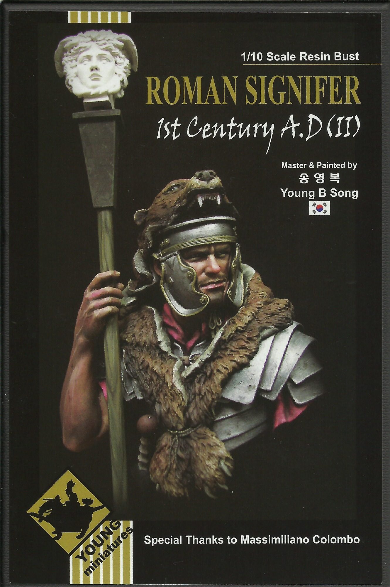
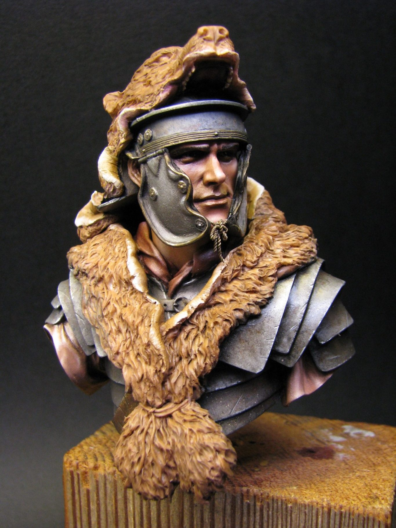
So, having seen the basics of the raw resin parts, photo #3 gives you a shot of the box art, and how they all fit together, plus how they should look when some paint gets near to them.
So, to adding the colour. I wanted a true Roman, a chap with Medditeranean colouring to his skin, and so I added alittle Olive Green to my normal paint mix…….OK I had Mars Brown, Titanium White……..Um, that’s the normal paint mix. Adding a splash of Olive Green wasn’t exactly rocket science then.
It only needs a small amount, even thought the brown and the white are strong pigments, the green sends the red bias off pretty quickly.
Photo #4 shows the face about three quarters finished. I’ve dried it at this point so that further payers of colour can be added as tints and washes.
The skin looks pretty dead and lifeless, but some Carline added to the tip of the nose, the cheeks and the chin, will breath a little life into his, and then some Payne’s Grey additions to the lower face to hint at twelve o’clock shadow will further the cause no end.
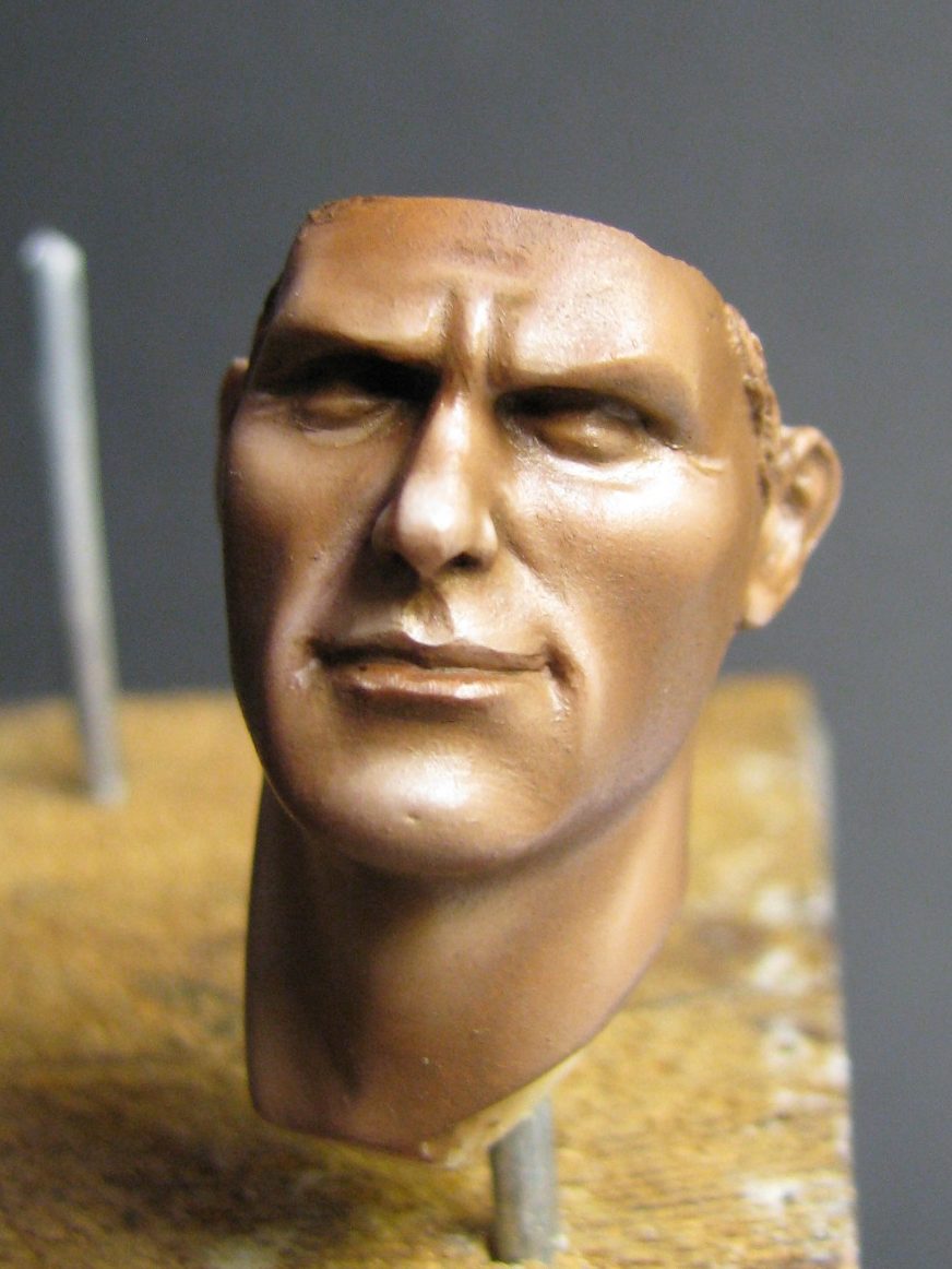
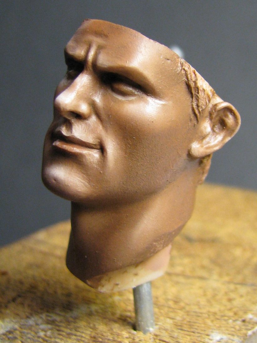
The main thing here, and in photo #5 is the smooth blending. If that’s not right, then there’s no point in carrying on. Hopefully you can see that the oils have been blended together seamlessly……..hopefully.
Jumping to photo #7, the face has had all the additions mentioned, and the eyes put in. I’m testing the helmet component for fit, but also how the front brim will overhang the forehead of the face section. I’ve done this to see what extra shading will be necessary to emphasise the shadow cast by the helmet brim, because when painting the face it’s very difficult to factor in where the shadow will eventually lie, and keep taking the helmet off and on might damage the paintwork.
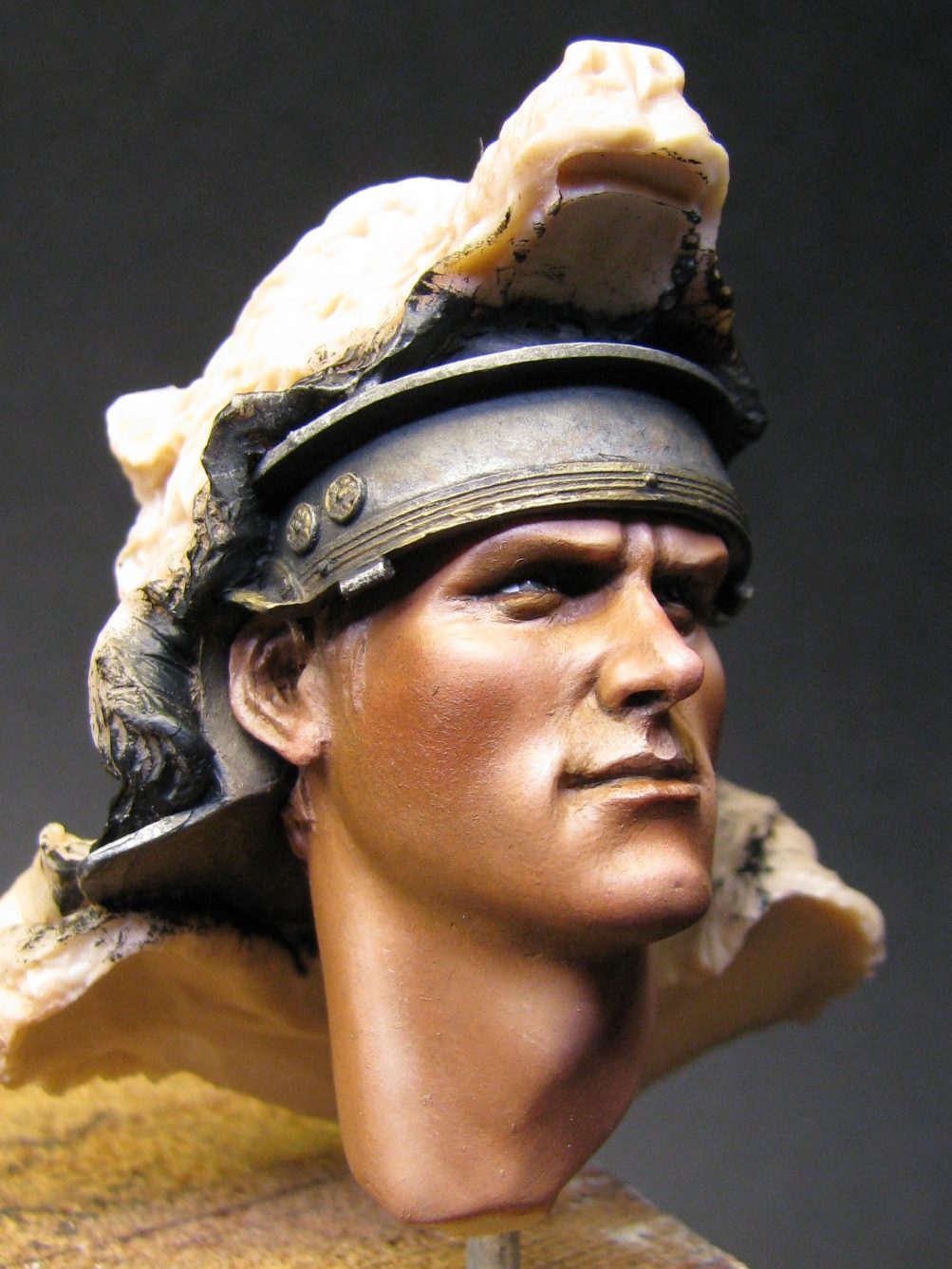

Back to photo #6.
The armour has dried now – boring ain’t it. In fact it doesn’t look very metallic at all. This needs altering as the inks dry to quite a matt finish and because the pigment is ground up so fine, they don’t reflect light like normal metallic flakes do.
I want to make the metal look more used – scratched, stained and tarnished.
For this to take place I need to seal the metallic areas as the oil paints diluted with lots of White Spirit might attack the inks if there are areas that haven’t fully dried. It shouldn’t happen, but then again, we have Sod’s Law to contend with.
So, a quick coat of Tamiya Smoke acrylic, or any type of acrylic medium, will act as a decent barrier.
Once that has dried I can begin adding a thin coat of White Spirit over one section of the armour at a time, and then add to that some squiggles and dots of Paynes Grey, Burnt Umber, Mars Black and Light Red. By stippling at these colours with a soft dry brush, I can haze the paint into faded effects and reproduce the staining and marks within or on the surface of the metal that I want to depict. It’s a slow process, but it’s worthwhile.
Photo #8 shows the same sections of the bust after a couple of hours of playing about with different coloured oils in the manner described above.
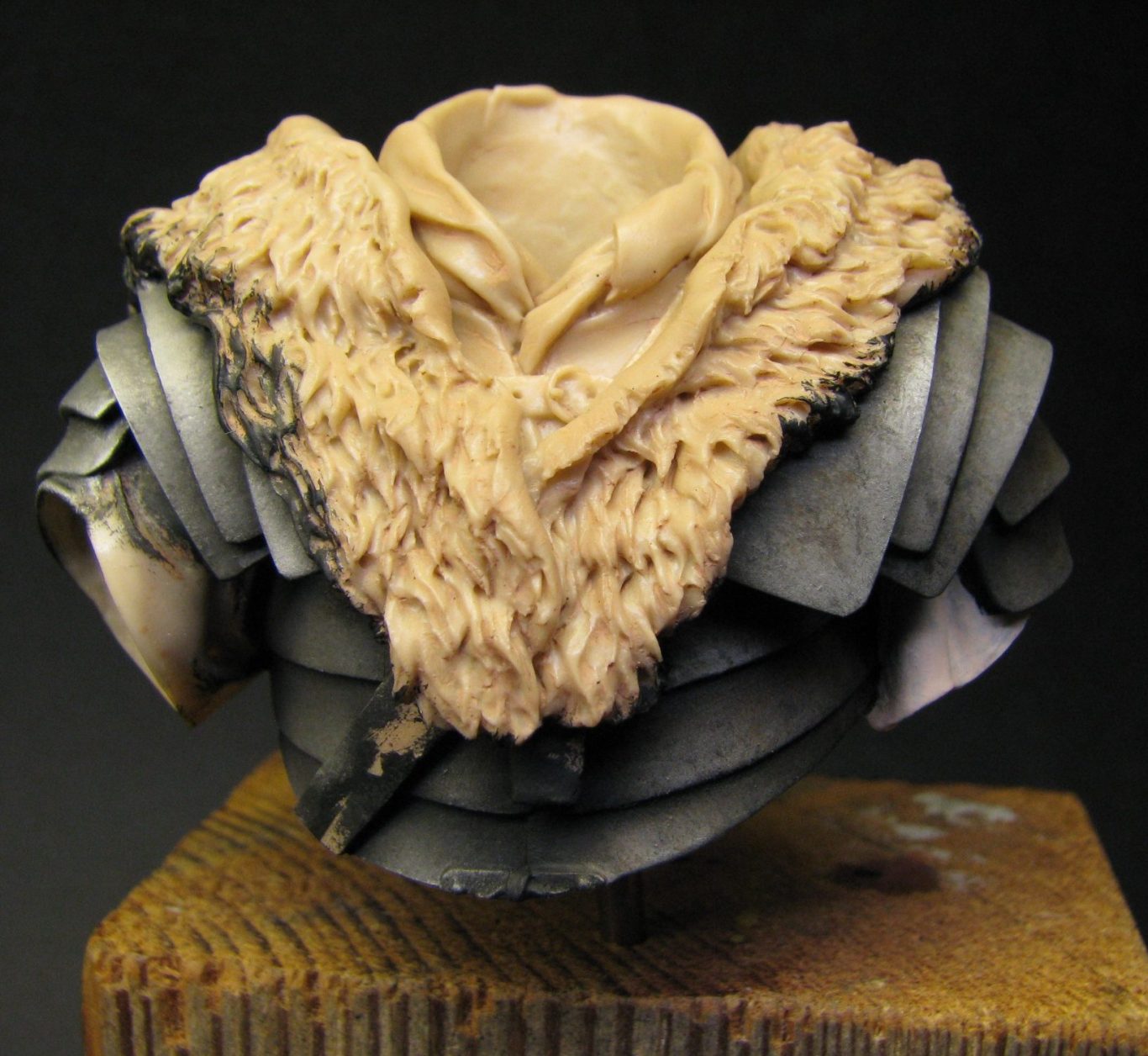
With all the damage added, the result is shown in photo #9. I’ve added scratches and gouges to the metal surfaces – these are painted on by reversing the reflections and putting a dark line onto the surface of the armour, then directly below it a line of the highlight colour. It takes a steady hand and a brush with a very good point, but with a little practice, this can be the result. Once it’s all dried properly, three thin coats of Tamiya Smoke are added to give an oily looking patina to the whole of the armour.
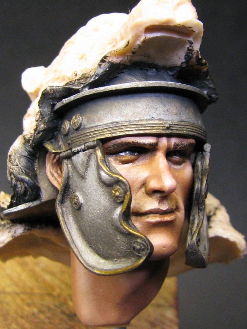
In photo #10 we return to the head, and I’ve fastened on the cheek-guards. These fit into place very well, and whilst I’ve done the basics of the painting on them, with a black acrylic colour added to the inner face of them prior to fastening them into position, I’ve left the staining off until they’re attached to the face.
I really dislike photo #10 because the gold areas on the edges look so false – they need a lot of work to bring them back from that gaudy appearance, but I suppose it shows what the raw gold ink colour looks like, and how much more work is needed to make it look realistic and more of a polished up brass colour.
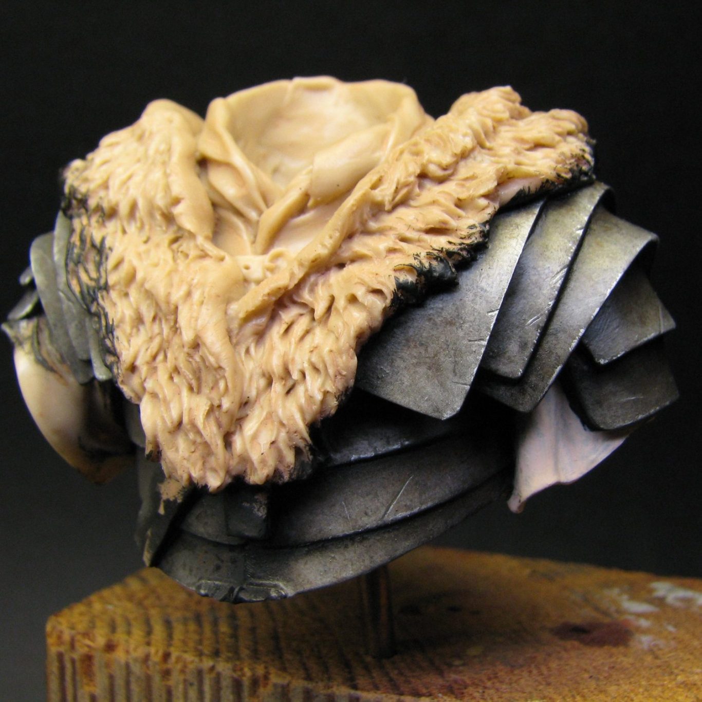
Photo #11 shows the head assembly being test fitted to the body. There’s quite a gap between the two, part of which can be seen at the model’s left shoulder. It’s going to need putty to fix it, but disguising it amongst that fur shouldn’t be too difficult.
Also in this shot I’ve undercoated the sleeves with about eight coats of very light cream coloured acrylic. There’s so many coats been used simply because the dark colour that’s over-spilled from the armour is quite difficult to cover up with a light colour – that’ll teach me to be a messy painter I guess……..Or possibly not.
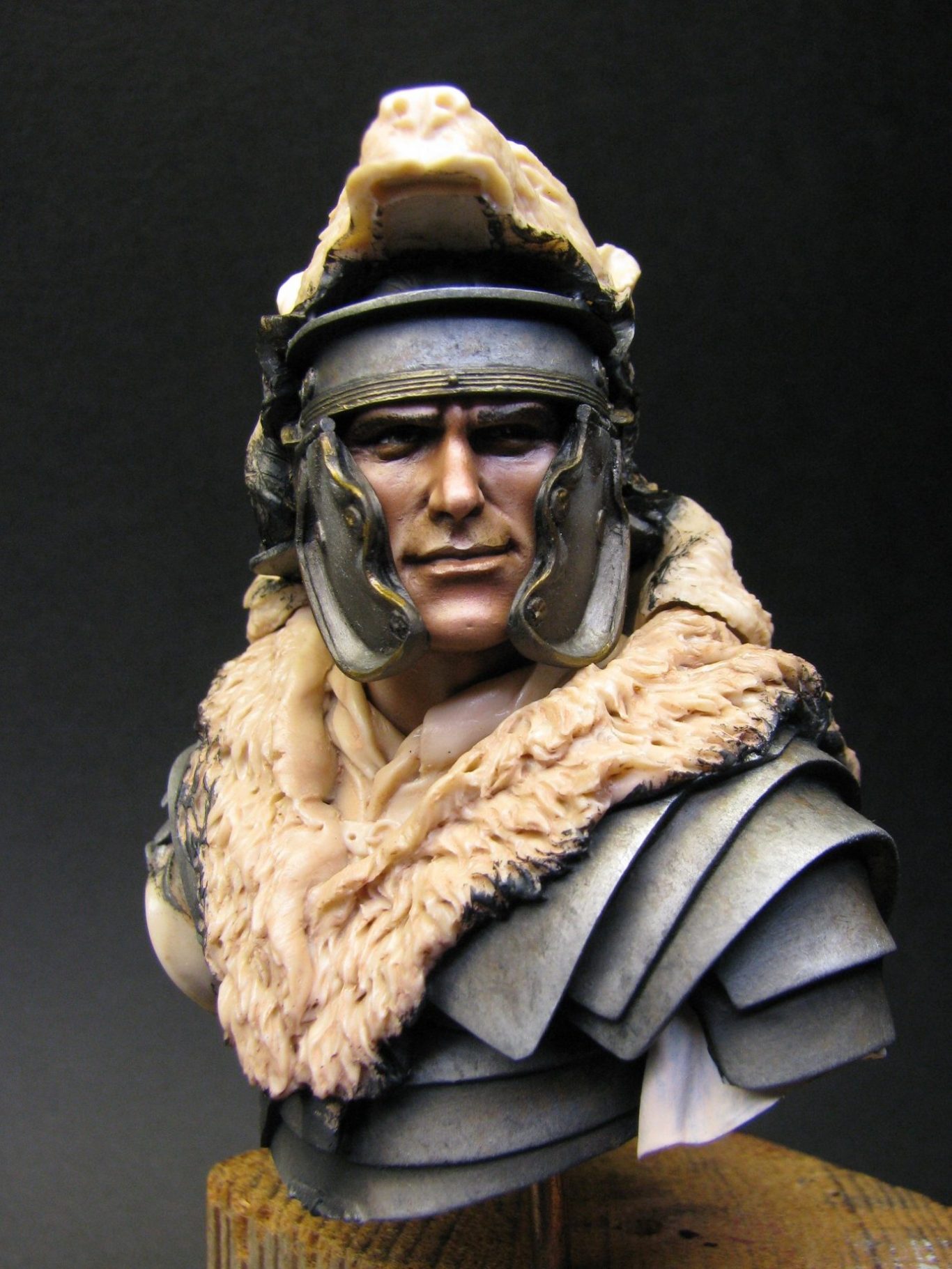
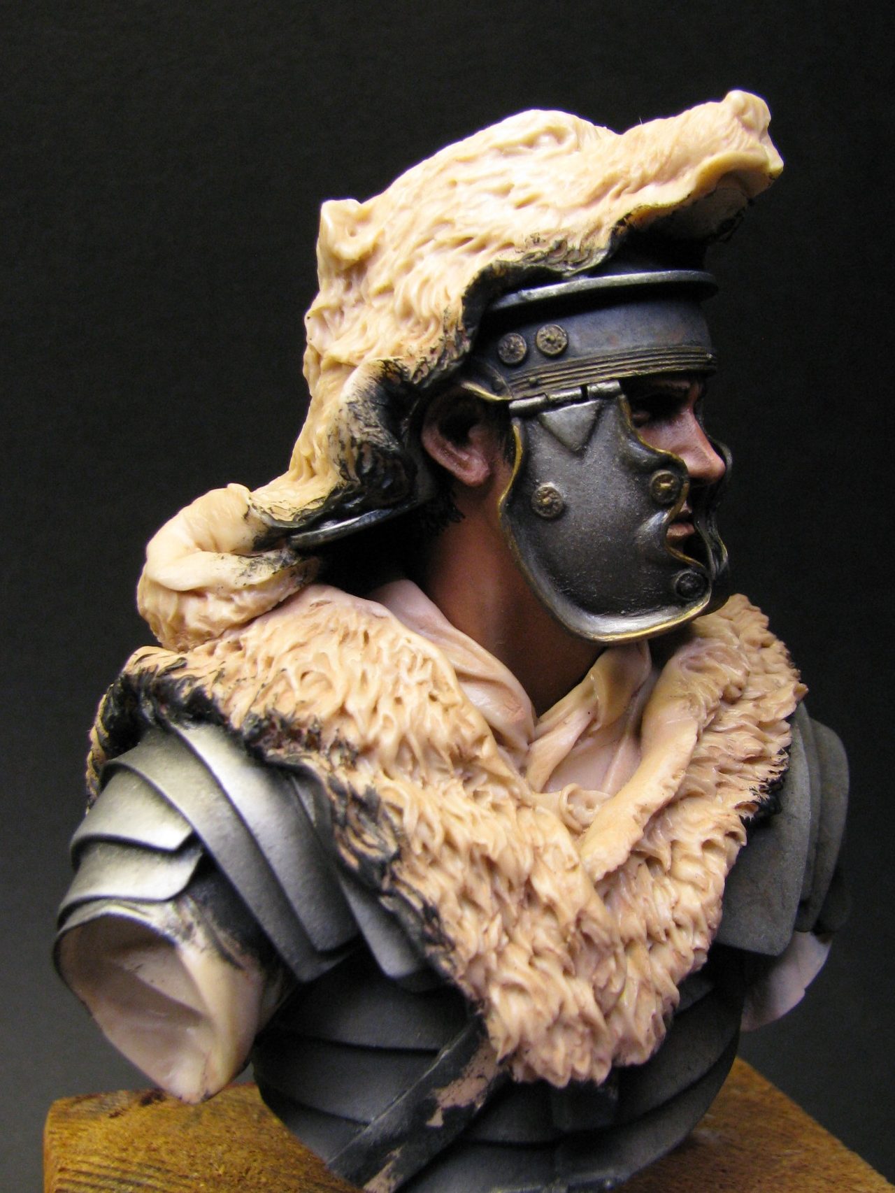
Photo #12 shows the same stage from a different angle. Here there’s not going to be anywhere near as much putty needed to fill the gap between the two sections, but before I get mixing the filler, I’d best sort out the scarf and also the small sections of armour that I’ve missed around the base of the neck.
With all the magic of article writing at my fingertips, I can say that I’ve accomplished the painting of scarf and armour sections, and have been able to add the head section to the upper body – and in photo #13 I prove that by showing the back of the model with the filler having been added to hide the joint.
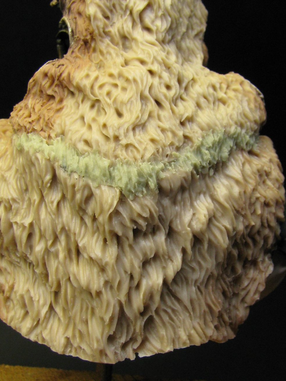
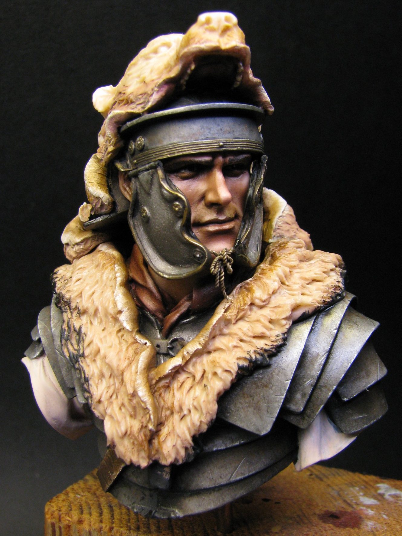
Photo #14 shows the front of the model, and see, I’m telling the truth, the scarf and armour are painted in and I’ve added some twists of soft wire to look like the tie that fastens the cheek-guards closed. I used a mix of Carmine and Titanium White for the scarf, adding some Black and also some Mars Brown to the shadow colour to grey out the redness somewhat. This was then built up through mid-tones and highlights by adding a mix of the carmine and a small amount of the white, then adding more white as a lighter colour was required for the highlights.
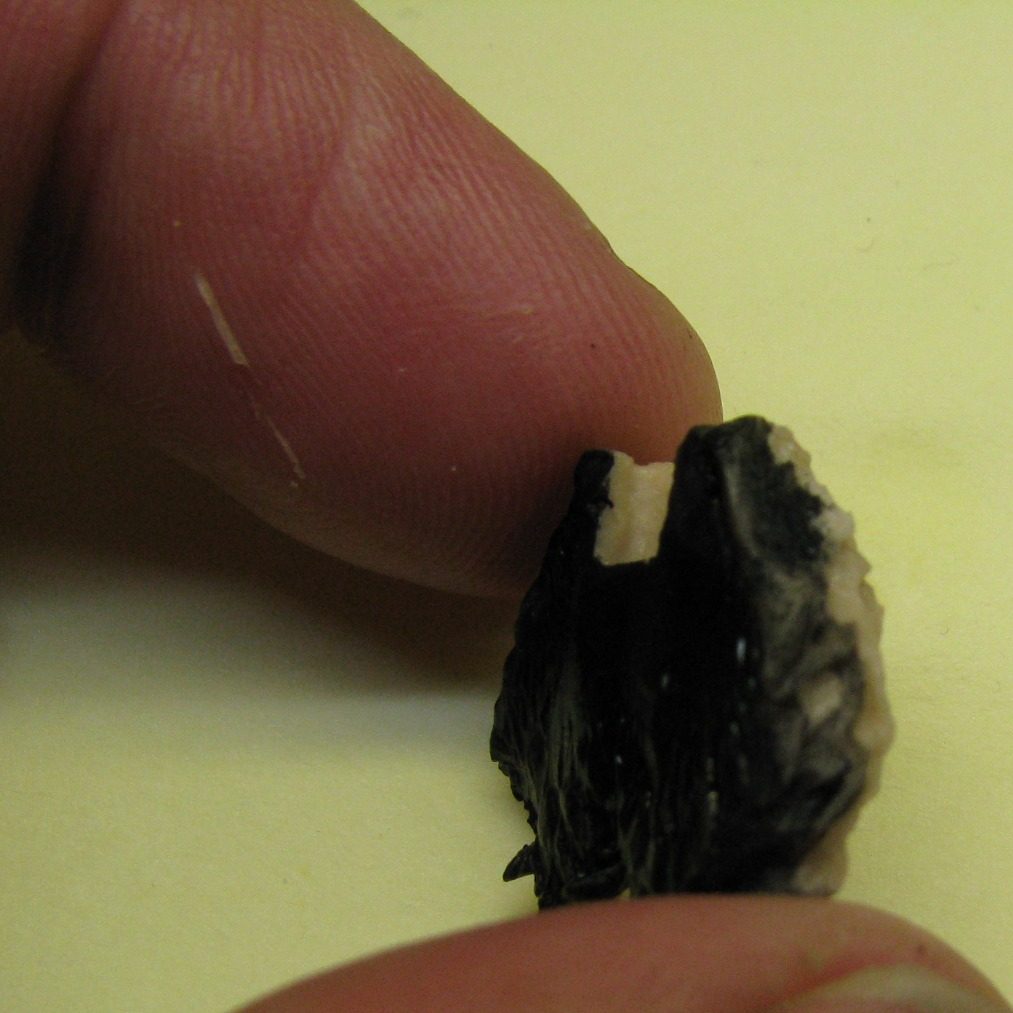
Photo #15 shows two things – the back of the bears paws having been painted with black acrylic so that any bits I can’t get to once they’re in place won’t show up as light areas of bare resin. And secondly that I should watch what I’m doing with the scalpel, as there’s a close call in evidence with the skin of the index finger got too close to the business end of the knife – see, it happens to the best of us.
With the paws in place I could undercoat the fur in Vermin Brown ( nice GW colour ) and once dry begin the application of oils.
I used a lot of Mars Black in the initial mix, lightening it a slight amount with Mars Brown, and thinning it with a good amount of White Spirit. I then painted this into all the depressions, working the colour into the deeper recesses, and then went and made a brew of tea. The time to brew up and drink a cuppa would allow a lot of the White Spirit to dry off – it was the warm months during the summer when this was being painted. So, with the dark brown still wet, but most of the liquid having dried off, I began adding more Mars Brown, then Light red, then a mix of mars yellow and Titanium White so that highlights gradually built up on the upper areas of the fur.
I used a gentle dry-brush technique here, coupled with almost combing the colour onto the fur as well. The paint tends to lay on a little thick in areas, no matter how conservative you are with the application, so it’ll take a while to dry.
But once dry I began adding some washes to the deeper recesses and to build up further contrast on the fur sections.
Finally it was a case of painting the standard. I began by doing the “god’s head” section, painting this with several coats of Skull White acrylic. Over this I added a very pale mix of Light red, a little Mars yellow and a lot of Titanium White. The mid-tones and highlights were built up by adding more titanium White to the upper surfaces, and gently blending them in with a soft, dry brush.
The wood sections were painted with a similar method to each other, that of beginning with a dark oil colour applied almost dry to get a streaky effect over the acrylic undercoat, then by adding lighter colours, again with an almost dry brush, but pulling the brush in long strokes so it creates a grain effect, the texture can gradually take form. I used lighter colours on the staff than on the square block that supports the “head”, my thoughts here being that in battle the staff might get damaged and broken, and thus replaced, but the head and it’s support would tend to be a constant as it was protected and retrieved from the field if ever it fell.
After everything was fully dry, I could use Superglue to fasten things together and take it along to a show – Euro Militaire.
Now you do live and learn, even at my cherished ancient age, I’m still learning. Like when not to get models out of the carry case and hand them round to folk – Friday night at Euro, is just such a case. Because all that Superglue has to give at some point…..
“That staff is loose” someone mentioned when this came out of the box, “No it’s not” replies I, it’s just the resin staff is a bit bendy.” First of the chaps pokes at the bottom of the shaft to prove his point. “Don’t do that.” Says I calmly, thinking that we’re all modellers and know not to touch. “It is loose says a second person, taking the model for a look.”
“Really, it’s not.” Says ….. in moderate disbelief now that a second person has wiggled at the bottom of the staff.
“S’definitely loose;” says a third person, adding helpful “you do realize that Superglue has a low shear strength ?”
“I does if folk keep wiggling it about.” I say, still unsure as to why grown modellers who should know better are doing this.
“Ah, it’s broken,” a helpful observation from the fourth or fifth guy……”we told you it was loose.” – this from several folk around the table.
Anyway, I must admit that Jon Page at Progressive Engineering ( AKA Sphere Products ) has an excellent line in superglue…….Which doesn’t seem to have low shear strength……or the judges were more gentle with it…….Thanks guys J
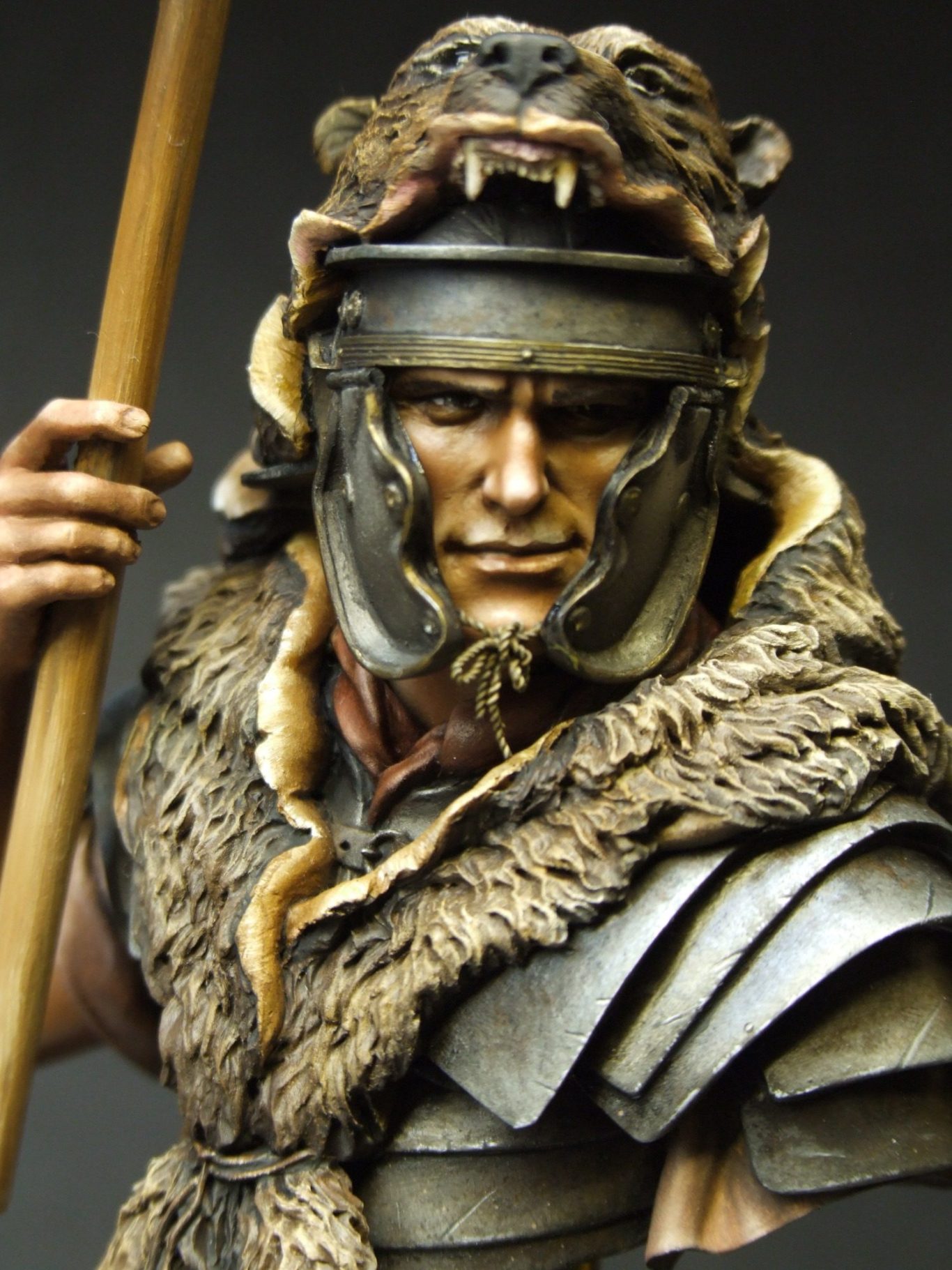
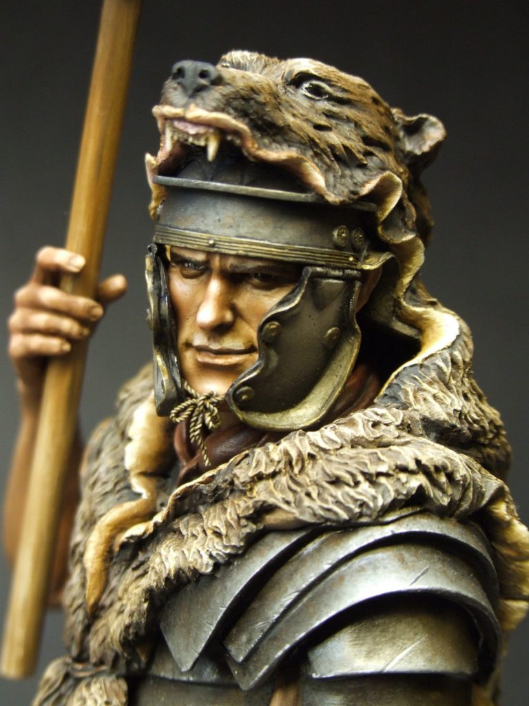
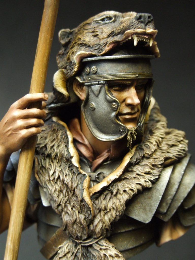
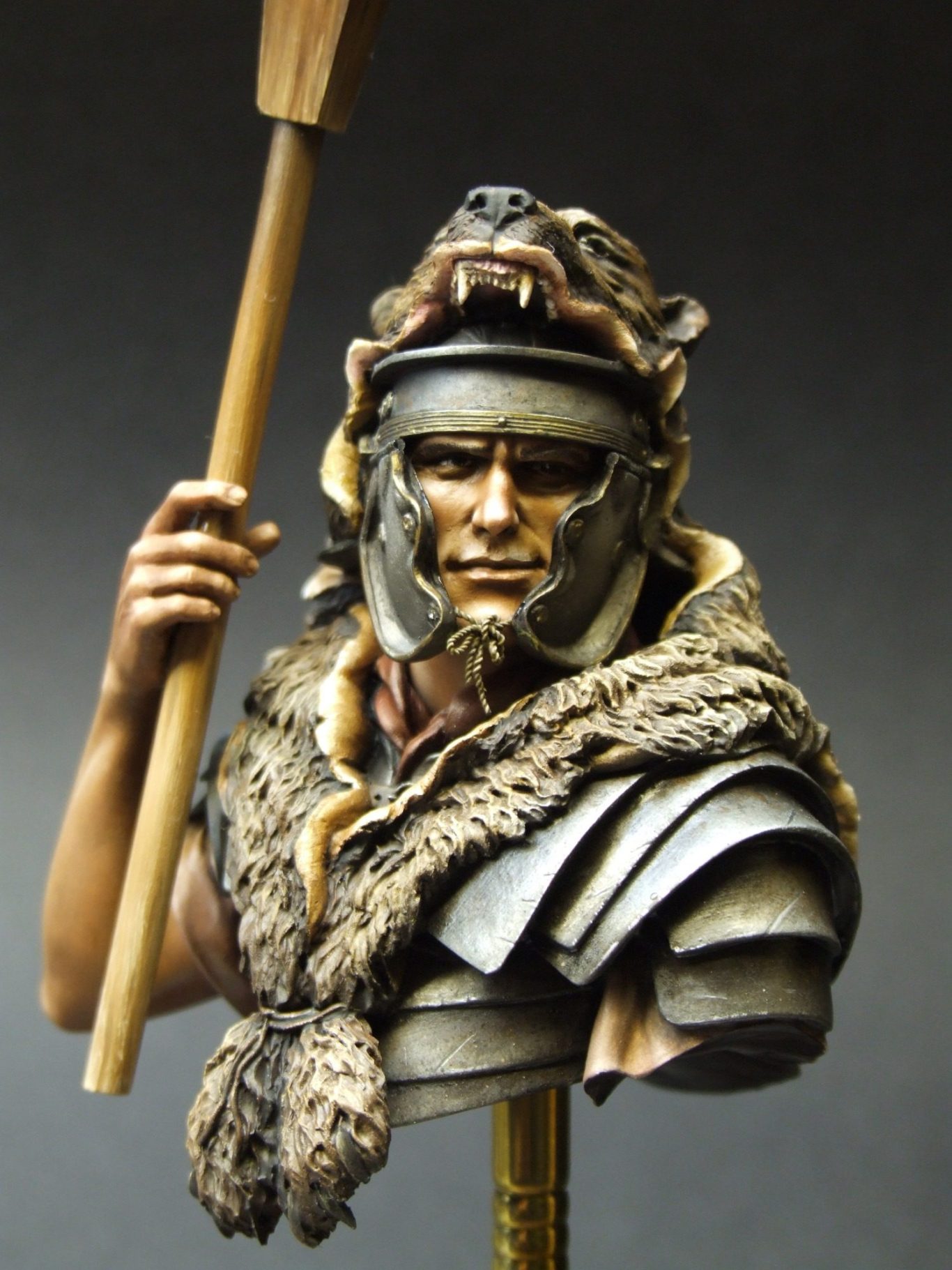
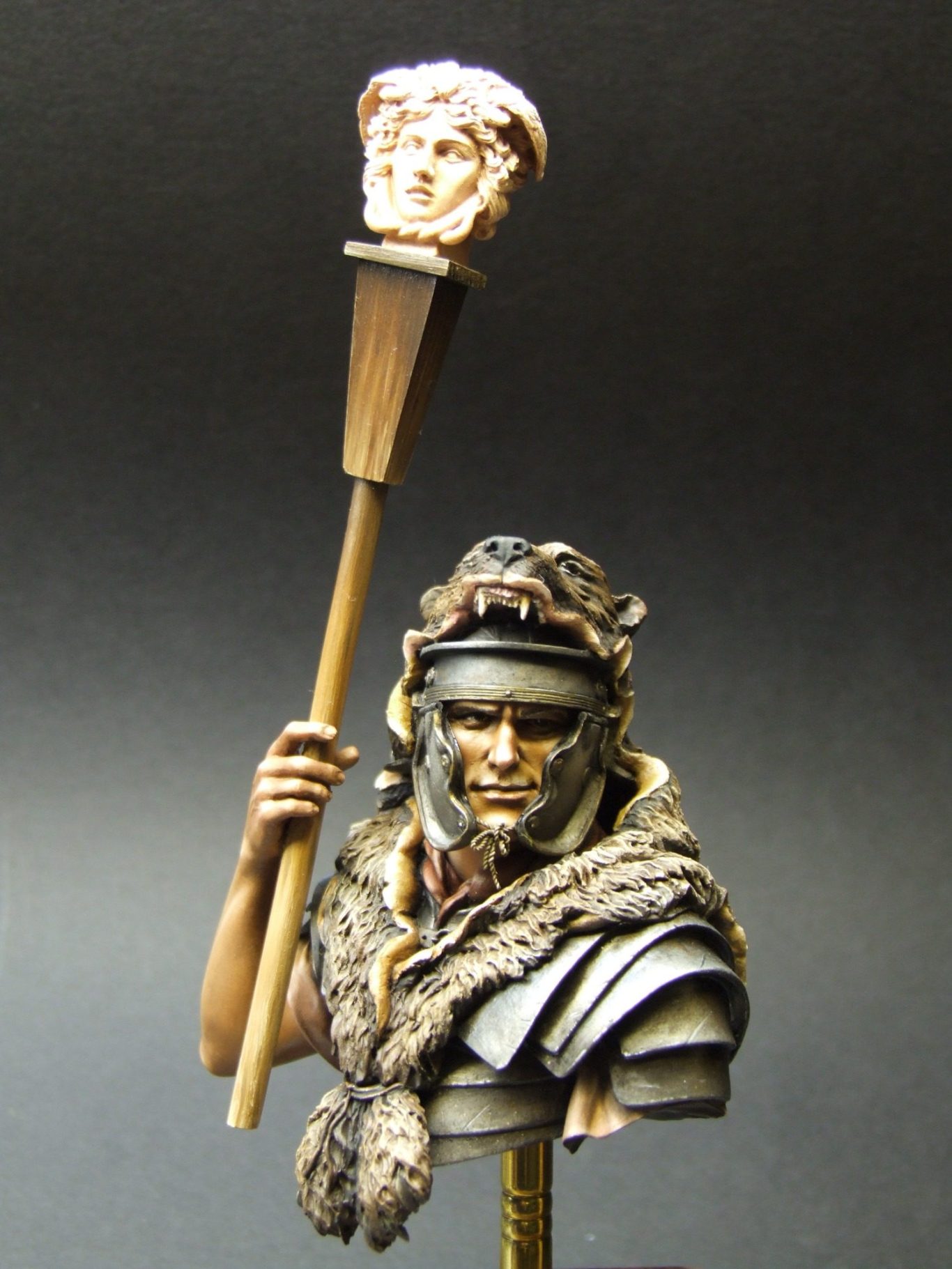
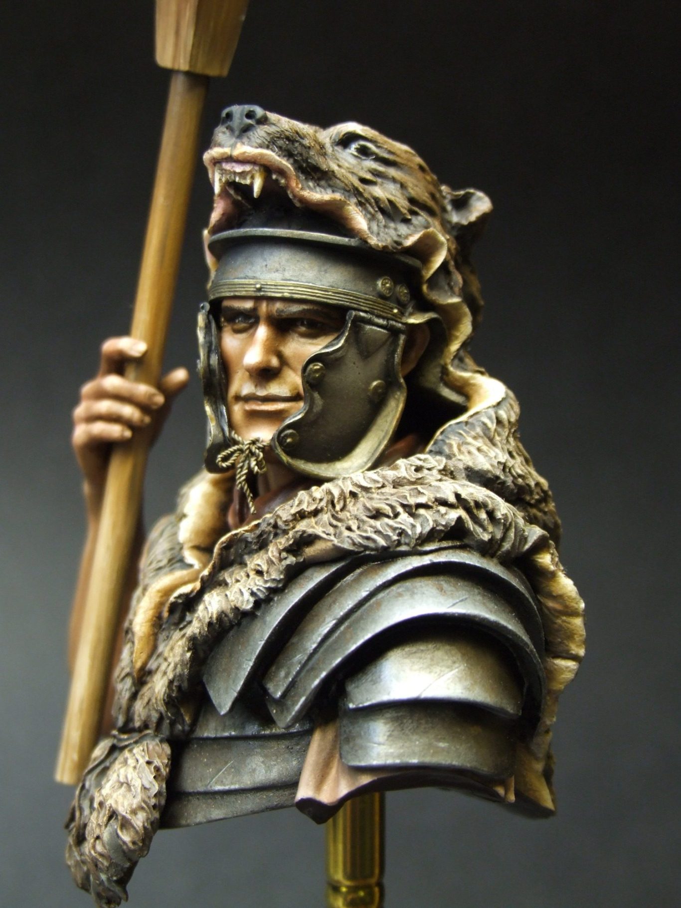
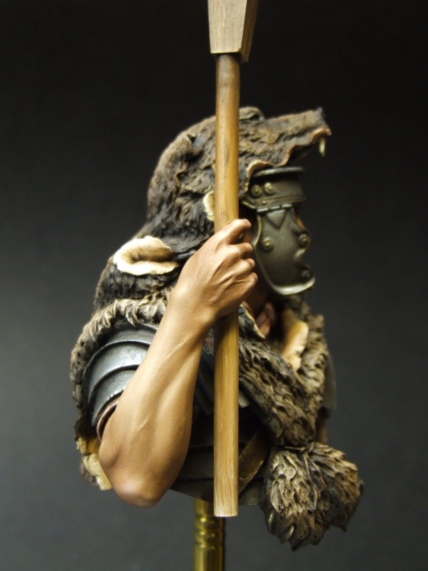
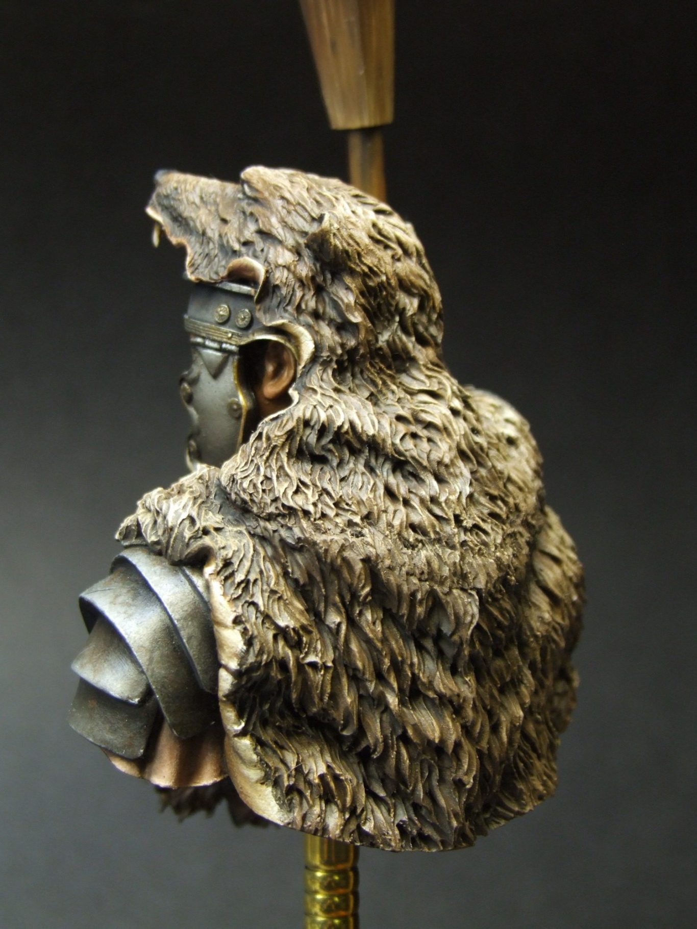
Which brings me nicely to the final photos, showing the model in its finished state, low shear superglue and all.
Final words.
Having painted a few of Young Miniatures pieces, I think I’m safe in saying that they are good quality kits, live up to the box art, and whilst even the best companies can field a howler of a piece now and again, if you like the subject matter and the pose, then you’re pretty safe in buying any of the Young Miniatures range.
This one is perhaps a little more complex than some of the others in the range, simply because of the fit of the headdress and then the fitting of the staff to the hand, but it shouldn’t cause problems for most modellers who are used to working with resin.
Ultimately I think it’s a very nice looking piece, and set amongst a collection of Romans, it’ll certainly hold it’s end of the display up well, I don’t think it can match the charisma of the Hector piece, because after all that’s got a Hollywood Blockbuster to back it up and the likeness is spot on.
However, I do think that this has it’s strengths, the cut-off point for the staff works well, and the detailing of different textured areas is well rendered. So overall, a good piece.